The Null Device
2009/8/17
This blog has been quiet recently, because I have been travelling.
I recently spent a few days in Venice; a spectacularly beautiful city, and one well worth visiting. (This is made all the more poignant by the possibility that Venice may not be around in its present form for much longer; rising sea levels and subsiding buildings threaten to sink the city.) In any case, I have posted photos to my Flickr page.
One thing I noticed about Venice (and this is, granted, a somewhat trivial observation, and one which seems unworthy of mention in the face of the all-surrounding sublime): its public transport system's signage is, for some inexplicable reason, set in Arial (i.e., the free Helvetica lookalike that Microsoft bought to give away), as evident below:
The giveaway is the 'G'; the vertical line descending from the crossbar would, in Helvetica, cross the circular part and touch the baseline. Other signs show other telltale Arialisms (the right leg of the 'R' being diagonal rather than vertical, and the top of the 't' being slanted rather than flat, but otherwise it looking more or less like Helvetica).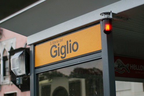
I say inexplicable because there seems to be little reason to use Arial on public signage. While it's a perfectly technically workable sans-serif typeface, Arial is known only as a Helvetica substitute one doesn't have to pay for. In fact, its entire raison d'etre is to be a cheaper, off-brand drop-in replacement for Helvetica, a state of affairs which makes it a defacto signifier of cheapness or naïveté. (It's a ubiquitous 20th-century modernist sans-serif font for people who aren't into fonts, and who aren't paid to pay attention to these sorts of things.) Does the city of Venice really save that much money by going with Arial? (Would a city have to specifically licence a typeface for signage? If so, presumably Arial would no longer cost nothing. If not, wouldn't shelling out the €25 or so for a copy of Helvetica Bold* be worth looking more professional? (I.e., dotting one's 'i's, and crossing (and not slanting the tops of) one's 't's.)
* A weight of Helvetica is listed as £20.25 on Linotype's website; this is roughly €23.50.
A man in Azerbaijan was recently interrogated by the National Security Ministry for having voted for the Armenians in the Eurovision Song Contest:
"They wanted an explanation for why I voted for Armenia. They said it was a matter of national security,” Nasirli said. “They were trying to put psychological pressure on me, saying things like, 'You have no sense of ethnic pride. How come you voted for Armenia?' They made me write out an explanation, and then they let me go."It is not known whether the same treatment was dealt to the (exactly) 42 other Azeris who voted for Armenia.
This is not the first time that politics have clashed with Eurovision voting; some years ago, Lebanon withdrew from the contest because, to participate, they would have had to allow their citizens to vote for any contestants, including the Israeli ones.
These people claim that manufactured pop electrovixen Lady Gaga is an Illuminati mind control parroting puppet, with everything from her makeup to her nonsense lyrics being allusions to Satanic symbolism and Illuminati mind-control techniques. Other tools of the conspiracy are Transformers 2, Beyonce and even the Flintstones. And here are their top 5 most sinister corporate logos.