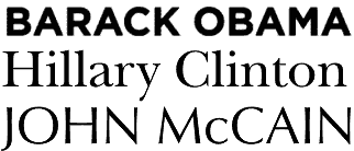
 Most go for safely conservative, focus-grouped choices; Hillary Clinton has gone for New Baskerville, a typeface seemingly designed for hardcover self-help books and suburban real-estate agencies' signs. (The latter association may not be the most prudent, with the subprime crisis.) Republican war-hero John McCain has gone for Optima, which, coincidentally or not, is the typeface used on the Vietnam War Memorial in Washington DC. Both typefaces are decades old (and New Baskerville is based on 18th-century English book type), and published by huge type foundries that predate the computer age.
Barack Obama, however, has broken away from the typographical consensus, and gone for a new font named Gotham. Designed by Tobias Frere-Jones starting in 2000 and based on examples of vernacular signage and lettering, Gotham evokes the classic yet forward-looking appearance of 1930s modernism. And the Obama campaign's adoption of it has led some to call it the hot font of 2008:
Though a discussion of fonts may seem obscure, anyone who has agonised over the look of a wedding invitation or sweated over a resume knows that the shape of letters can say nearly as much about a person as the words they spell out. And in the computer age, the message conveyed by a font is no longer subliminal. It's overt.
What, no link or acknowledgment? On yr toes buster, on yr toes.