The Null Device
2010/10/11
Recently, US youth-oriented clothing chain The Gap replaced its logo with a new one, one consisting of nothing more than the word "Gap", in Helvetica, with a blue rectangle in one corner, to much opprobrium from the design community:
Could this be a sign of the end of Helvetica's reign as the epitome of High Modernist cool, and a harbinger of its second decline? The sans serif has been enjoying a revival as the universal (well, almost universal) signifier of timelessness yet clean modernity for a while now; no longer trashily ubiquitous (no, that'd be Arial), the former "official typeface of the Vietnam War" became recognised as a design classic, a force of nature; merely setting something in Helvetica (or, even better, Helvetica Bold), is a statement of understated confidence (see, for example, American Apparel's ads, where it offsets the lo-fi porno aesthetic). A hagiographic documentary, released in the year of its 50th anniversary, didn't hurt either, and nor did Apple going with it as the standard system font of the iPhone, instantly making other mobile platforms look cheap and tacky. (Before this, Apple commissioned custom system fonts for their desktop operating systems; remember, for example, MacOS's "Chicago".) Such were the typographically conservative rules of the age of retro-modernism Helvetica presided over, when heritage was king.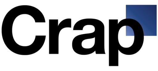
Now, after brand upon brand adopted the plain-black-Helvetica-on-white look, the trend seems to have peaked, and (as Gap has shown us), the emperor has no clothes. Perhaps we'll now see an anti-Helvetica backlash, with some Helvetica users switching to other, arguably better grotesks, such as Akzidenz, Univers and, yes, Aktiv Grotesk and others jumping further afield and rebranding themselves with other typefaces (Futura, as seen in Wes Anderson film titles, could be one to watch, as could Eurostile if one doesn't mind a bit of retro boxiness; Gill Sans, whilst overexposed in Britain, may have legs elsewhere, and perhaps FF Meta is old enough to be not so much trendy as mature), or even an explosion of daring experimentation and a move away from the classics and towards all-new typefaces.
Anyone want to bet on what the iPhone 5's system font will be? I imagine that with this and Windows Phone 7 one-upping the mid-20th-century public-signage aesthetic, the time for a break with Helvetica could be right.
Doing nothing to kill the stereotype of Australia as a spectator sports-centered society, seven footballers are running as candidates in the upcoming Victorian state election. Tellingly, six of them are running for the right-wing Coalition (four of those for the National Party, the coalition's more conservative party). Could this be another sign of the Australian Right having embraced anti-intellectualism (which could be argued to be a traditional Australian value) as a core part of its identity, and conceded the very idea of engagement with culture and ideas more sophisticated than a gut sense of tribal belonging (or, as John Howard called it, "mateship") to the leftward end of the spectrum?