The latest word in the Helvetica debate:
Neue Haas Grotesk,
a new digitisation of Max Miedinger's original typeface (which was originally named that, and only renamed to Helvetica by the marketing department in 1960 or so to cash in on the fad for Swiss modernist design):
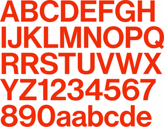
The digital version of Helvetica that everyone knows and uses today is quite different from the typeface’s pre-digital design from 1957. Originally released as Neue Haas Grotesk, many of the features that made it a Modernist favorite have been lost in translation over the years from one typesetting technology to the next.
The Helvetica obliques that come installed on every Mac today were generated mechanically by skewing regular upright forms 12°. Neue Haas Grotesk’s obliques have been properly corrected to have smoother curves, even stroke weights, and overall visual harmony.
The full 22-style family, which includes alternate character forms, will cost you US$616.00; about twice as much as Helvetica-discontent Bruno Maag's
Aktiv Grotesk (though less per individual weight), but considerably less than
the electronic revival of Rail Alphabet (which seems to have been created to cash in on British Rail/NHS nostalgists with deep pockets). Either way, it probably will not put an end to the debate over Helvetica's place in the canon of modern graphic design; whether it is justifiably a touchstone of High Modernism or a shoddy, opportunistically made example of the typographical grotesk which just happened to be in the right place at the right time.