The Null Device
Posts matching tags 'aesthetics'
2010/8/27
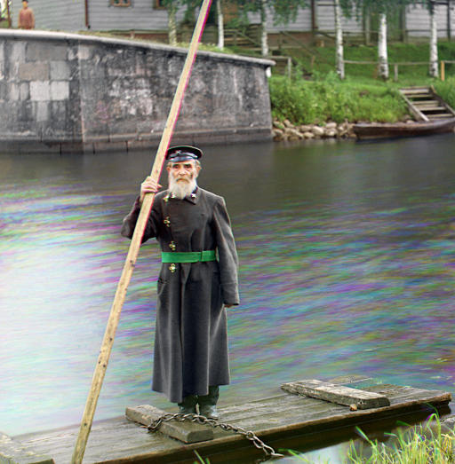
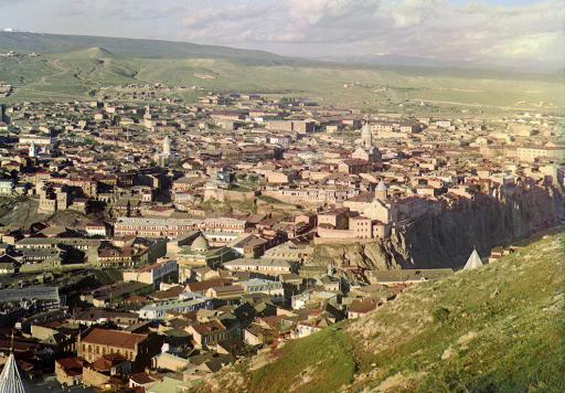
The Boston Globe has posted a selection of colour photographs taken across the Russian empire around 1910. The photographer, Sergei Mikhailovich Prokudin-Gorskii, travelled the length and breadth of Russia and its holdings (some of which are now in places like Georgia and even Turkey) at the Tsar's behest, producing a comprehensive photographic survey. Of course, colour film had yet to be invented, so Prudkin-Gorskii took his photos by taking three exposures, each with a different coloured filter in front of the lens, using a specialised camera that allowed for the filters to be swapped quickly. (It's not unlike the technique used to take HDR photos these days.) Anyway, the original glass plates were bought by the US Library of Congress in 1948 (not sure from whom; perhaps a White Russian exile took them whilst fleeing the Bolsheviks and they spent three decades in a suitcase in Paris or somewhere?), and have since been composited together into stunning full-colour images of what we too often think of as a sepia-toned age:

2010/8/22
A new technique involving ultraviolet light is revealing how ancient Greek statues were painted, by detecting traces of the organic compounds paints were made of. It turns out that the statues were coloured quite gaudily (indeed, some would say tackily), looking more like something you might find on a seaside pier than in a stately home.
And the fashion of subsequent millennia for alabaster-white statues of beautiful youths, female nudes, fauns and the like? Well, that's all based on the incorrect assumption that the way Classical Greek statues look now was the way they looked when they were made. (Indeed, I have heard the argument that the tendency towards minimalism in Western culture—as evidenced in High Modernism, for example—ultimately stems from the æsthetic values inculcated into the Western mindset through millennia of misinterpretation of Classical Greek artefacts.)
2010/8/11
The latest instalment of the OKCupid team's data-mining project looks at the correlations between the attractiveness of profile pictures attractiveness and the EXIF metadata contained in them. Among other things, it has found that:
- While a better camera may not make you a better photographer, it will make you look sexier (assuming you're being photographed with it, that is). Photos taken with Micro Four-Thirds cameras looked the best, followed by those taken with DSLRs, then compacts and finally camera phones, with Windows and Motorola phones taking the most minging profile pictures.
- Apple products do get you laid. or at least iPhone users have richer love lives than users of other smartphones.
- If you wish to take a flattering photo, open the aperture, getting a nice short depth of field (having a good camera, or at least not a cameraphone, helps here) and, for God's sake, don't use flash. (Unless perhaps you're going for that abject hipster porn aesthetic you see in American Apparel ads and Terry Richardson features in Vice.)
- The golden hour is not a myth; attractiveness of photos does spike immediately after sunrise and before sunset.
2010/6/6
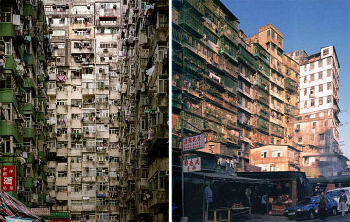
A collection of poignant photos of ruins and urban decay in Asia; in particular, Japan's Gunkanjima (Battleship Island), an industrial city on an island abandoned when coal was replaced with oil, Hong Kong's lawless Kowloon Walled City (which existed as a rat's nest of cyberpunkesque anarchy until it was finally demolished in the 1990s) and the sadly abandoned ruins of San Zhi, a half-completed futuristic resort in Taiwan:


2010/3/27
In user interface design, sometimes worse is better, as in the case of the Bloomberg Terminal, a proprietary computer terminal used by financial traders. The Bloomberg Terminal's interface, which hasn't been updated for a decade or so, is generally seen as cluttered and ugly. Proposals for more elegant redesigns have been knocked back, because the existing users like the macho ugliness of the interface and the aura of hardcore expertise it bestows on them:
Simplifying the interface of the terminal would not be accepted by most users because, as ethnographic studies show, they take pride on manipulating Bloomberg's current "complex" interface. The pain inflicted by blatant UI flaws such as black background color and yellow and orange text is strangely transformed into the rewarding experience of feeling and looking like a hard-core professional.In other words, the Bloomberg Terminal is one of a class of items whose bad design is a feature serving a higher-level social function; in this case, the function is that of being a badge of proficiency or status, and an artificial handicap to keep usurpers out. In this way, it functions somewhere between the tail of a peacock (which is expensive to grow and makes one more visible to predators, but having one (and being alive) also acts as proof of fitness) and the regalia and rituals of Freemasonry back when it was a force to be reckoned with. Of course, secrets are inherently leaky and can hold power only for so long, so sooner or later, perhaps someone (possibly Apple or Google?) will come along with a more elegantly-designed system that will demystify what it does and, in doing so, hole Bloomberg's boat below the waterline (unless they do so first).
2010/3/20
The latest fashion in mainstream Hollywood filmmaking seems to be colour-grading films to a uniform palette of teal and orange:
The orange and teal look is an artefact of technological possibility and creative laziness. About a decade ago, filmmakers started digitising film and electronically manipulating it, which gave them the ability to adjust colours for the whole film as easily as tweaking an image in Photoshop. While some of the more visionary filmmakers have used this as a creative tool (the Coens made use of it in Oh Brother Where Art Thou to give the film a sepia look, and Peter Jackson made extensive use of colour grading in the Lord Of The Rings films), those churning out action films, who typically have no time for such hoity-toity concerns as artistic vision, needed a quick and easy formula for how to make their films look more awesome. And they got one in complementary colour theory; human skin tones (especially when oversaturated for extra awesomeness) look orange, and stand out most strongly against bluish-green hues. Thus, grading films to an orange-on-teal palette is a cinematic equivalent of compressing the dynamic range of recorded music for extra kick-ass loudness; both add extra zing, producing a product that's superficially exciting, at the cost of subtlety. Though who goes to see Transformers for subtlety, right?
As artificial as it looks, it'll look quaint once they figure out how to shoot entire films in HDR.
2010/3/13
Not even bohemian Berlin is immune from the forces of gentrification; luxury apartments are going up where the Wall stood, and the city's legendary bars and clubs are threatened with closure by rising rents and noise complaints. The city's non-yuppie residents are fighting back in a number of ways; some are torching luxury cars, while others are uglifying their areas with yuppie-repelling camouflage:
A recent meeting at SO36 discussed non-violent ways to keep out "unwanted" residents. Erwin Riedmann, a sociologist, proposed an "uglification strategy" – to "go around wearing a ripped vest and hang food in Lidl bags from the balcony so that it looks like you don't have a fridge". The suggestion drew laughs, but is a strategy being adopted.
An "anti-schicki micki" website, esregnetkaviar.de (it's raining caviar), offers the following tips to make a neighbourhood unattractive for newcomers: "Don't repair broken windows; put foreign names on the doorbell, and install satellite dishes."
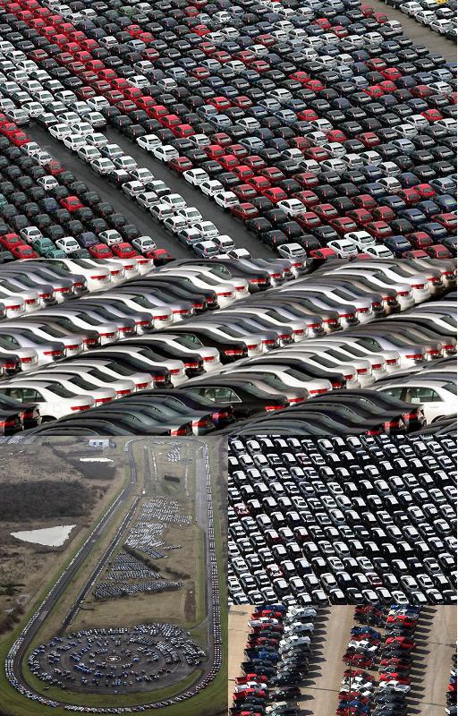
2009/1/22
A photo gallery of masses of unsold cars around the world, building up in parking lots, docks and racetracks as the economic crisis bites. These images have a sort of Koyaanisqatsi-esque beauty to them.
2008/9/3
In December 1969, a young man from the south of England decided, under the influence of kitchen-sink films, to go to the North with his camera and capture the stark beauty of the old North on film before it disappeared forever. Some decades later, he got a Flickr account, scanned his photos and posted them here. Most of them are in black and white, and many are quite beautiful, in a somewhat bleak, sparse sort of way.
The photographs, which are generally beautifully shot, are accompanied by the photographer's descriptions of the scenes, in which he laments the passing of the old grim north, and the Southernisation of England, with the arrival of things such as pebbledash, holidays to Florida and even the Clean Air Act. Which does at times seem somewhat problematic; I suspect that the residents of Moss Side or St. Helens would quite happily sacrifice the bleak poignancy of their streetscapes for holidays in the sun and indoor lavatories (not to mention not dying prematurely from the effects of air pollution), though other pieces (such as this one about lost opportunities for childrens' play and this lengthy meditation on fleeting experience and the beauty in the mundane are simply sublime.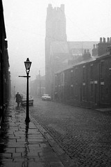


2007/8/28
The Boston Globe has an article about the Steampunk movement and the subculture of people who build gadgets that look like something from an imagined Victorian computer revolution:
Yet steampunk has also evolved as an aesthetic unto itself, drawing on a number of diverse references. Goth, which has its own anachronistic sensibility, borrowing heavily from Victorian styles such as corsets, offers an early glimpse of steampunk. Punk lent elements of leather and metal, as well as the DIY attitude. The film "Brazil" is of particular inspiration, where technology looks like junk, and the rebel fights against a technocratic authority. But one of the most important influences has to be Japanese animation, or anime, which is replete with images of mechanical robots, neo-Zeppelin starships, goggle-wearing hackers, and the melding of the techno with the organic.
Objects like the Infumationizer show that steampunk is also simply a love of the fantastic. Steampunk hackers are often science fiction geeks at heart. There's a love of things that don't exist, except in some alternate world, like the "Peltier-Seebeck Recycled Energy Generating Device" and the "Aetheric Flux Agitator Mk2." One of Datamancer's other inventions is a modified enclosure for his desktop computer, which he calls "The Nagy Magical-Movable-Type Pixello-Dynamotronic Computational Engine." He used the cabinet of 1920 tube radio, a turn of the century Underwood typewriter, and various parts and pieces to create a functional, completely anachronistic, impossibly real computer.
In all of the new steampunk design there is a strong nostalgia for a time when technology was mysterious and yet had a real mark of the craftsperson burnished into it, like the "Nagy" of Datamancer's "computational engine." In the Victorian era and at the turn of the century, people watched in astonishment as technology changed their lives, but they were also in awe of the inventors and scientists, some of whom became celebrities in their own right, like Edison and Tesla.The article mentions that steampunk is partly a rejection of the disposable, opaquely unmodifiable nature of consumer electronics today, and a sort of technological libertarianism, akin to the copyfighters who oppose DRM and the hackers who crack the locks on gadgets from XBoxes to iPhones because the locks' presence offends them.
2007/4/23
Charlie Brooker takes on another part of the blight affecting contemporary Britain: computer-generated shop signage, in particular singling out its crimes against typography and sensible use of colour:
[W]e live in a cluttered optical hell of carelessly stretched-and-squashed typefaces and colour schemes that clash so violently they give you vertigo. Stroll down the average high street and it is like being assailed by gaudy pop-ups on the internet. It makes your eyes want to spin inward and puke down their own sockets.
As if thoughtless font abuse were not enough, some signs even incorporate scanned photographs; a garish snap of some glistening meat surrounded by a yellow Photoshop "haze" effect, hovering over an electric blue background, flanked by the words KEBAB DUNGEON in bright red, foot-high Comic Sans crushed to 75% of its usual width. Jesus. Why not just punch me in the face and have done with it?
Something has got to be done because it is only going to get worse. You know what will be coming next: animated shop signs with moving "wallpaper" backgrounds. Storefronts resembling god-awful homepages from 1998. Row upon row of them. Visual bedlam wherever you turn. Two months of that and our cities are going to be over-run with screaming maniac gangs; hitherto law-abiding citizens driven insane without knowing why, like the demented hordes from 28 Days Later.He's right, you know. On Britain's high streets, many of the shops which are neither corporate franchises (which is part of another curse, the "clone high street") nor premium boutique affairs tend to stick to the value-for-money school of image management. Why mess around hiring expensive designers, decorators and image professionals when it's so much cheaper to get a computer-printed PVC sign, with your shop's name in bright yellow Helvetica on bright red, stretched to fit the length of the sign (which is also backlit with neon tubes). With the advancement of computer technology, meaning that anyone can be a designer without knowing anything about the rules of design, you can even stick in a scanned photograph or some clip-art.
One frequent subcategory of offenders here are fast-food shops, a good proportion of which are fried chicken shops named after varying US states ("New Hampshire Fried Chicken", anyone?) or words associated with the idea of America, and more often than not feature anthropomorphised animal mascots, usually chickens in Wild West sheriffs' hats or some variant of the theme.
And then there is the "fish bar" phenomenon. Those two words feature in the name of every other fish-and-chips shop in Britain, though to the best of my knowledge, are never used as a common noun in regular conversation. Has anybody ever said, for example, "let's go to a fish bar"?
2007/4/17
Rock aristocrat Bryan Ferry, unapologetic Tory and fox-hunting advocate, has expressed his admiration for the Nazis' aesthetic achievements:
In an interview withWelt am Sonntag, the 61-year-old also acknowledged that he calls his studio in west London his "Führerbunker". "My God, the Nazis knew how to put themselves in the limelight and present themselves," he said. "Leni Riefenstahl's movies and Albert Speer's buildings and the mass parades and the flags - just amazing. Really beautiful."Of course, when cornered about this, Ferry denied having Nazi sympathies, making all the right noises about abhorring Nazism itself and repudiating the Nazis' genocidal actions and ideologies. No, to him, it was purely about the spiffy uniforms and spectacular parades:
The singer, who is also a model for Marks and Spencer, issued a statement yesterday in which he said he was "deeply upset" by the negative publicity his remarks had caused. It added: "I apologise unreservedly for any offence caused by my comments on Nazi iconography, which were solely made from an art history perspective.Which would be alright, except for a few things; as No Rock'n'Roll Fun argues, you can't separate the aesthetics of Nazism from the "bad bits", without seeming monstrously callous at best and at worst to be protesting too much. And then there's his statement that he refers to his studio as the "Führerbunker" thing, which seems to give lie to his protests of having no Nazi sympathies whatsoever.
Though just looking at the aesthetics whose praises he sang so loudly: Albert Speer's cyclopean monumentalism, the Wagnerian bombast, the masses marching and chanting in unison, all subtlety subsumed beneath the single-minded show of raw, primal force. There isn't much good that can be said about these things; at best, they're crass and kitschy, and at worst, the mindset behind them is inseparable from that which would countenance projects such as the Third Reich. One does wonder about the mindset of someone with such aesthetic sensibilities.
And here is Momus' take on the whole matter, in which he reiterates his view that the aesthetics of rock are inherently fascist:
The fact that I sense some kind of fascism in rock music (especially live rock music) is absolutely central to my lifelong avoidance of the form. And rock stars don't seem to disagree with me, just disagree that it's bad, or matters. In 1975 a coked- and occulted-up David Bowie called Hitler "the first rock star -- he staged a whole country". Keith Moon liked to dress up as a Nazi, and Bobby Gillespie is fond of throwing Hitler salutes, probably more in tribute to Iggy than Adolf. What Ferry is saying now is a tame, drawing room version of the same thing.
2006/7/20
AIGA Design Forum has an article taking the Whitehouse to task for its poor typographical taste:
While his handlers would never allow the leader of the free world to go out in public wearing a rayon leisure suit and white bucks, they nonetheless use clownish shareware typefaces with hokey beveled edges and cheesy drop shadows to represent his ideas.
The most persistent is the use of Roman-like faux intaglio and engraved letterforms to give an air of authority and truth--although the effect is more Las Vegas casino. To celebrate the fourth anniversary of the "No Child Left Behind" act, someone got a little creative and added a drop shadow to a font that fakes the look of chalk or crayon lettering. This is only one evolutionary step away from introducing the Lariat font (novelty letterforms made from rope) whenever W is speaking from Crawford, Texas.The author suggests that the Whitehouse's design faux pas are the result of indifference, and/or the Whitehouse hiring computer geeks rather than designers (and, incidentally, offers his services as Undersecretary of Design. Momus, however, disagrees, arguing instead that the Whitehouse rejects what is received as good aesthetic taste because it is too closely associated with despised liberal elites, whereas chunky patriotic-action-thriller letters and extruded gold serif fonts are considered populist.
Momus then goes on to find other political signifiers in the Whitehouse's aesthetic choices:
The meaning of Trajan in the contemporary US seems fairly unambiguous to me. Trajan makes an implicit metaphor between the imperial power of ancient Rome and the imperial power of contemporary America. Whether it's made to look as if it were chiselled, or whether the letters are themselves made of metal, it suggests sharp implements, which conjure both the image of monumental permanence and the image of martial hardness -- the two basic meanings of Trajan's column itself. Pure Trajan suggests "right wing"; Trajan with drop shadow, metallic glints or lurid colors suggests "populist". Put them together and you get: "right wing populist". You don't have to spell it out in text; the message is there in the texture.
The Nazis would have hated [Mies van der Rohe's Neue Nationalgalerie's] lightness and clarity the way the Bush administration seem to hate clear, clean Franklin Gothic or Helvetica layouts. They'd already forced Mies to close down the Bauhaus, a den, in their view, of socialists, communists, Jews and progressives. They rejected Mies' Modernist style as "un-German". I'm trying to imagine a parallel world where the Nazis build a Modernist Germania of light articulated glass curtain architecture, but it's almost impossible, just as it's almost impossible to imagine the Bush administration producing a banner or a publication I'd actually admire and want to hang on my wall.Momus, though, comes to the conclusion that "good design" and "bad design" are entirely culturally relative.
There is no such thing as bad design or good design, the cultural relativist has to conclude, just their design and our design. The downside of that is that we lose the illusion that our taste has universal validity, or is inherently better than anyone else's. The upside is that we stop trying to preach and teach -- meaning, we become a little less imperialistic, perhaps. (Or do we become more imperialistic, and simply say "Our way is better because we have more power than you... and because we say so"?)I don't entirely agree with this conclusion, as it seems too much like the "blank slate" theories of human nature pushed with Lysenkoist zeal by some leftists. There is "good design" and "bad design", as far as utilitarian considerations are concerned. These considerations have to do with the nature of the human perceptual system, which (at least at its most basic levels) is most certainly not a product of culture, language or politics. I doubt, for example, whether there could be a culture that finds low-contrast combinations of colours (such as, say, green and orange) easier to read than high-contrast ones, or find lack of whitespace more legible.
2006/7/17
There's an interesting article in the International Herald Tribute about recent trends in typographical fashion, in particular, the revival of Microsoft's Georgia typeface as an increasingly popular web font, and the trend towards retro-styled typography after the 1990s grunge fad:
Georgia was well-received, but initially proved less popular than Verdana, which was hailed throughout the late 1990s as the defining typeface of the new digital era. By the early 2000s taste was changing. Just as fashion buffs were rummaging around vintage stores and product design was embracing romanticism, type designers were dusting down their history books. Among the most popular new fonts was the elaborate Mrs Eaves, created by the Californian designer Zuzana Licko and inspired by the glorious swirls of the 18th-century Baskerville. Mrs Eaves became so popular, even in junk mail, that typography blogs grumbled about it being over-exposed.
Designers continue to reinvent historic typefaces, but in a more restrained style. Again this reflects broader changes in visual culture. The typographic equivalent of the trend for fashion houses, like Lanvin and Balenciaga, to reinterpret vintage looks with advanced materials and technologies, is the development of computerized reinterpretations of elegant old serif typefaces, like Bodoni and the 15th century Bembo, for use in print. Among them are Farnham, developed for the art magazine frieze by the New York designer Christian Schwartz, and Guardian Egyptian, which he devised for the redesign of the British newspaper The Guardian, with the London-based designer Paul Barnes.
2005/3/26
This computer game looks pretty nifty; photorealistic backgrounds of decaying buildings and rusty machinery and surrealistic cartoon characters. Unfortunately, it seems to be available only in Russia. (via Urban Decay)
2005/2/6
The Times' Weekend Review has an interesting piece on the influence of fonts:
Dr Sigman has studied the emotional impact of fonts and is convinced that they constitute a second dialogue. After analysing stern letters from bank managers, he concluded that they are increasingly using fluffy, friendly fonts in a vain attempt to humanise their message.
Font experts in the type-obsessed world of advertising advise against such obvious clashes between meaning and typography. I hate it when banks talk to youths in yoofy typefaces, says Julian Vizard, of the St Lukes agency. Its like William Hague turning up at the Notting Hill Carnival in a baseball cap.
The print edition also has a whimsical inset matching fonts to personality types. Apparently the font of choice of bloggers and web types is Verdana, Courier is used by embittered old journalists, people with an affinity for Gill Sans are "tasteful, design-conscious, probably gay or bi-curious and have a lot of brushed stainless steel in [their] kitchen" (umm...) and Comic Sans people desperately want to be loved. Oh, and the Prince of Wales is said to like Helvetica; that really says a lot.
2005/1/5
A gallery in London is staging an exhibition of Italian late-futurist "aeropainting", vaguely Art Deco-ish paintings of bombers on missions and such from Mussolini's Italy. The Ettorick Collection are downplaying the fascist subtext of the images, though that hasn't gotten past the appalled Guardian columnist, who also suggests that the Berlusconi government's backing of such an exhibition may be part of an attempt to rehabilitate Mussolini, and/or a fascist streak in the right-wing Italian government.
Tato painted this piece of fascist crap in 1937. Does the date ring a bell? It was on April 26 1937 that the Condor Legion of the German Luftwaffe, in support of General Franco's war against the Spanish Republic, bombed the Basque capital Guernica, on a market day, killing 1,654 people out of a population of 7,000. Pablo Picasso began Guernica after he read about this new chapter in the story of human cruelty. It seems plausible that Tato's painting Aerial Mission refers to the same events. For more than half a century Picasso's Guernica has preserved the memory of a town torn to pieces by aerial bombing. Now, at last, Futurist Skies gives us the other point of view: that of the murderer in the cockpit.
Futurist Skies is not a joke. It is not a parody but an example of the moronic complacency of the art world. And it really does have the support of the Italian state. Silvio Berlusconi's government has meanly and destructively starved museums of cash. But the director of the Estorick Collection warmly thanks the Italian foreign ministry for its "commitment" and "support" for this exhibition of meretricious art from the golden age of Il Duce. At least it's good to know where the Berlusconi government's cultural priorities lie. Claiming "aeropainting" as a major 20th-century art amounts to rehabilitating fascist kitsch.
And, for reference, Flying and the Fascist Aesthetic, a screed from USENET a decade or so ago, making a connection between the two subjects:
Why is flying inherently fascist? Because it exploits man's drive to put himself *above* the masses, as if the masses were some sort of disease that needs to be expurged from the soul. Flight becomes partly a search for clarity [of the sort that fascist movements purport to offer], partly a quest to raise the spectre of patriarchic hegemony to new, unfounded heights. Here there are many parallels to Hitler. Everything in Hitler's speeches built on the idea of "purity", "room for living", etc. So it is no doubt that some parallels may rise to the surface, once that surface is scratched.
2004/11/17
Remember those ceramic geese seen on walls in middle-class living rooms in old British sitcoms and Aardman animations? Well, the fashionable, up-to-the-minute new equivalent of those is the bottom halves of ducks, cast in epoxy and stuck to the ceiling. Apparently they're popular in dentists' offices, for some reason. (also via bOING bOING)
2001/6/27
<RANT>
 What is it with indie-pop's fixation on the 1960s?
I recently picked up a free postcard advertising the Poptones record label;
it is green in colour and adorned with various cover art, all of which
has a strong retro motif.
Day-Glo colours and earth tones, swirly psychedelic lettering and
pop-art iconography abound. And then there are the shagadelic fonts used for
the text (ones in which the @ sign in the email address looks out of place)
and the Poptones logo itself, consisting of two swirly things in various shades of green. It's as if the past three decades never happened.
What is it with indie-pop's fixation on the 1960s?
I recently picked up a free postcard advertising the Poptones record label;
it is green in colour and adorned with various cover art, all of which
has a strong retro motif.
Day-Glo colours and earth tones, swirly psychedelic lettering and
pop-art iconography abound. And then there are the shagadelic fonts used for
the text (ones in which the @ sign in the email address looks out of place)
and the Poptones logo itself, consisting of two swirly things in various shades of green. It's as if the past three decades never happened.
And then there's much of the indie music you hear. In between Damon and Liam acting like extras from Quadrophenia, Belle and Sebastian doing the flower-child thing (compare them, the leading exponents of introspective pop balladry, to countarparts from a decade earlier, such as the Field Mice, or even the Smiths, and you will see what I mean), and all the lounge-pop and Bacharach-hop acts, the whole indie ideosphere seems rather backwards-looking.
It wasn't always like this; during the late '80s/early '90s, things were more innovative. New Order had just combined rock and acid house, and the Madchester baggycore movement was doing something similar; meanwhile, further south, the shoegazer scene was happening. Bands looking for inspiration found it in The Smiths, not retro acts from decades ago.
Of course, then came the juggernaut that was Seattle Grunge, steamrolling everything in its path; faced with the Seattle onslaught, all the other scenes wilted like so many flowers (or alternative web browsers/ independent cafés, if you prefer). Once grunge inevitably degenerated into manufactured pop (i.e., Alanis, the Presidents of the USA), the landscape was blasted and barren, and what followed (such as the britpop movement, which of course was a construct of the music press) had to go back several decades to the Golden Age Of Pop(tm) for inspiration. (The Great Spirit of Perfect Pop, you see, lives somewhere around 1967.) Pretty soon it was just wannabe-Mods and flower children, with a few brave souls venturing into '70s prog-rock.
Me? I'm just holding out for the shoegazer/madchester revival.
</RANT>