The Null Device
Posts matching tags 'helvetica'
2012/4/3
The latest word in the Helvetica debate:
Neue Haas Grotesk,
 a new digitisation of Max Miedinger's original typeface (which was originally named that, and only renamed to Helvetica by the marketing department in 1960 or so to cash in on the fad for Swiss modernist design):
The digital version of Helvetica that everyone knows and uses today is quite different from the typeface’s pre-digital design from 1957. Originally released as Neue Haas Grotesk, many of the features that made it a Modernist favorite have been lost in translation over the years from one typesetting technology to the next.
The Helvetica obliques that come installed on every Mac today were generated mechanically by skewing regular upright forms 12°. Neue Haas Grotesk’s obliques have been properly corrected to have smoother curves, even stroke weights, and overall visual harmony.The full 22-style family, which includes alternate character forms, will cost you US$616.00; about twice as much as Helvetica-discontent Bruno Maag's Aktiv Grotesk (though less per individual weight), but considerably less than the electronic revival of Rail Alphabet (which seems to have been created to cash in on British Rail/NHS nostalgists with deep pockets). Either way, it probably will not put an end to the debate over Helvetica's place in the canon of modern graphic design; whether it is justifiably a touchstone of High Modernism or a shoddy, opportunistically made example of the typographical grotesk which just happened to be in the right place at the right time.
2010/10/11
Recently, US youth-oriented clothing chain The Gap replaced its logo with a new one, one consisting of nothing more than the word "Gap", in Helvetica, with a blue rectangle in one corner, to much opprobrium from the design community:
Could this be a sign of the end of Helvetica's reign as the epitome of High Modernist cool, and a harbinger of its second decline? The sans serif has been enjoying a revival as the universal (well, almost universal) signifier of timelessness yet clean modernity for a while now; no longer trashily ubiquitous (no, that'd be Arial), the former "official typeface of the Vietnam War" became recognised as a design classic, a force of nature; merely setting something in Helvetica (or, even better, Helvetica Bold), is a statement of understated confidence (see, for example, American Apparel's ads, where it offsets the lo-fi porno aesthetic). A hagiographic documentary, released in the year of its 50th anniversary, didn't hurt either, and nor did Apple going with it as the standard system font of the iPhone, instantly making other mobile platforms look cheap and tacky. (Before this, Apple commissioned custom system fonts for their desktop operating systems; remember, for example, MacOS's "Chicago".) Such were the typographically conservative rules of the age of retro-modernism Helvetica presided over, when heritage was king.
Now, after brand upon brand adopted the plain-black-Helvetica-on-white look, the trend seems to have peaked, and (as Gap has shown us), the emperor has no clothes. Perhaps we'll now see an anti-Helvetica backlash, with some Helvetica users switching to other, arguably better grotesks, such as Akzidenz, Univers and, yes, Aktiv Grotesk and others jumping further afield and rebranding themselves with other typefaces (Futura, as seen in Wes Anderson film titles, could be one to watch, as could Eurostile if one doesn't mind a bit of retro boxiness; Gill Sans, whilst overexposed in Britain, may have legs elsewhere, and perhaps FF Meta is old enough to be not so much trendy as mature), or even an explosion of daring experimentation and a move away from the classics and towards all-new typefaces.
Anyone want to bet on what the iPhone 5's system font will be? I imagine that with this and Windows Phone 7 one-upping the mid-20th-century public-signage aesthetic, the time for a break with Helvetica could be right.
2010/7/9
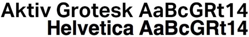
Swiss typographer Bruno Maag has nothing kind to say about Helvetica; the supposed apotheosis of High Modernism and the Swiss/International Style is, in his opinion, a greatly inferior typeface promoted to dominance by a powerful marketing machine over the far superior Univers, and raved about by the clueless (and not only that, but typically clueless Britons and Americans) who bought the gimmick that it is somehow an authentic example of Swiss Modernist design:
What galled me most in the movie [Gary Hustwit’s Helvetica] was when Massimo Vignelli said that Helvetica was a Modernist typeface – No! No! Helvetica is anything but Modernist, Clearly it has its roots in Akzidenz Grotesk and that was designed in 1899, which is Victorian as far as I am concerned. Akzidenz is a fantastic font but it’s not Modernist, it’s got a really antique feel about it, which again shows that Max Miedinger [Helvetica’s designer] didn't have a clue about type design. He was the salesman at [foundry] Haas’sche Schriftgießerei for Christ’s sake.This is reminiscent of the criticisms of Arial, that Helvetica knockoff used by people who aren't into fonts but have a Windows PC and want to make something look modern and/or clean. While it's universally acknowledged that Arial is a bastardisation of Monotype Grotesque shoehorned into Helvetica-like spacings, and thus not an authentic example of the High Modernist typography it gets mistaken for, the claim that Helvetica is not authentically Modernist is bound to set the cat among the pigeons more; it's not that long since Helvetica's 50th anniversary, which coincided with commemorative books, hagiographic articles and, of course, Gary Hustwit's documentary, which conspired to beatify the sans-serif. It does make some sense, though; I've seen claims that Helvetica's roots (and those of Akzidenz Grotesk and the grotesks which preceded it) lie in 19th-century hand-painted shop signage more than in clean Modernism.
Bruno Maag so detests Helvetica that he created a Modernist typeface, Aktiv Grotesk, to replace it. It looks about halfway between Helvetica and Univers:
2010/1/26
An American designer has created Helvetica cookie cutters:
They appear to be a once-off project, and not actually a product for sale. (Though I do wonder whether Linotype have looked at such merchandising opportunities for their increasingly popular modernist typeface. They could sell them in upmarket gift shops, next to the Pantone coffee mugs. Those with less money to spend will have to make do with Arial cookie cutters from their local Wal-Mart or Argos.)
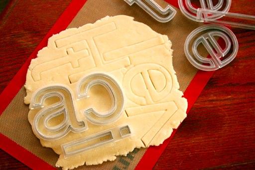
(via Boing Boing) ¶ 0
2009/9/19
There is now an electronic version of Rail Alphabet, the high-Modernist typeface designed in 1965 by Jock Kinneir and Margaret Calvert for British Rail and used extensively on signage of British public institutions of the period (the NHS and various airports also used it). And just in time to ride the wave of nostalgia for pre-Thatcherite public institutions.
Unfortunately, at £100 per weight (and £1,000 for the whole set!), it is a bit on the pricy side; if that's out of your price range, you may wish to consider just using Helvetica and hoping that nobody notices. (And, to be honest, few people would be able to tell the difference.)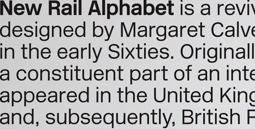
(Note that if you decide to be even more thrifty and use Arial, people will laugh at you.)
And here is a detailed article on the evolution of the London Underground typeface, from Edward Johnston's 1920s original (which influenced the design of Gill Sans), to its subtle redesign by Japanese typographer Elichi Kono in the 1970s (Kono's account appears here), and other adaptations made recently as it was adopted across the entire London transport system.
2009/8/17
This blog has been quiet recently, because I have been travelling.
I recently spent a few days in Venice; a spectacularly beautiful city, and one well worth visiting. (This is made all the more poignant by the possibility that Venice may not be around in its present form for much longer; rising sea levels and subsiding buildings threaten to sink the city.) In any case, I have posted photos to my Flickr page.
One thing I noticed about Venice (and this is, granted, a somewhat trivial observation, and one which seems unworthy of mention in the face of the all-surrounding sublime): its public transport system's signage is, for some inexplicable reason, set in Arial (i.e., the free Helvetica lookalike that Microsoft bought to give away), as evident below:
The giveaway is the 'G'; the vertical line descending from the crossbar would, in Helvetica, cross the circular part and touch the baseline. Other signs show other telltale Arialisms (the right leg of the 'R' being diagonal rather than vertical, and the top of the 't' being slanted rather than flat, but otherwise it looking more or less like Helvetica).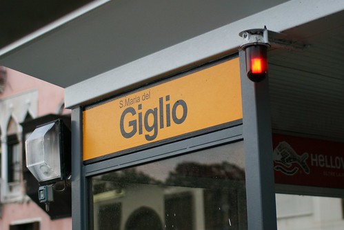
I say inexplicable because there seems to be little reason to use Arial on public signage. While it's a perfectly technically workable sans-serif typeface, Arial is known only as a Helvetica substitute one doesn't have to pay for. In fact, its entire raison d'etre is to be a cheaper, off-brand drop-in replacement for Helvetica, a state of affairs which makes it a defacto signifier of cheapness or naïveté. (It's a ubiquitous 20th-century modernist sans-serif font for people who aren't into fonts, and who aren't paid to pay attention to these sorts of things.) Does the city of Venice really save that much money by going with Arial? (Would a city have to specifically licence a typeface for signage? If so, presumably Arial would no longer cost nothing. If not, wouldn't shelling out the €25 or so for a copy of Helvetica Bold* be worth looking more professional? (I.e., dotting one's 'i's, and crossing (and not slanting the tops of) one's 't's.)
* A weight of Helvetica is listed as £20.25 on Linotype's website; this is roughly €23.50.
2009/1/21
Young British graphic designer Olly Moss (perhaps best known for his Threadless T-shirts) has now posted Swiss Modernist-influenced alternate cover art for video games and similarly Modernistic, Helvetica-intensive alternative movie posters:
Meanwhile, Kyle Gabler, the composer of the soundtrack for the videogame World Of Goo has made it available as a free download. Go and get it; it's a nice piece of classic cinematic scoring, equal parts vintage Morricone/Herrmann/Schifrin and Danny Elfman gingerbread-house oogie/spookyisms.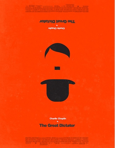
(via Boing Boing) ¶ 0
2008/6/16
I just watched the film Helvetica, a documentary about the eponymous typeface. In reality, it was more than just a film about a typeface, but rather one about visual design, aesthetics and ideology in the past half-century, seen through one element so ubiquitous that it is virtually a mirror. (Helvetica's ubiquity is the key; I imagine that one could as easily have made a film titled, say, "Water", ostensibly about the subject of its title, and had it encompass anything and everything.)
The film describes the typeface Helvetica and its origins in the Haas type foundry in Switzerland, as a cleaned-up version of German sans-serifs like Akzidenz Grotesk, and the way that, either by being in the zeitgeist or happening to embody an objectively optimal design, it caught the moment, being seen as fresh and clean compared to the mess of 1950s-vintage graphic design (which would now be considered "retro" and "groovy") and was propelled to ubiquity, becoming considered boring and/or corporate, mutilated by the grunge typographers of the 1990s, and rediscovered by a new generation of designers reclaiming modernism. The film puts forward multiple points of view (Helvetica was in the right place at the right time; Helvetica stumbled onto a timeless optimum; Helvetica carries with it the core values of the modern mindset; Helvetica is ideologically oppressive/corporate/right-wing (Paula Scher asserted that it was linked to the Vietnam War); Helvetica is beautiful; Helvetica is ugly), in the form of interviews with various key designers and figures, both young and old (these have included Matthew Carter, Neville Brody, David Carson, Hoefler and Frere-Jones and so on). (Other than shedding light—from various angles and of various colours—on the legacy of Helvetica, the interviewees tell us other interesting things; for one, I found Matthew Carter's description of his typeface design strategy quite informative.) All this is intercut with extensive stills and footage of Helvetica in the modern world, which drive home the full extent of its ubiquity. The soundtrack, containing the sort of tastefully minimal post-rock (Sam Prekop, El Ten Eleven and The Album Leaf) that one would associate with neo-modernist graphic design. Alas, there does not appear to be a soundtrack album available for this film.
2007/5/9
This year is the 50th anniversary of Helvetica, the sans-serif typeface which was designed by Swiss typographer Max Miedinger in 1957 and has since become ubiquitous, and synonymous with a very Swiss modernist aesthetic: clean, fastidious and businesslike, if perhaps somewhat bland:
As Wildenberg notes, its Swissness is part of the appeal. The land where clocks run meticulously and the streets are spotless carries the kind of cultural resonance that the logo makers and brand masters of the major corporations might like a bit of. For others, its neutrality is a platform for daring design.Some love it (there is a glossy coffee-table book and a documentary for its anniversary), while others hate it. Among the haters is designer and typographer Neville Brody, who was responsible for a lot of its use in the 1980s:
"When people choose Helvetica they want to fit in and look normal. They use Helvetica because they want to be a member of the efficiency club. They want to be a member of modernism. They want to be a member of no personality. It also says bland, unadventurous, unambitious."Though while Helvetica is not universally loved, it is nowhere near as despised as that idiot of the typographical village, Comic Sans