The Null Device
Posts matching tags 'design'
2016/4/27
The Australian Broadcasting Corporation, Australia's national broadcaster, is in the process of developing a unified visual identity for its properties; and in doing so, has commissioned a new typeface for use across its online properties; it's named OneABC, is a modern sans-serif , and this is what it looks like with a selection of headlines reflecting the Australian zeitgeist circa 2016:
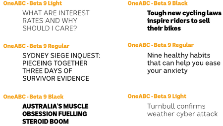
The ABC stresses OneABC's true-blue dinky-di Aussie pedigree and characteristics; it was developed locally, by an outfit named the Australian Type Foundry, and is said to be characteristically Australian in its design:
First was the connection to the land with a coastal and outback feel. The open spaces of a wide brown land played a significant role. A sense of contrast that is simultaneously austere and rich. A true sense of inclusiveness that celebrates diversity and multiculturalism. And finally that special larrikin mentality that does not take itself too seriously.
Which are some fine words, though I'm not sure how they relate to the actual typeface, which looks as if it could have just as easily emerged from Berlin or Amsterdam; I can see a bit of FF DIN and Erik Spiekermann's Meta in its heritage; meanwhile, the distended 'k' resembles earlier versions of Google's Roboto. Perhaps, at a stretch, the rounded tail of the ‘y’ could count as “Australian”, feeling a bit more casual than the sharp angles of more geometric typefaces. As for “special larrikin mentality”, I'm not sure I see it, but that may not be a bad thing: the idea brings to mind some kind of Ken Done-themed Comic Sans, with serifs modelled on Dame Edna's glasses or something.
Could one make OneABC look more distinctly “Australian”, rather than generically modern? Perhaps increasing the x-height to be equal to the height of capitals would embody the spirit of “mateship” and the “fair go” (and prompt the typical accusations from the Liberal Party and the Murdoch press of being subliminal Marxist propaganda, thus keeping with the ABC's reputation). Other than that, short of having boomerang-shaped descenders or other tourist-shop kitsch, I can't think of how one would design an “Australian” typeface.
2013/4/28
Visual treat of the day: Endbahnhof; a collection of photographs of all of Berlin's splendidly varied U-Bahn stations, by Melbourne photographer Kate Seabrook, who moved to Berlin some years ago. The platform are all photographed empty, without passengers or extraneous distractions, capturing the variety of architectural styles: from baroque grandeur and Jugendstil fancy to explosions of psychedelic kitsch, crisp modernism, and various steps in between. (And, of course, the nondescriptly utilitarian stations, typically on the outer reaches of lines, sporting just the stock BVG signage haven't been omitted.)
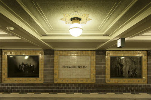
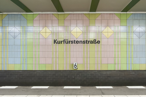
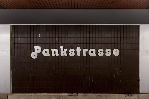
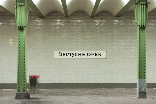
There's a piece about Endbahnhof in Atlantic Cities here, and an interview with Seabrook in Australian twee-culture bible Frankie here.
2013/4/6
The next thing after the study of human-computer interaction might be feline-computer interaction. Now there are iPad games and painting apps ostensibly designed specifically for cats, and hackathons to develop apps for cats, and now, on the first of April, HCI guru Jakob Nielsen has published a study into Essential Design Principles for Felines. The study found that Fitts' Law holds for cats as it does for humans, but that apps for cats require larger tap targets, should respond to swiping and use blinking and animation copiously, and should have a pause mode triggered by the user lying on the tablet. Unsurprisingly, the game Fruit Ninja performed fairly well with feline users.
While it is possible to write apps for existing tablets optimised for feline users, I suspect that human-oriented tablet hardware may be somewhat suboptimal for them. Certainly sound systems designed for humans (whose hearing range extends to barely above 20kHz when young, and deteriorates with age) would sound muffled to an animal whose hearing range goes well into the ultrasonic (apparently up to 75kHz). Designing a screen for a cat's eyes would probably result in a very different device than one for humans (though, since humans have to develop and debug them, there would have to be some overlap). Needless to say, scratchproofing would also be a consideration. Also, it remains to be determined whether there is any way of allowing a cat to select different apps (or different activities) from a device, or indeed whether a non-tool-using animal such as a cat could conceive of a tablet as being anything other than a random phenomenon it reacts to.
2013/1/22
A landmark of 20th-century Australian experimental architecture faces demolition:
 the Fairhaven pole house, which stands on a platform atop a 15-metre concrete pole near the Great Ocean Road in Victoria, is scheduled to be torn down this week, despite calls for it to be placed on the state heritage list:
''The Dixon pole house is one of the most striking and unusual examples of an 'experimental house' which takes risks and which may serve as a design prototype,'' Mr Lewis said. ''The design of a dwelling on a pole is unique in Victoria, and rare elsewhere,'' he said.
But the Heritage Council rejected the application, saying it was ''not of importance above a local level'' and should be included by the local Surf Coast Council in its heritage overlay.The house, built in the 1970s, will be replaced by a new house of roughly the same size, which is intended to remedy design flaws in the original, such as the fact that none of its windows would open, making it less than comfortable.
Through the four or so decades of its existence, the house has survived three bushfires, including 1983's devastating Ash Wednesday fire, and attracted considerable attention; some from tourists, and some less favourable attention from the common Australian feral bogan:
Mr Dixon, who conceived the house while recovering from a surfing accident, said it always attracted interest from passers-by. ''Even at 2 o'clock in the morning they'd walk around the balcony on the outside and make comments that wouldn't be printable.
2012/4/11
PHP: a fractal of bad design; a good essay on why PHP, one of the most popular web programming languages, is horribly, irreparably flawed:
PHP is not merely awkward to use, or ill-suited for what I want, or suboptimal, or against my religion. I can tell you all manner of good things about languages I avoid, and all manner of bad things about languages I enjoy. Go on, ask! It makes for interesting conversation. PHP is the lone exception. Virtually every feature in PHP is broken somehow. The language, the framework, the ecosystem, are all just bad. And I can’t even point out any single damning thing, because the damage is so systemic. Every time I try to compile a list of PHP gripes, I get stuck in this depth-first search discovering more and more appalling trivia. (Hence, fractal.)
Imagine you have uh, a toolbox. A set of tools. Looks okay, standard stuff in there.
You pull out a screwdriver, and you see it’s one of those weird tri-headed things. Okay, well, that’s not very useful to you, but you guess it comes in handy sometimes.
You pull out the hammer, but to your dismay, it has the claw part on both sides. Still serviceable though, I mean, you can hit nails with the middle of the head holding it sideways.
You pull out the pliers, but they don’t have those serrated surfaces; it’s flat and smooth. That’s less useful, but it still turns bolts well enough, so whatever.
And on you go. Everything in the box is kind of weird and quirky, but maybe not enough to make it completely worthless. And there’s no clear problem with the set as a whole; it still has all the tools.
Now imagine you meet millions of carpenters using this toolbox who tell you “well hey what’s the problem with these tools? They’re all I’ve ever used and they work fine!” And the carpenters show you the houses they’ve built, where every room is a pentagon and the roof is upside-down. And you knock on the front door and it just collapses inwards and they all yell at you for breaking their door.
That’s what’s wrong with PHP.I always thought of PHP as Perl's brain-damaged little brother.
2012/4/3
The latest word in the Helvetica debate:
Neue Haas Grotesk,
 a new digitisation of Max Miedinger's original typeface (which was originally named that, and only renamed to Helvetica by the marketing department in 1960 or so to cash in on the fad for Swiss modernist design):
The digital version of Helvetica that everyone knows and uses today is quite different from the typeface’s pre-digital design from 1957. Originally released as Neue Haas Grotesk, many of the features that made it a Modernist favorite have been lost in translation over the years from one typesetting technology to the next.
The Helvetica obliques that come installed on every Mac today were generated mechanically by skewing regular upright forms 12°. Neue Haas Grotesk’s obliques have been properly corrected to have smoother curves, even stroke weights, and overall visual harmony.The full 22-style family, which includes alternate character forms, will cost you US$616.00; about twice as much as Helvetica-discontent Bruno Maag's Aktiv Grotesk (though less per individual weight), but considerably less than the electronic revival of Rail Alphabet (which seems to have been created to cash in on British Rail/NHS nostalgists with deep pockets). Either way, it probably will not put an end to the debate over Helvetica's place in the canon of modern graphic design; whether it is justifiably a touchstone of High Modernism or a shoddy, opportunistically made example of the typographical grotesk which just happened to be in the right place at the right time.
2012/2/19
Some good news for people (well, Britons mostly) who like good design. You may remember Min-Kyu Choi's prototype of a folding electric mains plug compatible with both Britain's ruggedly oversized power sockets and its conservative electrical safety standards, which briefly made the news back in 2009:
Well, after some two and a half years, Choi's design (with some modifications) is finally making it onto the market, at least for certain values of "making it" and "market". Known as The Mu, the plug will be available as a folding USB charger, which will be sold for £25 at the Design Museum in London (i.e., this is currently for design enthusiasts only). As for being able to charge your ultra-light laptop with a plug that doesn't look anachronistic next to it, that's still some way off.
2011/12/31
A few random odds and ends which, for one reason or another, didn't make it into blog posts in 2011:
- Artificial intelligence pioneer John McCarthy died this year; though before he did, he wrote up a piece on the sustainability of progress. The gist of it is that he contended that progress is both sustainable and desirable, for at least the next billion years, with resource limitations being largely illusory.
- As China's economy grows, dishonest entrepreneurs are coming up with increasingly novel and bizarre ways of adulterating food:
In May, a Shanghai woman who had left uncooked pork on her kitchen table woke up in the middle of the night and noticed that the meat was emitting a blue light, like something out of a science fiction movie. Experts pointed to phosphorescent bacteria, blamed for another case of glow-in-the-dark pork last year. Farmers in eastern Jiangsu province complained to state media last month that their watermelons had exploded "like landmines" after they mistakenly applied too much growth hormone in hopes of increasing their size.
Until recently, directions were circulating on the Internet about how to make fake eggs out of a gelatinous compound comprised mostly of sodium alginate, which is then poured into a shell made out of calcium carbonate. Companies marketing the kits promised that you could make a fake egg for one-quarter the price of a real one.
- The street finds its own uses for things, and places develop local specialisations and industries: the Romanian town of Râmnicu Vâlcea has become a global centre of expertise in online scams, with industries arising to bilk the world's endless supply of marks, and to keep the successful scammers in luxury goods:
The streets are lined with gleaming storefronts—leather accessories, Italian fashions—serving a demand fueled by illegal income. Near the mall is a nightclub, now closed by police because its backers were shady. New construction grinds ahead on nearly every block. But what really stands out in Râmnicu Vâlcea are the money transfer offices. At least two dozen Western Union locations lie within a four-block area downtown, the company’s black-and-yellow signs proliferating like the Starbucks mermaid circa 2003.
It’s not so different from the forces that turn a neighborhood into, say, New York’s fashion district or the aerospace hub in southern California. “To the extent that some expertise is required, friends and family members of the original entrepreneurs are more likely to have access to those resources than would-be criminals in an isolated location,” says Michael Macy, a Cornell University sociologist who studies social networks. “There may also be local political resources that provide a degree of protection.”
- Monty Python's Terry Jones says that The Life Of Brian could not be made now, as it would be too risky in today's climate of an increasingly strident religiosity exercising its right to take offense:
The 69-year-old said: "I took the view it wasn't blasphemous. It was heretical because it criticised the structure of the church and the way it interpreted the Gospels. At the time religion seemed to be on the back burner and it felt like kicking a dead donkey. It has come back with a vengeance and we'd think twice about making it now."
- The Torygraph's Charles Moore: I'm starting to think that the Left might actually be right:
And when the banks that look after our money take it away, lose it and then, because of government guarantee, are not punished themselves, something much worse happens. It turns out – as the Left always claims – that a system purporting to advance the many has been perverted in order to enrich the few. The global banking system is an adventure playground for the participants, complete with spongy, health-and-safety approved flooring so that they bounce when they fall off. The role of the rest of us is simply to pay.
- The sketchbooks of Susan Kare, the artist who designed the icons, bitmaps and fonts for the original Macintosh, and went on to an illustrious career as a pixel artist (Microsoft hired her to do the Windows 3.x icons, and some years ago, Facebook hired her to design the virtual "gifts" you could buy for friends.) The sketchbooks show her original Macintosh icons, which were drawn by hand on graph paper (because, of course, they didn't have GUI tools for making icons back then).
- How To Steal Like An Artist: advice for those who wish to do creative work.
- The street finds its own uses for things (2): with the rise of the Arduino board (a low-cost, hackable microcontroller usable for basically anything electronic you might want to program), anyone can now make their own self-piloting drone aircraft out of a radio-controlled plane. And it isn't actually illegal in itself (at least in the US; YMMV).
- An answer to the question of why U2 are so popular.
2011/7/15
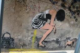
Web design webzine Smashing Magazine has an interesting article on Berlin's street-art heritage:
After the few East Germans who crossed the Berlin Wall in the ’80s blinked and pinched themselves, what do you think was the first thing they saw? They saw big bubbly letters, spelling out words in German, English and French. They saw political slogans, either carved indelibly into the concrete or sprayed temporarily onto surfaces, commenting not only on the situation in Germany, but on the whole political world: “God Ble$$,” “Concrete Makes You Happy,” “Death to Tyrants.” As far as they could see, covering every inch of wall, was layer upon layer of zest, life and color.
After the collapse of the Berlin Wall, the graffiti artists marched straight into East Germany. Mitte, Friedrichshain, Prenzlauer Berg — all of the areas that the military had occupied became a new playground for the Western artists and became a new world for the Eastern artists who joined them. Few doubted that the East Germans’ work was weightier. It wasn’t that they were better artists, but that they could express — with authority — the one concept close to the hearts of all people now living in the city: what it meant to be free.
The article briefly profiles and analyses the work of a number of Berlin street artists, including XOOOOX (who does impeccably drawn black-and-white stencils of glamorous fashion models, sometimes relieving themselves), Mein Lieber Prost (whose sketches of jolly cartoon homunculi have become immediately recognisable)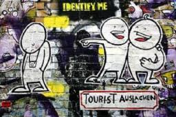
 and the curious case of Linda's Ex, an artist who, in 2003, put up hand-drawn posters imploring someone named Linda to take him back, engaging others to debate whether the object of the unknown artist's affections should return to him, before revealing that Linda never existed, and the whole thing was an art project, sort of like a web soap implemented in wheatpaste.
At first, people either ignored the posters or were mildly curious. But as both the pictures and messages increased in intensity, they had no choice but to take notice. On one poster, Linda’s ex told his estranged lover that he would be waiting to speak to her at a certain bar every Saturday and Tuesday night. People were starting to believe that his suffering was real. And if his suffering was real, then they did not doubt that he needed help.
People enjoy XOOOOX’s approach because of his objective treatment of his subjects, presenting each model as neither happy nor sad, neither warm nor cold. He even draws one model urinating on the ground; while some might interpret the piece as a sign of arrogance, XOOOOX’s signature, flowing from her head like a thought bubble, persuades sensitive observers to judge her on a more humane level. She is, he suggests, just like everyone else.The article also mentions the peculiar status of street art in Berlin. Graffiti is, of course, an outlaw activity and subculture, and gets its vitality from its fraught, illegal status. Berlin (the capital of Germany, a country not known for its citizens' cavalier disdain of regulation, no less), however, gets a lot of its buzz (and, indirectly, tourist revenue) from this underground culture. Berlin's police insist that graffiti is a crime, whilst focussing their enforcement efforts on gang-related tagging. Meanwhile, having dodged the threat of prosecution, street art arguably faces the threat of legitimacy, of being turned into just another cultural consumable in a gentrified playground for the affluent:
Today, such work has made the street art a tourist attraction. Kunsthaus Tacheles, once an artists’ squat and still a focal point of the scene, holds disco nights downstairs and sells urban art books upstairs — its bar is as expensive as anywhere in the city. Artists such as XOOOOX, Mein Lieber Prost and Alias have started to exhibit and sell in galleries. They still work on the street, but they are no longer impoverished artists — if they ever were. They can afford to travel and work in countries across the world.
While these artists believe that street art needs to appeal to a wider audience, the local, more traditional artists, such as the tagging crews, disagree. They argue that street art derives its power from being on the margins of society; only from the outside can they address problems within it. That difference of opinion is opening a space in the scene that can be filled only by the mainstream. In the next few years, street art has the potential to become a social movement as inclusive as anything from the ’50s and ’60s.Does it make sense to talk of tagging crews as "artists", though?
2011/6/23
A few interesting links I've seen recently:
- BBC Four recently aired a fascinating documentary titled The Joy Of Easy Listening, charting the history of easy-listening/light music from the 1950s onward. It's viewable on YouTube here.
- Digital artist Joshua Nimoy worked on some of the visuals for Disney's Tron Legacy film, and describes how they were done, from the physics of fireworks simulations and the algorithms behind various clusters of digital-looking lines to authentic-looking UNIX command-line shots for a hacking scene. (The fact that we've gone from "UPLOAD VIRUS Y/N" screens and random equations/6502 machine code/cyber-Japanese glyphs to nmap(1) being seen as too much of a hacking-scene cliché suggests that computer literacy in the movie-viewing public has increased dramatically over the past few years.)
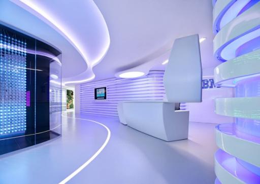
- IBM's Executive Briefing Center in Rome looks like something out of a scifi film:
- In epic feats of computing: the latest work by prolific technical genius Fabrice Bellard is a JavaScript-based PC emulator that's powerful enough to boot Linux. I repeat: it runs (a slightly cut-down, though fully native) Linux on a Pentium-class PC it simulates in your web browser, in JavaScript. Meanwhile, a high-school student named Jack Eisenman has designed and built his own 8-bit computer, including the CPU, from simple logic chips. The machine runs a machine code of Eisenman's own devising and can display graphics on a TV screen; Eisenman provides some games for it and full schematics, as well as a JavaScript-based emulator for those whose soldering skills aren't up to building their own.
- Quite possibly the most awesomel wedding invitation in the history of wedding invitations would have to be Karen Sandler and Mike Tarantino's, a card which unfolds into a paper record player that plays a song recorded by the happy (and creative) couple. There are more details here.
2011/1/6
Austrian type designer Othmar Motter recently passed away, aged 84. You may not recognise the name, but will probably recognise a few of the typefaces he designed in the Sixeventies: Tektura, (which is currently out of print; there's an amateur recreation here) which was used by Apple and Reebok in the 1980s (and, in a monospaced, bitmapped form, ended up in the Commodore 64 video game Paradroid) and the heady psychedelia of Femina:


2010/12/27
A set of photographs taken in cold-war Berlin, by an American intelligence officer and amateur photographer; there are some interesting scenes here.
Also, Cold War era maps of the Berlin U-Bahn, from the West and the East. It's interesting to note the differences in graphic design and what information they contain. The West German map is neutral and businesslike, though shows both lines in the West and the East (though the Eastern lines are uncoloured). The Eastern map looks superficially more colourful and friendly (much like the jovially behatted Ampelmann compared with the standard capitalist traffic-light man), but shows only East Berlin; the forbidden capitalist enclave behind the "anti-fascist protection barrier" is terra incognita.
2010/11/28
There are some rather nice typefaces amongst the winners of designaustria's annual Joseph Binder typeface awards; such as Malabar:
Premiéra:
and Acorde:
Nice to see they're designing elegant text faces these days.
2010/10/26
The latest project from Peter Saville, who designed Factory Records' covers and posters and contributed to their coolly enigmatic image: a headstone for the late founder of Factory, Tony Wilson, which is appropriately stylish and minimal and yet with a gravitas outside of the throwaway realm of pop culture:
The headstone, which is made of black granite and set in Rotis, was unveiled just over three years after Wilson passed away; one could probably make a reference to Saville delivering Factory gig posters after the actual gig. It does not have a Factory catalogue number, as Wilson's casket, FAC 501, was the last one ever to be issued.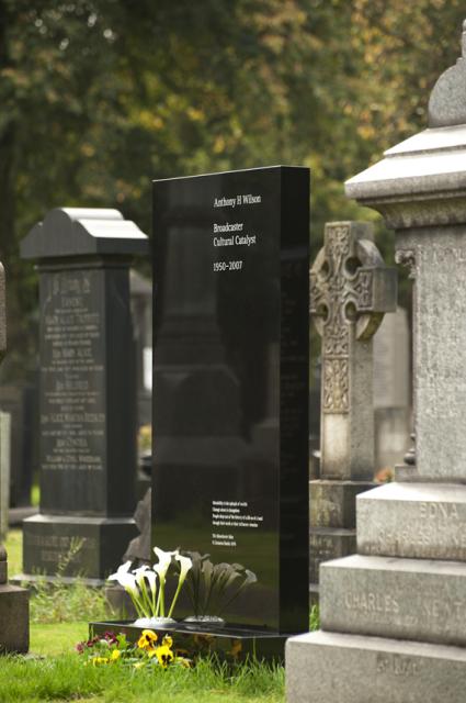
2010/10/11
Recently, US youth-oriented clothing chain The Gap replaced its logo with a new one, one consisting of nothing more than the word "Gap", in Helvetica, with a blue rectangle in one corner, to much opprobrium from the design community:
Could this be a sign of the end of Helvetica's reign as the epitome of High Modernist cool, and a harbinger of its second decline? The sans serif has been enjoying a revival as the universal (well, almost universal) signifier of timelessness yet clean modernity for a while now; no longer trashily ubiquitous (no, that'd be Arial), the former "official typeface of the Vietnam War" became recognised as a design classic, a force of nature; merely setting something in Helvetica (or, even better, Helvetica Bold), is a statement of understated confidence (see, for example, American Apparel's ads, where it offsets the lo-fi porno aesthetic). A hagiographic documentary, released in the year of its 50th anniversary, didn't hurt either, and nor did Apple going with it as the standard system font of the iPhone, instantly making other mobile platforms look cheap and tacky. (Before this, Apple commissioned custom system fonts for their desktop operating systems; remember, for example, MacOS's "Chicago".) Such were the typographically conservative rules of the age of retro-modernism Helvetica presided over, when heritage was king.
Now, after brand upon brand adopted the plain-black-Helvetica-on-white look, the trend seems to have peaked, and (as Gap has shown us), the emperor has no clothes. Perhaps we'll now see an anti-Helvetica backlash, with some Helvetica users switching to other, arguably better grotesks, such as Akzidenz, Univers and, yes, Aktiv Grotesk and others jumping further afield and rebranding themselves with other typefaces (Futura, as seen in Wes Anderson film titles, could be one to watch, as could Eurostile if one doesn't mind a bit of retro boxiness; Gill Sans, whilst overexposed in Britain, may have legs elsewhere, and perhaps FF Meta is old enough to be not so much trendy as mature), or even an explosion of daring experimentation and a move away from the classics and towards all-new typefaces.
Anyone want to bet on what the iPhone 5's system font will be? I imagine that with this and Windows Phone 7 one-upping the mid-20th-century public-signage aesthetic, the time for a break with Helvetica could be right.
2010/9/24
Design consultancy IDEO have posted a video presenting three concepts for the future of electronic books. The concepts are: "Nelson", a critical reader intended for politically and culturally influential books, which charts the influence of points within books, links to debates and discussions arising from them presents links validating or repudiating supporting facts and presents books mentioning and mentioned by a book; "Coupland", an enterprise-oriented social reader, which allows books to be recommended within an enterprise, and "Alice", an entertainment-oriented reader which relies on ebooks branching out from the stream-of-linear-text model that they inherited from paper books; by participating in various games, you can unlock hidden chapters of a book.
2010/9/17
Dark Patterns is a list of deliberately deceptive or user-hostile website/interface design patterns, used by unscrupulous operators to deceive or exploit unwary users. These range from honest-but-hamfisted attempts to corral user behaviour into profitable channels (i.e., making it inconvenient to compare prices; sites which use JavaScript-based navigation to frustrate opening links in other windows do this) to various more underhanded tricks, ranging from sneaking unwanted items into shopping baskets, adding unsolicited recurring charges to spamming your friends under false pretexts to generally making it hard for the user to unsubscribe or do anything that reduces turnover. Featured offenders include the likes of Ryanair, various travel and consumer electronics retail sites, and Facebook (who get their own entry):
“The act of creating deliberately confusing jargon and user-interfaces which trick your users into sharing more info about themselves than they really want to.” (As defined by the EFF). The term “Zuckering” was suggested in an EFF article by Tim Jones on Facebook’s “Evil Interfaces”. It is, of course, named after Facebook CEO Mark Zuckerberg.
(via Boing Boing) ¶ 0
2010/9/16
An Italian company has developed a new, ultra-compact airline seat for making economy class even more economical. Called the Skyrider, it takes only 23 inches, and involves the passenger sitting astride a saddle.
One could imagine penny-pinching airlines like Ryanair tearing out all their existing seats and replacing them with these, knowing that their clientele don't mind an hour or two of discomfort in return for getting to Ibiza or wherever for less than the train fare to the airport, though, as pointed out here, an entire jet full of these won't be possible for regulatory reasons. (Even if the total weight of the passengers sardined into it doesn't exceed the maximum carrying weight, the requirement that the aircraft can be evacuated in 90 seconds puts an upper limit on the number of passengers per exit.) The seats, it seems, aren't so much intended for budget carriers as for mixed carriers, allowing them to put in a tier below economy class, moving their lowest fares to this tier and raising the prices of their old cattle-class seats. Consequently, airlines, pressed by fuel prices and fare wars, will become slightly less unprofitable, and the flying experience will become that little bit shittier.
2010/9/2
Design innovation of the day: German industrial designer Cornelius Comanns has designed an ultra-compact and rather funky-looking one-person camping vehicle based on the Piaggio APE cargo scooter (for those unfamiliar with small Italian motor vehicles, that's a very small lorry/ute based on a motorscooter; essentially the Vespa's less frivolous big brother). He calls it the Bufalino:
It looks like it'd be great to go on holiday in, but given its size, it may be a rather solitary holiday. Perhaps this needs a Unhappy Hipsters caption?


2010/8/8
After making the documentaries Helvetica (about the aesthetics and politics of design in the 20th century seen through the ubiquitous sans-serif typeface; previously) and Objectified (about industrial design, and featuring luminaries such as Dieter Rams and Jonathan Ive), design-minded filmmaker Gary Hustwit's next project is a film about urban design and planning, titled Urbanized:
The third documentary in this trilogy is about the design of cities. Urbanized looks at the issues and strategies behind urban design, featuring some of the world's foremost architects, planners, policymakers, builders, and thinkers. Over half the world's population now lives in an urban area, and 75% will call a city home by 2050. But while some cities are experiencing explosive growth, others are shrinking. The challenges of balancing housing, mobility, public space, civic engagement, economic development, and environmental policy are fast becoming universal concerns. Yet much of the dialogue on these issues is disconnected from the public domain.Urbanized is due out in 2011.
2010/7/9
Swiss typographer Bruno Maag has nothing kind to say about Helvetica; the supposed apotheosis of High Modernism and the Swiss/International Style is, in his opinion, a greatly inferior typeface promoted to dominance by a powerful marketing machine over the far superior Univers, and raved about by the clueless (and not only that, but typically clueless Britons and Americans) who bought the gimmick that it is somehow an authentic example of Swiss Modernist design:
What galled me most in the movie [Gary Hustwit’s Helvetica] was when Massimo Vignelli said that Helvetica was a Modernist typeface – No! No! Helvetica is anything but Modernist, Clearly it has its roots in Akzidenz Grotesk and that was designed in 1899, which is Victorian as far as I am concerned. Akzidenz is a fantastic font but it’s not Modernist, it’s got a really antique feel about it, which again shows that Max Miedinger [Helvetica’s designer] didn't have a clue about type design. He was the salesman at [foundry] Haas’sche Schriftgießerei for Christ’s sake.This is reminiscent of the criticisms of Arial, that Helvetica knockoff used by people who aren't into fonts but have a Windows PC and want to make something look modern and/or clean. While it's universally acknowledged that Arial is a bastardisation of Monotype Grotesque shoehorned into Helvetica-like spacings, and thus not an authentic example of the High Modernist typography it gets mistaken for, the claim that Helvetica is not authentically Modernist is bound to set the cat among the pigeons more; it's not that long since Helvetica's 50th anniversary, which coincided with commemorative books, hagiographic articles and, of course, Gary Hustwit's documentary, which conspired to beatify the sans-serif. It does make some sense, though; I've seen claims that Helvetica's roots (and those of Akzidenz Grotesk and the grotesks which preceded it) lie in 19th-century hand-painted shop signage more than in clean Modernism.
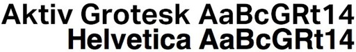
Bruno Maag so detests Helvetica that he created a Modernist typeface, Aktiv Grotesk, to replace it. It looks about halfway between Helvetica and Univers:
2010/6/6
Architect Gary Chang, like most Hong Kong residents, lives in a tiny (32m2) apartment. Unlike most residents, though, Chang has developed a way of transforming his apartment into any of 24 combinations of living space, using a system of sliding elements on rails. Each room is combined into the walls of two adjacent elements, and designed to be or fold flat. The bed folds against the wall, and the next element that slides out exposes the kitchen; a wall-sized CD shelf moves to expose a linen closet, which in turn conceals a bath and a guest bed. There's a 4-minute video here and a New York Times article here (warning: requires registration). Chang also has a book about the history of his apartment and its various transformations, though it's not clear whether it covers the current arrangement.
2010/6/4
The latest design innovation to improve safety: equipment that emits an unpleasant smell when damaged, strongly encouraging the user to replace it. The first test case of the technology is in bicycle helmets, though the researchers have plans for using it in other devices such as pressure hoses:
Researchers at Germany's Fraunhofer Institute have developed a manufacturing process that injects microcapsules containing malodorous oils into the helmet itself, causing it to stink when damaged -- alerting you that it's time to replace it (and making it difficult to try and make do with a less than safe one, at that).The developers of the product have yet to decide on a suitable odour to use.
2010/5/23
A few quick links to things recently seen:
- A visual study guide to cognitive biases
- Sydney is considering closing George St. to traffic, building a light rail (pronounced "tram") line. Interestingly enough, this plan, like Melbourne's original laneway-driven regeneration and "Copenhagen lanes", was suggested by a Danish urban-planning consultant.
- Google have developed facial recognition technology, capable of identifying individuals in photographs. Given the privacy implications (that plus Google Goggles would be the ultimate stalker tool), they're wisely being very careful about what, if anything, they do with it.
- Spoonflower is a web-based company that will print your designs onto fabric and send it to you. Now if only we could get them talking to Blank Label (a web-based service that lets you design custom shirts, though currently only from a somewhat conservative range of fabrics), then that would be awesome.
- Some music videos: The Pains Of Being Pure At Heart, Higher Than The Stars (warning: features furries), Rainbow Arabia, Holiday In Congo (warning: not actually filmed in Congo but Brazil; features massed Michael Jackson impersonators)
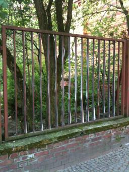
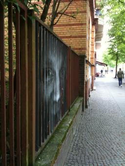
- Nifty trompe l'oeil paste-up on the sides of a fence in Berlin:
2010/4/14
Typography/design blogger Stephen Coles offers a typographically-oriented critique of Apple's iPad interface, and it doesn't come off well. Apple, it seems, are guilty of privileging style over substance, aiming to make the iPad look stylish rather than be legible. As an e-book reader, it fails, with the iBooks application falling for that most vulgar of desktop-publishing tricks and forcibly full-justifying all text, despite research showing that ragged-right margins are actually more legible. iBooks also falls down on typeface choice; the user has a choice of reading books in one of five typefaces, which range from middling to poor for reading large quantities of text. Support for custom fonts on the iPad is poor all round; there is no option to embed fonts in e-books, and the version of Mobile Safari supplied doesn't have up-to-date @font-face embedding support.
And then there's the famously Helvetica-fetishising UI, whose typographical choice is seemingly more designed to exude mid-20th-century modernist chic and pander to the owner's self-image as a stylishly cool individual, rather than aiming for anything as gauchely utilitarian as legibility. While Helvetica is good for print and signage, or, indeed, larger sizes on the screen, there are more legible typefaces for use on computer screens (the Lucida family, shipped with Apple's own OSX, is a case in point). The Helveticolatry, though, pales into insignificance next to the Notes application's cutesy felt-marker typeface, which, whilst less cringeworthy than Comic Sans, is still somewhat ridiculous; all of a sudden, High Modernist chic gives way to kitsch.
Bonus link: Stephen Coles with a list of alternatives to Helvetica. (Note the complete absence of Arial in this list; it's a list of actual typefaces of typographical merit.)
2010/3/27
In user interface design, sometimes worse is better, as in the case of the Bloomberg Terminal, a proprietary computer terminal used by financial traders. The Bloomberg Terminal's interface, which hasn't been updated for a decade or so, is generally seen as cluttered and ugly. Proposals for more elegant redesigns have been knocked back, because the existing users like the macho ugliness of the interface and the aura of hardcore expertise it bestows on them:
Simplifying the interface of the terminal would not be accepted by most users because, as ethnographic studies show, they take pride on manipulating Bloomberg's current "complex" interface. The pain inflicted by blatant UI flaws such as black background color and yellow and orange text is strangely transformed into the rewarding experience of feeling and looking like a hard-core professional.In other words, the Bloomberg Terminal is one of a class of items whose bad design is a feature serving a higher-level social function; in this case, the function is that of being a badge of proficiency or status, and an artificial handicap to keep usurpers out. In this way, it functions somewhere between the tail of a peacock (which is expensive to grow and makes one more visible to predators, but having one (and being alive) also acts as proof of fitness) and the regalia and rituals of Freemasonry back when it was a force to be reckoned with. Of course, secrets are inherently leaky and can hold power only for so long, so sooner or later, perhaps someone (possibly Apple or Google?) will come along with a more elegantly-designed system that will demystify what it does and, in doing so, hole Bloomberg's boat below the waterline (unless they do so first).
2010/3/20
Clever design of the day: a 7" record sleeve which transforms into an acoustic record player:
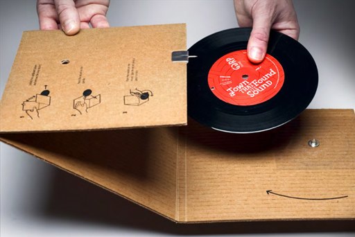
This one was created by an advertising agency named GGRP, as a demonstration. I believe that cardboard record players have existed for a while, but haven't heard of one which doubled as the record sleeve before.
2010/3/19
Two artists in Berlin have created a digital camera which automatically edits smiles onto the subjects:
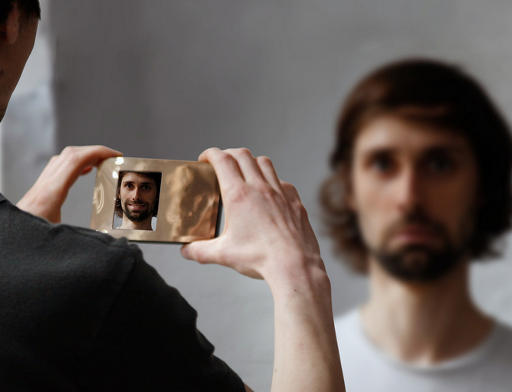
The camera „Artificial Smile“ is an apparat, whose pictures show in principle only smiling people, irrespective of their former emotional state. The camera uses a pool of pictures with smiling faces, which was created beforehand, to replace the mouthes of the pictured people with smiling ones. To generate to maximum level of exaggeration it was knowingly renounced to show the laughter/smile realistically. Unlike the cameras commercially available on the market and their autoretouch function “Artificial Smile” distorts the context of the picture, reinforced formally by the golden reflecting body of the camera.
2010/2/28
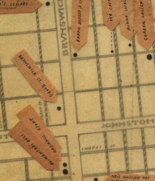 Acclaimed Melbourne street artists/underground illustrators Miso and Ghostpatrol have released
a downloadable, printable map of inner Melbourne (or, as some would argue, the parts of Melbourne White People like). The map consists of two sheets, covering the CBD and Fitzroy, and showing the locations of cafés, bars, art spaces and art supply shops; it may be downloaded from here.
Acclaimed Melbourne street artists/underground illustrators Miso and Ghostpatrol have released
a downloadable, printable map of inner Melbourne (or, as some would argue, the parts of Melbourne White People like). The map consists of two sheets, covering the CBD and Fitzroy, and showing the locations of cafés, bars, art spaces and art supply shops; it may be downloaded from here.
The choice of the CBD and Fitzroy suggests that gentrification doesn't seem to have affected the north/south divide. North of the Yarra is hip and culturally rich, whereas south of the Yarra is merely trendy, a shallow, consumeristic imposter for actual cool; St. Kilda (once the crucible of punk—blah blah blah Nick Cave blah blah Seaview Ballroom— but now, as The Lucksmiths so appositely worded it, home of bright-eyed boys in business suits, tourists where once were prostitutes) and Prahran (which committed the cardinal sin of getting house music and T-shirt boutiques a decade before Fitzroy) don't rate a mention in the psychogeography of cool in Melbourne. And while Fitzroy real estate prices approach South Yarra levels, there is still enough of a cultural legacy (not to mention tram routes from more affordable areas) to maintain the area's claim to cultural vitality.
2010/1/26
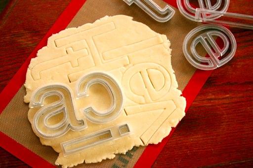
An American designer has created Helvetica cookie cutters:
They appear to be a once-off project, and not actually a product for sale. (Though I do wonder whether Linotype have looked at such merchandising opportunities for their increasingly popular modernist typeface. They could sell them in upmarket gift shops, next to the Pantone coffee mugs. Those with less money to spend will have to make do with Arial cookie cutters from their local Wal-Mart or Argos.)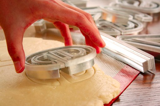
(via Boing Boing) ¶ 0
2010/1/20
Priori Acute, a new display typeface by Johathan Barnbrook (best known for Exocet and Ma(n)son Serif), and published by Emigre, has a nicely Escheresque look to it.
2009/12/13
The New York Times has published its annual roundup of the past year in ideas (unfortunately, in a pretty but annoyingly unlinkable JavaScript-based format).
This list has the usual variety of design/technological ideas (artificial engine noise for electric cars, artificial guilt for battlefield robots, a kitchen sink that puts out fires by filling the air with a fine mist, the glow-in-the-dark dog), environmental interventions/observations (artificial carbon-absorbing trees, a way of more efficiently disposing of corpses, bans on suburban culs-de-sac, pessimistic variants on the Gaia hypothesis), psychology and the social sciences (lithium in the water supply reduces suicide rates, randomly promoting employees works best, being given "counterfeit" goods to wear can increase one's likelihood of cheating), geopolitics (promoting communication in itself to undermine dictatorships) and business (subscription models for funding art). Where last year's had a recurring theme of trying to fix a dysfunctional capitalism, this year's theme seems to be zombies (both in the context of Jane Austen mashups and finding scientific models of how to survive a zombie epidemic; the answer, for what it's worth, is strike back hard and annihilate them before it's too late).
2009/10/15
Recently, the Swiss National Bank held a competition to redesign the Swiss Franc banknotes, and got some very handsome submissions:
Switzerland has probably the best-looking banknotes I've seen; they're as colourful as the Australian ones, but with the fastidiously neat graphic design the Swiss are renowned for (they didn't name Helvetica after the Latin name for Switzerland for nothing, you know).


2009/10/8
A number of social software systems give their users reputation/trust scores, which can be voted on by other users. This, however, is not without problems: when carelessly designed, the ability of users to vote down other users' reputations can lead to extortion rackets:
It didn't take long for a group calling itself the Sims Mafia to figure out how to use this mechanic to shake down new users when they arrived in the game. The dialog would go something like this:
"Hi! I see from your hub that you're new to the area. Give me all your Simoleans or my friends and I will make it impossible to rent a house.”
"What are you talking about?"
"I'm a member of the Sims Mafia, and we will all mark you as untrustworthy, turning your hub solid red (with no more room for green), and no one will play with you. You have five minutes to comply. If you think I'm kidding, look at your hub-three of us have already marked you red. Don't worry, we'll turn it green when you pay…"The solution to this is to keep positive and negative feedback separate, and have the latter go through moderators (who, presumably, will spot any shenanigans) before making it public.
(via Boing Boing) ¶ 1
2009/9/29
 In Germany, they go in for human-powered transport in a big way. In Hamburg, for example, they have an experimental bus powered by onboard stationary bicycles:
The bus takes a maximum of 20 people, and needs at least six to power the bus. One model had a row of seats at the back for pure passengers. The driver doesn't pedal, but steers and operates the brake. It can get up to about 25mph. (Here's another design, on YouTube.)I haven't seen one of those, but I have recently been in Berlin, where I saw a bicycle-powered two-carriage fake tram being pedalled through Mitte. I spoke with the two gents pedalling it, who told me that it was a consciousness-raising exercise to campaign for an extension of Berlin's tram network to the West (where it had been torn up in the 1960s, as not to get in the way of affluent capitalist Berliners' VWs and BMWs), and to help campaign for the Greens in the election.
2009/9/19
There is now an electronic version of Rail Alphabet, the high-Modernist typeface designed in 1965 by Jock Kinneir and Margaret Calvert for British Rail and used extensively on signage of British public institutions of the period (the NHS and various airports also used it). And just in time to ride the wave of nostalgia for pre-Thatcherite public institutions.
Unfortunately, at £100 per weight (and £1,000 for the whole set!), it is a bit on the pricy side; if that's out of your price range, you may wish to consider just using Helvetica and hoping that nobody notices. (And, to be honest, few people would be able to tell the difference.)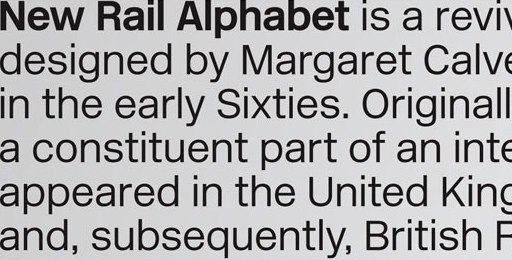
(Note that if you decide to be even more thrifty and use Arial, people will laugh at you.)
And here is a detailed article on the evolution of the London Underground typeface, from Edward Johnston's 1920s original (which influenced the design of Gill Sans), to its subtle redesign by Japanese typographer Elichi Kono in the 1970s (Kono's account appears here), and other adaptations made recently as it was adopted across the entire London transport system.
2009/9/17
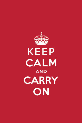 An article in Radical Philosophy (a journal of "socialist and feminist philosophy") looks at the phenomenon of those Keep Calm And Carry On posters, and what the reprinting and near-ubiquitous popularity of a WW2-era propaganda poster that was never originally released says about contemporary British society, alienation from the consumer-capitalist values of Thatcherism-Blairism, and a displaced longing for an imagined utopia of benign paternalistic bureaucracy and modernistic optimism that happened (as all golden ages happen) decades before those contemplating it were born.
Initially sold in London by the Victoria & Albert Museum, the poster only gradually became the middlebrow staple it is now when the recession, euphemistically the ‘credit crunch’, hit. Through this poster, the way to display one’s commitment to the new austerity was to buy more consumer goods, albeit with a less garish aesthetic than was customary during the boom. It is in a sense not so different to the ‘keep calm and carry on shopping’ commanded by George W. Bush both after September 11 and when the sub-prime crisis hit America – though the ‘wartime’ use of this rhetoric has escalated during the economic turmoil, especially in the UK. Essentially, the power of ‘Keep Calm and Carry On’ comes from a yearning for an actual or imaginary English patrician attitude of stoicism and muddling through, something which survives only in the popular imaginary, in a country devoted to services and consumption, and given to sudden outpourings of sentiment and grief, as over the deaths of celebrities like Diana Spencer or Jade Goody. The poster isn’t just a case of the return of the repressed, it is rather the return of repression itself, a nostalgia for the state of being repressed – solid, stoic, public-spirited, as opposed to the depoliticized, hysterical and privatized reality of Britain over the last thirty years. At the same time as it evokes a sense of loss over the decline of this idea of Britain and the British, it is both reassuring and flattering, implying a virtuous (if highly self-aware) stoicism in the displayer of the poster or wearer of the T-shirt.The article then mentions a number of other examples of related "austerity chic" or fetishisations of a more high-minded and public-spirited pre-Thatcherite idyll: celebrity chef Jamie Oliver's "Ministry of Food" concept, aesthetic references to Jan Tschichold' Penguin paperback covers, and plates printed with austerely clean images of 1930s Modernist buildings (which the author of the essay links to a reaction against the Blatcherite culture of high-Gini property speculation). One can add to this list a number of other icons. For example, on things like CD covers, the British Rail logo seems to have taken the place of the Mod RAF roundel as an insignia of retro cool, also referencing a pre-privatisation institution remembered more fondly in retrospect to its better-marketed, fare-gouging Blatcherite successors. Perhaps if Rupert Murdoch gets his way, we'll see hipsters wearing BBC logo badges in the not too distant future?
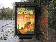 It's not all benign nostalgia for a kinder, gentler age, though: the article mentions a more sinister edge, from the police force's Keep Calm-esque "We'd Like To Give You A Good Talking To" posters (ironically juxtaposing an attention-grabbing tone of authoritarian brutality with a "caring"official message, which happened, as the author points out, near the harshly suppressed G20 protests) to Ken Livingstone's ironically Orwellian "Secure Beneath Their Watchful Eyes" posters, promoting the comprehensive surveillance society as a beneficial thing. (One is reminded of the "High Security Holiday Resort" posters in Terry Gilliam's Brazil.)
2009/8/21
Doing its part to cope with the global obesity epidemic, the subway system in Sao Paolo, Brazil, has introduced double-width, reinforced seats for fat people:
The seats are bright blue and have stickers above them marking them out as special seats for the use of obese persons. Strangely enough, they seem almost always empty; presumably, a lot of those who can fit into a regular seat or can bear standing are not keen to self-identify themselves as severely overweight.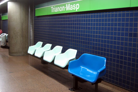
One wonders how facility planners could cater for a widening population without coming up against against stigma and denial. They could, of course, go back to flat benches without divisions, except that those allow homeless people to sleep on them, which is unacceptable for various reasons. (Not all people are sufficiently enlightened and compassionate to share their daily commute with the aromatically homeless, and if public transport facilities adopted a secondary role as a homeless shelter, this would drive out many of those who are sufficiently well-off to avoid public transport, putting more cars on the road, and resulting in the money spent on running the actual trains being wasted, but I digress.) Possibly some sort of design with all seats being double-width with a low-key, or movable, divider in the middle, would do the trick; though that could have the unintended consequence of encouraging amorous couples.
(via london-underground) ¶ 0
2009/8/17
This blog has been quiet recently, because I have been travelling.
I recently spent a few days in Venice; a spectacularly beautiful city, and one well worth visiting. (This is made all the more poignant by the possibility that Venice may not be around in its present form for much longer; rising sea levels and subsiding buildings threaten to sink the city.) In any case, I have posted photos to my Flickr page.
One thing I noticed about Venice (and this is, granted, a somewhat trivial observation, and one which seems unworthy of mention in the face of the all-surrounding sublime): its public transport system's signage is, for some inexplicable reason, set in Arial (i.e., the free Helvetica lookalike that Microsoft bought to give away), as evident below:
The giveaway is the 'G'; the vertical line descending from the crossbar would, in Helvetica, cross the circular part and touch the baseline. Other signs show other telltale Arialisms (the right leg of the 'R' being diagonal rather than vertical, and the top of the 't' being slanted rather than flat, but otherwise it looking more or less like Helvetica).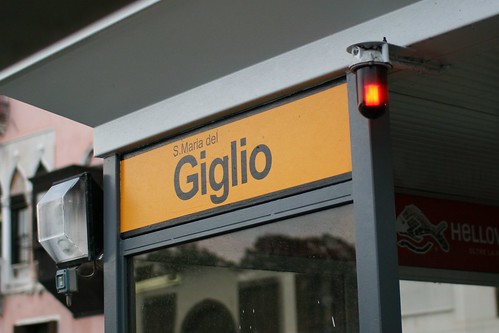
I say inexplicable because there seems to be little reason to use Arial on public signage. While it's a perfectly technically workable sans-serif typeface, Arial is known only as a Helvetica substitute one doesn't have to pay for. In fact, its entire raison d'etre is to be a cheaper, off-brand drop-in replacement for Helvetica, a state of affairs which makes it a defacto signifier of cheapness or naïveté. (It's a ubiquitous 20th-century modernist sans-serif font for people who aren't into fonts, and who aren't paid to pay attention to these sorts of things.) Does the city of Venice really save that much money by going with Arial? (Would a city have to specifically licence a typeface for signage? If so, presumably Arial would no longer cost nothing. If not, wouldn't shelling out the €25 or so for a copy of Helvetica Bold* be worth looking more professional? (I.e., dotting one's 'i's, and crossing (and not slanting the tops of) one's 't's.)
* A weight of Helvetica is listed as £20.25 on Linotype's website; this is roughly €23.50.
2009/8/9
Yahoo!'s Christian Crumlish posits the five principles of good social software design:
He also puts forward five anti-patterns, or ways in which sites get it wrong:
- Pave the Cowpaths
- Talk Like a Person
- Play Well with Others
- Learn from Games
- Respect the Ethical Dimension
Briefly, the Cargo Cult means imitating superficial features of successful websites and applications without really understanding what makes them work. Don't Break Email warns against the practice of using email as a one-way notification or broadcast medium while disabling your users' ability to hit reply as a normal response. The Password Anti-Pattern is the pernicious practice of asking users to give you their passwords on other systems so that you can import their data for them, thus training them to be loose and insecure with their private information. The Ex-Boyfriend Bug crops up when you try to leverage a user's social graph without realizing that some of the gaps in a person's network may be deliberate and not an up-sell opportunity. Lastly, a Potemkin Village is an overly elaborated set of empty community discussion areas or other collaborative spaces, created in anticipation of a thriving population rather than grown organically in response to their needs (see also Pave the Cowpaths).
(via Boing Boing) ¶ 0
2009/6/24
Industrial design of the day: this folding UK mains plug:
Not much is known about who designed it (the video is posted by a "MrMinKyuChoi", though the narrator of the video is female, with an accent), though it certainly is ingenious, and solves the problem of British mains plugs being huge and chunky (which may have been reassuring when attached to an electric kettle, but doesn't quite fit comfortably in a laptop sleeve, in the way that plugs in most of the rest of the world do.)
The narrator asserts that the plug fully meets Britain's exacting safety standards. If this is the case, and the wear and tear of folding and unfolding it doesn't cause it to explode in flames or electrocute the user, it is a neat piece of design.
(Britain's rather conservative specifications for plugs and sockets seem to have something to do with the fact that, in a fit of post-war thrift, British houses were wired for electricity using a single ring of copper cable, rather than a length for each socket (which would be safer and more expensive), which is the case with the rest of the world. I'm not an electrical engineer, though I wonder whether (a) adopting the European plug standards (you know, the slender round-pinned ones they use on the continent) would have been more hazardous with ring mains, or whether there was somewhat of an ideological nativism and/or imperial exceptionalism in Britain's decision to roll its own rather than surrender their wall outlets to Johnny Foreigner.)
Anyway, if this idea works and ends up being manufactured, I'd gladly buy a few.
2009/6/21
A few interesting posts from LiveJournal: Momus writes about the nihilism of heat:
In hot places, human life seems to be worth less. Iraq is a place where an army of Mersaults in the form of soldiers and "contractors" are constantly on the brink of breaching their own culture's taboos, driven to acts of violence by the murderous heat. Under the sun, nothing matters any more.
In hot places, human life seems to be worth less. Iraq is a place where an army of Mersaults in the form of soldiers and "contractors" are constantly on the brink of breaching their own culture's taboos, driven to acts of violence by the murderous heat. Under the sun, nothing matters any more.
Some say that cultural psychology changes as you move closer to the equator. In Discovering Psychology with Philip Zimbardo, a precis of a film about cultural psychology made for the University of Stanford, James Jones of the University of Delaware argues that a way of being has evolved near the equator featuring particular uses of time, rhythm, improvisation, orality, and spirituality. What he describes is a failure to defer gratification:And Lord Whimsy (author of The Affected Provincial's Companion) examines cod-Victorianism (think steampunk, goth and McSweeney's-esque retro typography) and cod-Modernism (think Shibuya-kei, Mod revivalism and, for want of a better word, Helvetipunk):
Cod-Vic usually has an element of knowing perversity to it, relishing its bad taste rather than recoiling from it. Cod-Vic has also opened the floodgates to a host of one-liners, cheap novelties, and dead ends--some delightful, others less so. The most successful Cod-Vic offerings seem to strike a deft balance, borrowing from overwrought Victorian forms while maintaining a modern crispness and rigor.
Cod-Mod is another form of retro, but an altogether less problematic one than Cod-Vic since its clean lines, unadorned materials and simple color schemes lend a laid-back, contemporary air of unaffected sophistication, making it much easier to defend as an aesthetic. Cod-mod has been mined heavily by indie music (Camera Obscura and Belle & Sebastian, anyone?), as well as interior design types like Jonathan Adler and film directors like Wes Anderson. Oh yeah, and Ikea.
(via ![]() imomus,
imomus, ![]() lord_whimsy) ¶ 0
lord_whimsy) ¶ 0
2009/5/19
Wikileaks has posted what appears to be the British National Party's "Language & Concepts Discipline Manual, a set of guidelines for party activists to ensure that they don't appear, you know, racist or anything. A few choice excerpts:
Rule #1: The BNP is not a ‘racist’ or ‘racial’ or ‘racialist’ or ‘race-conscious’ or ‘white’ or ‘whitepeople’s’ party. It should never be referred to as such by BNP activists, and anyone else who does so must be politely but firmly corrected. The precisely correct description of what we are, in the standard terminology of international comparative politics, is an ‘ethno-nationalist’ party. That is, we espouse, like many political parties all over the world, the interests of the particular ethnic groups to which we belong. There is nothing fascistic or unusual about this, and we don’t have to apologise for it. If we must describe our attitude towards race, it is ‘racial realism,’ as no-one can admit being against realism.
Rule #15. BNP activists and writers should never refer to ‘black Britons’ or ‘Asian Britons’ etc, for the simple reason that such persons do not exist. These people are ‘black residents’ of the UK etc, and are no more British than an Englishman living in Hong Kong is Chinese. Collectively, foreign residents of other races should be referred to as ‘racial foreigners’, a non-pejorative term that makes clear the distinction needing to be drawn. The key in such matters is above all to maintain necessary distinctions while avoiding provocation and insult.
Rule #17. Britain does not have ‘immigrants,’ a term proper for use in settler societies like Canada, Argentina, and the USA. It has ‘guest workers,’ ‘foreign workers,’ or ‘descendants of foreign workers.’ They are, depending on who they are, ‘racial foreigners,’ ‘religious foreigners’ or ‘persons of foreign religion,’ or ‘ethnic foreigners.’ The last term is meant to apply to persons racially similar to Britons, but ethnically dissimilar, like Dutchmen.Meanwhile, Charlie Brooker tears into the BNP's ugly campaign materials:
The other day, the BNP had a political broadcast on the box. I wasn't in my beloved homeland at the time, but I heard about it, via internet chuckles of derision. Fellow geeky types tweeting about the poor production values. I looked it up on YouTube. Sure enough, it was badly made. No surprise there. Extremist material of any kind always looks gaudy and cheap, like a bad pizza menu. Not because they can't afford decent computers - these days you can knock up a professional CD cover on a pay-as-you-go mobile - but because anyone who's good at graphic design is likely to be a thoughtful, inquisitive sort by nature. And thoughtful, inquisitive sorts tend to think fascism is a bit shit, to be honest. If the BNP really were the greatest British party, they'd have the greatest British designer working for them - Jonathan Ive, perhaps, the man who designed the iPod. But they don't. They've got someone who tries to stab your eyes out with primary colours.
2009/4/8
We haven't had a Wayne Kerr post for a while, so one is overdue. Anyway, I am Wayne Kerr, and if there's one thing I hate... it's websites attempting to coerce you into registering.
A while ago, there was an online newspaper named the International Herald Tribune. Owned by the New York Times but published in Paris, it was quite a good paper, with fairly incisive articles not too far from Economist territory. Then someone at head office decided to kill the brand and roll it into the New York Times brand, and iht.com became global.nytimes.com. And, with that, inherited the New York Times' draconian insistence on users requiring to register and log in to view their their precious content.
The New York Times, you see, is not satisfied with the standard online news business model (make their content freely viewable and linkable and sell ads to those surfing in on web links from wherever in the world they may be); that may be good enough for rabble like their London namesake, but the NYTimes' content is worth more than that. At the start, they even tried charging for online access to it. Of course, as Clay Shirky points out, this is not a viable business model for online news (current events cannot be copyrighted or monopolised, and someone can always do it cheaper), so the NYTimes soon dropped the demands for subscription. However, they have doggedly kept the other part of the equation: the insistence on users subscribing, remembering yet another username and password, and giving a valid, verified email address, as well as some juicy demographic information. Of course, there are ways around this; the most popular site on BugMeNot, a website for sharing free usernames/passwords to such sites, is the New York Times. However, such accounts usually have a very short lifespan; either they perish when the email verification period lapses or, failing that, the Times' web admins hunt them down and kill them, like an ongoing game of Whack-a-Mole.
The New York Times, however, is not the most irritating example of coercive registration; that accolade would probably go to a site named, ironically, Get Satisfaction. This is an external tech support site, used by a number of web 2.0-ish sites, including SoundCloud and ping.fm. As a web site, it is the very model of a modern website; rounded corners, quirky retro fonts (oh so San-Francisco-via-Stockholm), pastel-hued gradients, animated fades, you name it, it ticks the box; it would be perfect, but for one fatal flaw in the human interface design.
What somebody neglected to notice is the typical use case of such a site. One doesn't go to Get Satisfaction to socialise with friends, share photos or music, find a date or a flat, or do anything one does on a typical social web site; one goes there when one has gone to such a site and found that it doesn't work properly, and wants to notify somebody to fix this. Now when that happens, the last thing one wants it to have to think up another username and password, and be cheerfully invited to fill in one's profile and choose a user icon representing one's personality. As far as support forums go, less should be more, and Get Satisfaction, for all of its pretentions to being some kind of online clubhouse, falls short.
Not everything that isn't charged for is without cost; there is a cost, in time and finite mental resources, to keeping track of usernames and passwords. (Of course, you could use the same password across all sites, but that replaces a psychological/time cost with the security risk of all one's passwords being compromised.) And sites which put registration speed bumps in their users' way could find users going elsewhere where offers a smoother ride.
2009/1/25
Some interesting notes from a talk about the scalability of social software delivered at the Web 2.0 Expo last September by Joshua Schachter of del.icio.us:
There are 3 Kinds of scale: technological, social, and personal. We’re going to briefly go through the technical stuff... Common access pattern is to have a screen, make a modification, requery the data, and then resend the results. We’re building a lot of these systems to be synchronous which is a huge performance hit. What you need is a queue not a database for processing messages asynchronously. Decouple interactive performance from the rest of the system. Huge win for Delicious. Now that we’ve got technical stuff out of the way…
Don’t go too far and expose too much information. A long time ago you could see how many friends you had and how many followers you had and compare who it was that was following but not a friend. The system allowed me to get angry at two people. People got freaked out by people ‘follow’ing them on delicious.
Wanted delicious to be a harmonious system. That’s why there were no conversations. Didn’t want people to come in and have religious wars. You have to be willing to deal with abuse, spam, porn, etc. His last year this got really bad.
Pretty urls are important. It’s prime advertising space. People will copy paste and link.
(via ![]() substitute) ¶ 0
substitute) ¶ 0
2009/1/21
Young British graphic designer Olly Moss (perhaps best known for his Threadless T-shirts) has now posted Swiss Modernist-influenced alternate cover art for video games and similarly Modernistic, Helvetica-intensive alternative movie posters:
Meanwhile, Kyle Gabler, the composer of the soundtrack for the videogame World Of Goo has made it available as a free download. Go and get it; it's a nice piece of classic cinematic scoring, equal parts vintage Morricone/Herrmann/Schifrin and Danny Elfman gingerbread-house oogie/spookyisms.
(via Boing Boing) ¶ 0
2009/1/13
The Royal Mail has just launched a new stamp series commemorating classics of British design:
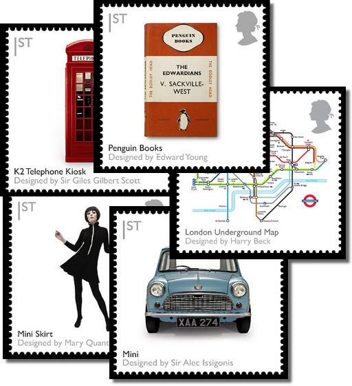
It's appropriate that each one features another British design classic, the typeface Gill Sans.
2008/12/30
The New York Times has published its annual Year In Ideas for 2008; unsurprisingly, perhaps, there is a lot more rethinking of economics and the foundations of capitalism there ("Guaranteed Retirement Account", "Rising Tide Tax System", and a "Stock Transfer Tax", which months ago would have been seen as unwarranted interference in the majestic free market). Other ideas tackle the energy crisis ("biomechanical energy harvester", "gallons per mile", "smart grids"), environmental issues in general ("carbon penance", "the climate-change defense", and "eat kangaroos to fight global warming"), new findings from psychology (such as "scrupulosity disorder", research into why social exclusion feels cold, or the finding that chauvinistic men earn more than egalitarian men), and random inventions (airbags for the elderly, spray-on condoms) and trends (wine from China, zoning prohibitions on fast-food restaurants).
Meanwhile, LogoLounge has posted its annual roundup of trends in logo design. It seems that organic flourishes and wrapping things around spheres are still big, with bright colours making a comeback, while more corporate clients are going for the instant sincerity of hand-sketched logos.
2008/12/22
Tom Ellard, adopting the persona of an archæologist from the distant future, points out an interesting historical phenomenon of the late 20th century:
“The gap” is a mysterious incident in the late twentieth century in which a wild change in commonly reproduced artworks came and went in as little as a decade. What we believe to be religious inscriptions on popular artefacts changed very quickly from ornate painted works to extremely simple combinations of letter shapes in bold colours. These were soon discarded and just as quickly poor copies of the original artwork were reintroduced.
2008/12/19
I recently bought myself a Korg NanoKey. That's a tiny USB MIDI keyboard, about the width of a low-end MacBook, with two octaves of plasticky-feeling keys.
The NanoKey has received mixed reviews, with some admiring the concept and others complaining at how cheap it feels. I've only been using it for a week or so, but I'm extremely pleased with it. For one, it's tiny, which makes all the difference. It fits comfortably in a laptop bag, and is small enough to get out and use anywhere; I can take it out in a café without looking like some kind of attention-seeking weirdo, or even use it on a train (these have both been tested; the last one, in economy class aboard the Eurostar). Or, I can place it unobstrusively on the desk. The convenience factor is a big win; in contrast, I also have a 25-key Evolution MK-425C, which is about the size of a backpack, and has been gathering dust for ages.
Of course, as you can probably guess, the NanoKey is thin and plasticky. If you're guessing it feels cheap, kind of like a child's toy piano, you'd be right. No-one will mistake it for a Steinway grand any time soon. Though, given the convenience, that doesn't matter; it works well enough for what it does, which is sending MIDI notes better than the QWERTY keyboard. And furthermore, it is touch-sensitive; I was quite surprised to find this out.
It also came with a download code for the cut-down edition of Korg's M1 softsynth. Which is great should I ever need an Italo-house piano or similar.
The upshot of this is that I've been playing with music more, and when I do, in a more hands-on way; actually playing notes, rather than clicking and dragging. In any case, it was probably the best £45 or so I've spent in a long time.
2008/10/25
I'm no fan of Hollywood action flick director Roland Emmerich and his mindlessly bombastic work, though his house sounds all kinds of awesome:
Mao and Lenin fill the length of the 25ft living room wall; an old master-style painting of the Crucifixion shows Jesus sporting a Wham T-shirt; in the guest bathroom is a portrait of Saddam Hussein; and under the stairs, Pope John Paul II pores over his own obituaries. Welcome to the London home of Roland Emmerich, director of epic blockbusters, including Independence Day and The Day After Tomorrow. It's an overtly political home: glass coffee tables dot the house, containing 3D architectural models of politically significant places, including Abu Ghraib prison, Tiananmen Square, the Dallas road where JFK was assassinated, and - a nice Hollywood touch - the LA neighbourhood where Hugh Grant had his infamous encounter with a prostitute. There's even a giant White House-shaped birdcage in the top-floor hallway, with stuffed white doves.
Teall's starting point was a suitcase full of Mao statues that Emmerich picked up in Shanghai. He then approached film set designers and artists to realise his own designs, employing scenic artist Jim Gemmill to draw the murals that pepper the house, and a posse of prop and model makers to fabricate everything from the life-size papal waxwork to the coffee table dioramas. "The joy of working with film people is their can-do attitude," Teall says. "I had approached high-end furniture makers who gave me outrageous estimates and didn't grasp the humour in the pieces. An architectural model-making firm refused to build the Iraq prison camp."
Emmerich is currently in Vancouver filming, but family and friends visit regularly, sleeping in the guest suites. "It's a choice of English camp or American butch," says Teall, who designed the former with Princess Diana paraphernalia: hand-painted rose wallpaper, a gold bedspread with velvet maroon crown canopy from Harrison Gill in Chelsea ("It was so hideous, but it totally worked"); Charles and Di wedding dolls found on eBay that now languish in the fireplace, and Alison Jackson's photographs of a fake royal family in various compromising situations. The American room is kitted out with army-issue gear, including a bed throw neatly sewn from 70 pairs of vintage army underwear bought from a bemused army surplus store owner. The headboard is adapted from a second world war aeroplane wing. Resting on a bedside table is a photograph of Mahmoud Ahmadinejad, the Iranian president, wearing an open dressing gown revealing a hairy six-pack, Photoshopped from a gay website.There are photos here.
2008/9/10
Icelandic artist and product designer Hafsteinn Júlíusson has come up with a technological solution to the global obesity crisis: zero-calorie crisps made of flavoured edible paper, allowing one to happily consume lots of tasty, crunchy stuff. Or, as Júlíusson puts it, it's like eating tasty air:
It is not clear whether the chips are being marketed or whether they're just a piece of conceptual art.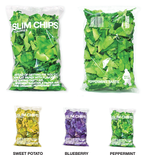
Júlíusson's web site also has information on his other projects, including laptop bags which double as pillows, which are hand-sewn in Reykjavík and sold in the local Apple Store there:
Cliff Kushler, one of the inventors of the T9 text-entry system used on most mobile phones made over the past decade, has developed a new, amazingly fast text entry system for touch-screen devices. Named Swype, the system displays an on-screen keyboard; though, instead of tapping individual keys, the user merely scribbles on the keyboard, joining the letters of the desired word, and the system finds the appropriate word and enters it:
The video is quite impressive; in it, Kushler demonstrates the system, entering a sentence and, at one point, scribbling on the keyboard for a fraction of a second and producing the word "Mississippi".
The prototype of Swype has been implemented on PC tablets and Windows Mobile phones, though the technology is up for licensing. The question on everybody's lips is probably whether Apple will grab it for the iPhone (or, indeed, buy Kushler out and lock it up as an iPhone/Mac exclusive; assuming, of course, no serious prior art). Assuming that it remains non-exclusive, this looks like an excellent fit for the Android architecture. Android is a pluggable system, in which applications aren't programs as such but objects which provide various services (such as composing an email, showing an image or, indeed, entering text). A Swype text-entry plug-in for Android would be fairly easy to create.
2008/9/2
Google are apparently working on a new web browser. Named Chrome, the browser is designed more like an operating system which happens to be based on web technologies like DOM and JavaScript than a traditional browser; different pages are separate processes (and about time, too) and privileges are compartmentalised to fortify security. Meanwhile, the web rendering implementation is based on WebKit (the Apple/KDE open-source web engine), with a JIT-compiling JavaScript engine optimised for application from a Danish company named V8 (I wonder how it compares to Apple's Squirrelfish and Mozilla's new engine). Alas, there's no code available (and the URL given returns a 404); instead, Google have given us a beautifully drawn 38-page comic by Scott McCloud, illuminating the technical innovations and the reasons for them, in great detail and with no small amount of humour:
That's all the detail that seems to exist so far. There is a possibility that it's just an elaborate feint; Google could, in theory, have paid McCloud some huge sum to draw a comic to specification, peppered with technical versimilitude, purely in order to send Microsoft/Apple/Yahoo!/whoever's development teams on a wild goose chase. Though I suspect that there is an actual product there. For one, Google are known to use WebKit on Android.
 More importantly, though, a browser designed as a web application operating system (with the expectations of performance and stability that implies), rather than an information viewer with programmability grafted on as an afterthought (as is the case with current browsers), would line up rather nicely with Google's strategy to make the web into a first-class application platform.
There are no details on what platforms Chrome will run; it is open-source (and other projects, or those willing to fork those, will probably have a field day with this), and the comic does mention Windows in one place, so presumably a Windows version is planned. I'm guessing that Google aren't doing this to help Microsoft sell Windows licences, though, so presumably this is not the only version planned. A Linux desktop version, running on top of X, is probably likely. Another possibility is it running over something lighter than the average Linux desktop, making a robust web-browsing appliance on which the browser meets the conventional definitions of an operating system; either Android or some other lightweight OS.
The other option, of course, is that this is an elaborate hoax, akin to the Photoshopped "spy photos" of new Apple Mac tablets and other fantastic gear that are a regular feature of gadget blogs. The fact that Google's Chrome page doesn't yet exist (at time of writing) does suggest this possibility. Though this would imply that the hoaxers had an enormous amount of time on their hands, excellent comic drawing skills and an uncanny mastery of the drawing style of Scott McCloud.
Update: Google have confirmed Chrome. It's initially a Windows product (presumably to win market share before IE8 comes along and shuts off Google's oxygen with its advertising cookie blocker), though Mac and Linux versions are in the works. The Windows version will apparently be out tomorrow.
2008/8/27
There is a tradition of restaurants serving meat having happy anthropomorphic cartoons of the animals whose meat they serve as their mascots. Of these mascots, there is a subset in which the animals actually slaughter or eat their own kind, usually with great gusto. There's a set of such logos here:
(via Boing Boing) ¶ 1
2008/6/24
The latest manifestation of the gothic/macabre aesthetic trend: furniture containing stuffed animals:

2008/6/16
I just watched the film Helvetica, a documentary about the eponymous typeface. In reality, it was more than just a film about a typeface, but rather one about visual design, aesthetics and ideology in the past half-century, seen through one element so ubiquitous that it is virtually a mirror. (Helvetica's ubiquity is the key; I imagine that one could as easily have made a film titled, say, "Water", ostensibly about the subject of its title, and had it encompass anything and everything.)
The film describes the typeface Helvetica and its origins in the Haas type foundry in Switzerland, as a cleaned-up version of German sans-serifs like Akzidenz Grotesk, and the way that, either by being in the zeitgeist or happening to embody an objectively optimal design, it caught the moment, being seen as fresh and clean compared to the mess of 1950s-vintage graphic design (which would now be considered "retro" and "groovy") and was propelled to ubiquity, becoming considered boring and/or corporate, mutilated by the grunge typographers of the 1990s, and rediscovered by a new generation of designers reclaiming modernism. The film puts forward multiple points of view (Helvetica was in the right place at the right time; Helvetica stumbled onto a timeless optimum; Helvetica carries with it the core values of the modern mindset; Helvetica is ideologically oppressive/corporate/right-wing (Paula Scher asserted that it was linked to the Vietnam War); Helvetica is beautiful; Helvetica is ugly), in the form of interviews with various key designers and figures, both young and old (these have included Matthew Carter, Neville Brody, David Carson, Hoefler and Frere-Jones and so on). (Other than shedding light—from various angles and of various colours—on the legacy of Helvetica, the interviewees tell us other interesting things; for one, I found Matthew Carter's description of his typeface design strategy quite informative.) All this is intercut with extensive stills and footage of Helvetica in the modern world, which drive home the full extent of its ubiquity. The soundtrack, containing the sort of tastefully minimal post-rock (Sam Prekop, El Ten Eleven and The Album Leaf) that one would associate with neo-modernist graphic design. Alas, there does not appear to be a soundtrack album available for this film.
2008/6/4
 An Australian human-interface innovation I hadn't heard of until now: the Marshalite, an early analogue traffic signal developed in the 1930s. Unlike modern pedestrian crossings (with the exception of those in some US cities), it not only displayed whether crossing the road was permitted, but gave an indication of how much time pedestrians had to cross, in the form of a clock face. The downside of the Marshalite was that, being mechanical, it was not adjustable, and worked on the assumption that traffic lights had a fixed duration. (And changing the speed of the moving hands is not an option; people would make assumptions about what the hand at a specific position would mean, and could not be expected to look at it long enough to gauge the speed.) At some point, they started adjusting the lengths of traffic lights to better manage traffic, and the Marshalites were all replaced by the now ubiquitous red/green man.
2008/5/13
An outfit named Sweet Dreams Security is making designed objects for a more paranoid age; from spiked railings, barbed wire and CCTV camera covers in the shape of cute animals to heart-shaped chains and (perhaps more practically) lace curtains shaped like anti-burglar grilles.
It's not clear how much of this is sincerely intended to fill a gap in the market and how much is critiquing or poking fun at of the siege mentality of contemporary society and its normalisation as a banal aspect of consumer capitalism. The pieces shown are said to be actual manufactured items which may be ordered or bought in various designy shops, though they have mostly been exhibited in art galleries.
2008/4/13
Web toy of the day: FontStruct. A Flash-based web app which allows you to create your own geometric fonts from a selection of tiles.
The site lets you make your characters as large or small as you want, and gives you access to all of Unicode (so if you want to do the entire set of Chinese pictographs, knock yourself out). You can download your creations in TrueType or Flash bitmap format, or share them in the site's galery under a variety of Creative Commons licences. Or just browse the gallery for other users' creations, which vary from the sorts of geometric and bitmap fonts you'd expect to find to retro-styled ones, blackletter fonts, and the odd twee-looking picture font.
Which is way cool, though I can't help but think that FontShop has just wiped out its market for geometric fonts. (Not that that was unexpected; with the rise of user-generated content and better authoring tools, content is no longer a seller's market, and the standard of user-generated content is rising to the point where, even if it's on average not as good as the professional stuff, it's often good enough.)
2008/4/3
 Britain's Royal Mint has unveiled the designs for Britain's new coins. The new set of coins is based on the Royal Arms, or rather a hip, edgy, modern treatment of it befitting a marketing powerhouse such as post-Thatcherite Britain. When arrayed in a pattern, you see, the sub-pound coins come together like Voltron's lions and show the edges of the Arms. The design was created by a 26-year-old London-based graphic designer named Matthew Dent.
I think the coins look pretty nifty, though part of me wonders how dated the concept will look in a few decades.
2008/4/1
In US presidential elections, as in any mass-marketing exercise, typography and design are important.
 Most go for safely conservative, focus-grouped choices; Hillary Clinton has gone for New Baskerville, a typeface seemingly designed for hardcover self-help books and suburban real-estate agencies' signs. (The latter association may not be the most prudent, with the subprime crisis.) Republican war-hero John McCain has gone for Optima, which, coincidentally or not, is the typeface used on the Vietnam War Memorial in Washington DC. Both typefaces are decades old (and New Baskerville is based on 18th-century English book type), and published by huge type foundries that predate the computer age.
Barack Obama, however, has broken away from the typographical consensus, and gone for a new font named Gotham. Designed by Tobias Frere-Jones starting in 2000 and based on examples of vernacular signage and lettering, Gotham evokes the classic yet forward-looking appearance of 1930s modernism. And the Obama campaign's adoption of it has led some to call it the hot font of 2008:
Though a discussion of fonts may seem obscure, anyone who has agonised over the look of a wedding invitation or sweated over a resume knows that the shape of letters can say nearly as much about a person as the words they spell out. And in the computer age, the message conveyed by a font is no longer subliminal. It's overt.
2008/3/3
What the Star Wars movie titles would look like had they been designed by legendary 1950s/60s title designer Saul Bass (best known for his groovy animated titles). Awesome.
(via Boing Boing) ¶ 0
2008/2/5
The charts of Clarence Larkin; fantastic diagrams explaining arcane points of Christian theology and eschatology by analogy to hydraulics, produced between 1914 and 1919. If you ever wondered where the Church of the SubGenius' artists got some of their inspiration, look no further.
It's interesting that Larkin, a man of the 19th and early 20th centuries, used hydraulics (a commonly understood technology of his day) as a metaphor for salvation, damnation and the afterlife. I wonder whether his equivalents today use more contemporary technological metaphors. What would today's equivalents be? The scriptures as a computer bus diagram? UML charts of salvation and damnation? The Lake of Fire as /dev/null?
(via Boing Boing) ¶ 1
2008/1/25
Art hipsters rejoice: someone has finally designed a digital camera without a screen or viewfinder:
Designer Sungwoo Park's prototype Eazzzy! camera consists of a USB stick with a lens and one button, and offers "the feeling of not knowing how your shots turned out à la analog film" with the convenience of USB transfer; not to mention a groovily ironic, retro-styled shape in several bright colours. And you can undoubtedly expect the images to turn out fashionably lo-fi, as you'd get that with anything of that size.
Though I wonder if it'd be just standard cameraphone lo-fi or whether they'd put an artfully crappy lens on the thing (as with cult film cameras such as the Lomo and Diana). They could, of course, program the firmware to oversaturate the colours, or overexpose the centre of the image and vignette the edges, though that would run against the cult of authenticity from which the lo-fi fad stems, thus being the photographic equivalent of alternative rock recorded for major labels in expensive studios, with special ProTools plug-ins thrown in to make it sound grungier.)
2008/1/24

2007/12/28
LogoLounge.com has just published its overview of trends in logo design in 2007. This year's trends include helices, ribbons and streams of descending/ascending bubbles, 3D trompe-l'oeil logos and uses of colour which wouldn't translate into black and white well (suggesting that designers are not caring as much for print as for the web), and a few recurring motifs:
Mix a little nose-in-the-air, overly stodgy, family coat of arms with a sharp tongue-in-the-cheek, Napoleon Dynamite liger, and you have something that approximates a Pseudo Crest. These are fun, and packed with detail that sticks it to the man at every opportunity. For the high school and college market, Jason Schulte's firm, Office, built a best-of-class brand for Target with the Independent Studies line.
At first glance, most of these look like they've been lifted from a heraldry 101 style book, until you scrutinize the composition elements. Only at this point are you likely to see wrenches, guitars, penguins, shoes, cell phones and anything else you'd never expect to find in Camelot. This is a youth anthem; and designers have identified this as a source language for fashion culture and the music industry. In fact, this is a modern trend you will see everywhere, despite its roots in heraldry and even other intricate patterning like Victorian wallpaper.
The floral/botanical/organic logotypes (also evidenced by the work of the British graphic designer whose name I forget, who seems to have come up with the idea of sans-serif type growing into organic vine-like shapes) could be a sign of a broader cultural trend: a reaction against the slick and industrial and a move towards a rustic/pastoral aesthetic. This trend has also come up in indie music (in the Pitchfork sense, not the NME haircut rock sense), with a shift away from angular/stylised sharper-than-thou aesthetics of the Interpol/Franz Ferdinand era (now thoroughly commercialised; witness the calculated faux-edginess of The Killers, for example, or the wave of derivative "indie" bands in the UK) towards more organic sounds (the antifolk/freak-folk scene, bands like Animal Collective (and, indeed, most of the bands with animal names in their names), as well as a more folky, anti-sharp aesthetic (rustic-looking beards, home-made clothes that look like hand-me-downs, &c.)Let's just make the assumption if you water a logo and give it adequate sunlight, it will start to grow a rhythmic crop of vines, buds, blooms and other fantasies of a botanical nature. These may be further evolution of last year's Embellish trend, or they could just be another subset of a larger trend. This would be a direction that uses borrowed remnants of a patterned, Victorian era to attach a delicate human quality to the hard outer shell of an other wise sterile logo. Detail of this nature is inherently engaging and asks the consumer to participate visually in a non-confrontational fashion.
Anyway, the page also has links to previous years' trends in logo design, going back to 2003, which make for interesting reading.
(via Boing Boing) ¶ 0
2007/9/23
 This afternoon, I made my way to the Design Museum in London to see Friendly Fire: The Graphic Design of Jonathan Barnbrook. Barnbrook is probably best known for his fonts, particularly Ma(n)son Serif, a.k.a. "that 90s goth/metal/occult font" (last seen on a package of "sinfully delicious" cheesecake or somesuch; presumed dead of overexposure). He also did a lot of political/protest work, including design for Adbusters magazine and surreptitious flyposting during Bush's visit to London, and some of these works were on show at the exhibition, along with context.
There were examples of fonts he had designed, the influences he drew on (Barnbrook is a keen historian of vernacular design, and many of his fonts refer to bits of it — from Edward Johnston's Underground type to Yugoslavian Communist brand lettering to the Lindisfarne Gospels), along with related context (such as how Mason was originally named Manson, but Emigre renamed it after being deluged with letters of protest, and Barnbrook's surprise at how Exocet was used by a neo-Nazi group for its website). There were also examples of more recent typefaces, which included NixonScript (a "font to tell lies with"), Expletive (a cursive font with two sets of forms, one which goes above the base line and one below), Prozac (a font made up of just six shapes in various rotations) and the Shock & Awe series), and a set of alternative Olympic symbols named "Olympukes" (and free for non-commercial use), with symbols for things like bribery, reinforcement of oppressive regimes and ridiculous made-up sports. There was also a section of artwork riffing off North Korean propaganda art and mashing it up with Western commercial design (such as Kim Jong Il as Colonel Sanders; in some ways, this was a little like Banksy's "Santa's Ghetto" salon, only with better design/more thought/less punk-rock attitude).
The exhibition is on until the 10th of October, if you're interested in this sort of thing.
2007/9/9
In 2005, Olia Lialina wrote A Vernacular Web, a survey of the culture of amateur web design some years ago, cataloguing ubiquitous pheonomena like starry backgrounds, "Under Construction" signs, rainbow horizontal rules and animated "Mail Me" graphics. Now, she has returned to the subject with a look at how things have changed over the past few years in the world of non-professional web pages:
Home pages no longer exist. Instead, there are other genres: accounts, profiles, journals, personal spaces, channels, blogs and homes. I’d like to pay special attention to the latter ones.
If you look at the most viewed layouts on MySpace, you’ll notice that most of them have a big picture as a background, which repeats itself horizontally and vertically. This back-to-1996 design flaw is now forever linked to Web and amateur users, and nobody cares about eliminating it – neither services nor users themselves.
Firstly, glitter became a trademark of today’s amateur aesthetics, and I’m certain that in the future sparkly graphics will become a symbol of our times, like “Under Construction” signs for the 90’s. Glitter is everywhere (in the universe of user-generated pages), it has become a meta category. It has absorbed all other categories of ready-made graphics – people, animals, buttons, sex graphics.
Starry backgrounds represented the future, a touching relationship with the medium of tomorrow. Glitter decorates the web of today, routine and taken-for-granted.Lialina also mentions the ubiquity of cat-themed graphics on the web of today (LOLCats and "Kitten Of The Day"), though declines to go into it, or theorise about the idiosyncratic phraseology and typography used in LOL* graphics.
2007/6/28
Someone has invented a must-have accessory for the radical urban itinerant, a means of getting free accommodation whilst striking a blow against car culture: a tent shaped like a car cover, which turns any parking space into a campsite:
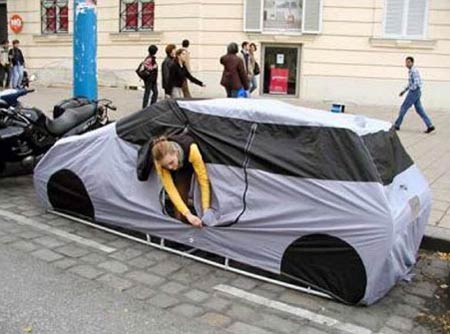
2007/5/17
Blog of the day: Architectures Of Control. Written by an industrial designer, it looks at how products or systems are designed to control the behaviour of their users, explicitly or implicitly. It has posts covering everything from public seating designed to discourage sleeping or lingering to the way that packaged food portion sizes subliminally influence how much people eat to interactive museum exhibits subtly forcing people to learn things embedded in the context of a game, to deliberately incompatible light sockets which require compact fluorescent bulbs, and of course, the DRM/"trusted computing" debate. For some reason or other, this blog is blocked in China.
(via Boing Boing) ¶ 0
2007/5/9
This year is the 50th anniversary of Helvetica, the sans-serif typeface which was designed by Swiss typographer Max Miedinger in 1957 and has since become ubiquitous, and synonymous with a very Swiss modernist aesthetic: clean, fastidious and businesslike, if perhaps somewhat bland:
As Wildenberg notes, its Swissness is part of the appeal. The land where clocks run meticulously and the streets are spotless carries the kind of cultural resonance that the logo makers and brand masters of the major corporations might like a bit of. For others, its neutrality is a platform for daring design.Some love it (there is a glossy coffee-table book and a documentary for its anniversary), while others hate it. Among the haters is designer and typographer Neville Brody, who was responsible for a lot of its use in the 1980s:
"When people choose Helvetica they want to fit in and look normal. They use Helvetica because they want to be a member of the efficiency club. They want to be a member of modernism. They want to be a member of no personality. It also says bland, unadventurous, unambitious."Though while Helvetica is not universally loved, it is nowhere near as despised as that idiot of the typographical village, Comic Sans
2006/12/8
An interesting article, by danah boyd, on the social dynamics of Friend relations in social software, predominantly Friendster and MySpace:
The most common reasons for Friendship that I heard from users [11] were:Boyd, er, boyd describes some ways in which the design of a social-network implementation (i.e., is Friendship transitive, what information is displayed about users, how access to information is controlled, and whether or not friendships can be ranked) influences the social dynamics:
- Actual friends
- Acquaintances, family members, colleagues
- It would be socially inappropriate to say no because you know them
- Having lots of Friends makes you look popular
- It's a way of indicating that you are a fan (of that person, band, product, etc.)
- Your list of Friends reveals who you are
- Their Profile is cool so being Friends makes you look cool
- Collecting Friends lets you see more people (Friendster)
- It's the only way to see a private Profile (MySpace)
- Being Friends lets you see someone's bulletins and their Friends-only blog posts (MySpace)
- You want them to see your bulletins, private Profile, private blog (MySpace)
- You can use your Friends list to find someone later
- It's easier to say yes than no
Collecting is advantageous for bands and companies and thus, they want to make it advantageous for participants to be fans; because there is little cost to do so, those who connect figure, "why not?" When Friends appear on someone's Profile, there is a great incentive to make sure that the Profiles listed help say something about the individual.
When a Friend request is sent, the recipient is given two options: accept or decline. This is usually listed under a list of pending connections that do not disappear until one of the two choices is selected. While most systems do not notify the sender of a recipient's decline, the sender can infer a negative response if the request does not result in their pages being linked. Additionally, many systems let the sender see which of their requests is still pending. Thus, they know whether or not the recipient acted upon it. This feature encourages recipients to leave an awkward relationship as pending but to complicate matters, most systems also display when a person last logged in on their Profile. Since it is generally known that the pending list is the first thing you see when you login, it is considered rude to login and not respond to a request. For all of these reasons, it's much easier to just say yes than to face questions about why the sender was ignored or declined.There is more fodder here for those who hold that MySpace is evil; the site, it seems, is designed to clutter social networks with "junk friends" (i.e., strangers and brand campaigns) and deliberately amplify social drama. Case in point: its "Top 8" feature, which allows users to say who is and isn't their bestest friend ever, and/or to whine about not being in someone's Top 8.
"As a kid, you used your birthday party guest list as leverage on the playground. 'If you let me play I'll invite you to my birthday party.' Then, as you grew up and got your own phone, it was all about someone being on your speed dial. Well today it's the MySpace Top 8. It's the new dangling carrot for gaining superficial acceptance. Taking someone off your Top 8 is your new passive aggressive power play when someone pisses you off."
When Emily removed Andy from her Top 8, he responded with a Comment [13] on her page, "im sad u took me off your Top 8." Likewise, even though Nigel was never on Ann's Top 8, he posted a Comment asking, "y cant i b on ur top 8?" These Comments are visible to anyone looking at Emily or Ann's page. By taking their hurt to the Comment section rather than privately messaging Ann and Emily, Nigel and Andy are letting a wider audience know that they feel "dissed."
"Myspace always seems to cause way too much drama and i am so dang sick of it. im sick of the pain and the hurt and tears and the jealousy and the heartache and the truth and the lies ... it just SUCKS! ... im just so sick of the drama and i just cant take it anymore compared to all the love its supposed to make us feel. i get off just feeling worse. i have people complain to me that they are not my number one on my top 8. come on now. grow up. its freaking myspace." -- OliviaSmall design decisions make a profound difference to how a social web site works. MySpace seems to be designed to maximise social pressures and exacerbate social anxiety and drama. This may be out of thoughtlessness (which wouldn't surprise me, given the generally inelegant design of the site), as part of some kind of Milgram/Zimbardo-esque psychological experiment (see also: Reality TV), or just an externality of maximising appeal to advertisers and youth marketers. LiveJournal, in contrast, goes out of its way to minimise drama; for example, its notification engine won't tell you if you've been unfriended.
(via Boing Boing) ¶ 0
2006/7/20
AIGA Design Forum has an article taking the Whitehouse to task for its poor typographical taste:
While his handlers would never allow the leader of the free world to go out in public wearing a rayon leisure suit and white bucks, they nonetheless use clownish shareware typefaces with hokey beveled edges and cheesy drop shadows to represent his ideas.
The most persistent is the use of Roman-like faux intaglio and engraved letterforms to give an air of authority and truth--although the effect is more Las Vegas casino. To celebrate the fourth anniversary of the "No Child Left Behind" act, someone got a little creative and added a drop shadow to a font that fakes the look of chalk or crayon lettering. This is only one evolutionary step away from introducing the Lariat font (novelty letterforms made from rope) whenever W is speaking from Crawford, Texas.The author suggests that the Whitehouse's design faux pas are the result of indifference, and/or the Whitehouse hiring computer geeks rather than designers (and, incidentally, offers his services as Undersecretary of Design. Momus, however, disagrees, arguing instead that the Whitehouse rejects what is received as good aesthetic taste because it is too closely associated with despised liberal elites, whereas chunky patriotic-action-thriller letters and extruded gold serif fonts are considered populist.
Momus then goes on to find other political signifiers in the Whitehouse's aesthetic choices:
The meaning of Trajan in the contemporary US seems fairly unambiguous to me. Trajan makes an implicit metaphor between the imperial power of ancient Rome and the imperial power of contemporary America. Whether it's made to look as if it were chiselled, or whether the letters are themselves made of metal, it suggests sharp implements, which conjure both the image of monumental permanence and the image of martial hardness -- the two basic meanings of Trajan's column itself. Pure Trajan suggests "right wing"; Trajan with drop shadow, metallic glints or lurid colors suggests "populist". Put them together and you get: "right wing populist". You don't have to spell it out in text; the message is there in the texture.
The Nazis would have hated [Mies van der Rohe's Neue Nationalgalerie's] lightness and clarity the way the Bush administration seem to hate clear, clean Franklin Gothic or Helvetica layouts. They'd already forced Mies to close down the Bauhaus, a den, in their view, of socialists, communists, Jews and progressives. They rejected Mies' Modernist style as "un-German". I'm trying to imagine a parallel world where the Nazis build a Modernist Germania of light articulated glass curtain architecture, but it's almost impossible, just as it's almost impossible to imagine the Bush administration producing a banner or a publication I'd actually admire and want to hang on my wall.Momus, though, comes to the conclusion that "good design" and "bad design" are entirely culturally relative.
There is no such thing as bad design or good design, the cultural relativist has to conclude, just their design and our design. The downside of that is that we lose the illusion that our taste has universal validity, or is inherently better than anyone else's. The upside is that we stop trying to preach and teach -- meaning, we become a little less imperialistic, perhaps. (Or do we become more imperialistic, and simply say "Our way is better because we have more power than you... and because we say so"?)I don't entirely agree with this conclusion, as it seems too much like the "blank slate" theories of human nature pushed with Lysenkoist zeal by some leftists. There is "good design" and "bad design", as far as utilitarian considerations are concerned. These considerations have to do with the nature of the human perceptual system, which (at least at its most basic levels) is most certainly not a product of culture, language or politics. I doubt, for example, whether there could be a culture that finds low-contrast combinations of colours (such as, say, green and orange) easier to read than high-contrast ones, or find lack of whitespace more legible.
2006/7/17
There's an interesting article in the International Herald Tribute about recent trends in typographical fashion, in particular, the revival of Microsoft's Georgia typeface as an increasingly popular web font, and the trend towards retro-styled typography after the 1990s grunge fad:
Georgia was well-received, but initially proved less popular than Verdana, which was hailed throughout the late 1990s as the defining typeface of the new digital era. By the early 2000s taste was changing. Just as fashion buffs were rummaging around vintage stores and product design was embracing romanticism, type designers were dusting down their history books. Among the most popular new fonts was the elaborate Mrs Eaves, created by the Californian designer Zuzana Licko and inspired by the glorious swirls of the 18th-century Baskerville. Mrs Eaves became so popular, even in junk mail, that typography blogs grumbled about it being over-exposed.
Designers continue to reinvent historic typefaces, but in a more restrained style. Again this reflects broader changes in visual culture. The typographic equivalent of the trend for fashion houses, like Lanvin and Balenciaga, to reinterpret vintage looks with advanced materials and technologies, is the development of computerized reinterpretations of elegant old serif typefaces, like Bodoni and the 15th century Bembo, for use in print. Among them are Farnham, developed for the art magazine frieze by the New York designer Christian Schwartz, and Guardian Egyptian, which he devised for the redesign of the British newspaper The Guardian, with the London-based designer Paul Barnes.
2006/4/20
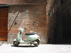 This month, the Vespa motorscooter is 60 years old. It was created in 1946 by the Piaggio company, looking to transition from the suddenly less lucrative military-aviation market, and hitting upon tapping a market for cheap, convenient personal transport. As austeriry ended and consumers acquired more disposable income, it became a hit in Italy and abroad, and became an icon of freedom and youth culture (becoming to European kids roughly what Dad's Cadillac was to the rising American teens, only with the attendant European je ne sais quoi), and later of retro style.
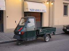 Piaggio, the Vespa's manufacturer, also made a line of miniature scooter-trucks, ideally adapted for narrow Italian town streets that had in the past been trod by donkey carts or similar; occasionally one sees one outside of Italy (I once saw one in West London; the poor thing must have gotten terribly lost), though they don't seem to have caught on in a big way there. It could be argued that post-war Italy had a two-stroke engine-led recovery.
As revolutionary as compact, stylish-looking and affordable scooters were in the post-war years, they can't help but look a bit dated. They're noisy, bulky, relatively inefficient (technology having moved on since then), and consume Saudi Arabia's Finest, which probably isn't going to get any cheaper. Though Piaggio are now testing a hybrid Vespa in Milan; the new model can run off either petrol or electricity, much like a Prius, or can be plugged into the mains if you'd prefer to give the House of Saud the finger. The "electric-only" mode is still said to be slower than the petrol-powered mode, though one presumably doesn't buy a scooter for raw power.
2006/3/14
A review of the ten most annoying alarm clocks, for those who find the basic model with a snooze button too lenient and easy to ignore. The selection includes fiendish devices that make loud noises and run away, forcing you to catch them and/or solve puzzles to shut them up:
The Kuku Alarm Clock greets you every morning by crowing and laying eggs. It won't stop chirping until you've returned its eggs.
The Blowfly alarm clock escapes from a cage in your room, moves and produces sound around you when the alarm goes off. To turn it off you have to catch it and put it back in its home.
(via bOING bOING) ¶ 0
2006/2/7
The BBC is running a poll of British design icons. On the current page are 25 candidates; there are the usual design classics (Jan Tschichold's distinctive Penguin paperback covers, red phone boxes, Routemaster buses, the Mini (and the miniskirt!), and Harry Beck's Tube map), and also some more recent entries, including Peter Saville's cover for New Order's Power, Corruption and Lies, Neville Brody's design of The Face magazine, the Dyson vacuum cleaner (what about the Henry?), Lara Croft and Grand Theft Auto. Oh, and the World Wide Web, because the first form of it was developed by an English bloke.
Not to mention a few things I didn't know were British, such as the Chopper bicycle now ironically popular with SugaRAPE-reading hipsters (apparently it's not Californian, just a knockoff of Californian designs) and Microsoft's Verdana typeface (designed by British-born type designer Mathew Carter). In that case, I wonder why they didn't include the iMac or iPod (whose appearance was designed by Englishman Jonathan Ive).
And it's interesting to read that Britain's current system of road signage was (re-)designed in the 1960s. Which probably explains why Australia has entirely different (US-style?) signs.
2005/9/27
Faced with a ban on tobacco advertising, cigarette companies are turning to increasingly subtle forms of marketing, such as redesigning bar decor to subliminally suggest their brand identities:
These 'installations', as they were called, created lounge areas by placing comfortable red sofas in front of video screens showing scenes redolent of Wild West 'Marlboro country' to convey the essence of the cigarette brand while circumnavigating sponsorship bans.
'All that former advertising money has to go somewhere,' said one industry insider. 'The tobacco firms are looking to create extensive "design languages" in bars and clubs and other venues through the use of particular types of furniture or material which will make people think of their brands.'
2005/9/13
Luke Williams from design firm Frogdesign (who designed the original Mac and the NeXT cube) talks about the design of the iPod and the way design conventions reference other objects:
"So... as I was sitting on the toilet this morning" (this is of course where most good ideas come from), "I noticed the shiny white porcelain of the bathtub and the reflective chrome of the faucet on the wash basin... and then it hit me! Everybody perceives the iPod as 'clean' because it references bathroom materials!"
The public once thought electricity was dangerous and expensive, so to change this perception, the electricity industry sought to project the image of electricity as a modern and progressive source of energy. To symbolize these qualities, designers used the conventions associated with "technological futurism"--hrome plating and streamlining. In 1955, industrial designer Henry Drefuss wrote that changes in the design of the modern kitchen had been brought about "by two things that had nothing to do with cooking a meal--the automobile and the airplane."
Although the symbolism has changed, the iPod also uses conventions to appear ahead of its time. Its surfaces are seamless and have no moving parts-- two conventions that have often been used in science and science-fiction to connote advanced technology. Remember the seamless, molten-metal bad guy in Terminator 2? Or how about the perfectly seamless, black monolith in 2001: A Space Odyssey?
2005/7/12
I'm getting rather fed up with the Fresh prepaid mobile service I use. I got it when I arrived in the UK, as it was the cheapest way to get a +44 mobile number (essential for getting calls about accommodation/jobs returned), and to someone living off saved Australian pesos, cheap is good. (It's something like half or less of the cost of using other services.) What I've since learned is that what you save in call costs, you pay for in gratuitous inconvenience. Consider, for example:
- There is no convenient way of knowing how much credit you have, short of calling an automated voice number and going through the menus. They occasionally send you texts when you're "running low" (i.e., below £4 credit, which is enough to last a month or two)
- If you're not careful, the first you find out that you've run out of credit is when your phone is barred.
- Unless you pay a lot of money in, your phone will not be unbarred when you top it up. You hav e to go in/call up separately after topping up to get the bar removed.
This happened to me a few times. The most recent time, yesterday I went to top up my account, and asked the clerk to remove the bar immediately. He said he could do that. He lied.
As such, I just spent 9 minutes on hold, being subjected to what sounded like some kind of jazz-fusion/whalesong melange, punctuated at 15-second intervals by a plastically cheerful female voice insincerely apologising for the delay, before getting a call-centre employee who could lift the bar for me.
There is no technical reason for why Fresh needs to suck so badly. I suspect it may be part of an experiment in how people monetise convenience, and how much inconvenience they are willing to put up with to save a few quid.
2005/4/22
Quite probably the world's coolest-looking pizza cutters, which look like some kind of collision between Gigeresque biomechanics, steampunk and cyberpunk:
2005/2/6
The Times' Weekend Review has an interesting piece on the influence of fonts:
Dr Sigman has studied the emotional impact of fonts and is convinced that they constitute a second dialogue. After analysing stern letters from bank managers, he concluded that they are increasingly using fluffy, friendly fonts in a vain attempt to humanise their message.
Font experts in the type-obsessed world of advertising advise against such obvious clashes between meaning and typography. I hate it when banks talk to youths in yoofy typefaces, says Julian Vizard, of the St Lukes agency. Its like William Hague turning up at the Notting Hill Carnival in a baseball cap.
The print edition also has a whimsical inset matching fonts to personality types. Apparently the font of choice of bloggers and web types is Verdana, Courier is used by embittered old journalists, people with an affinity for Gill Sans are "tasteful, design-conscious, probably gay or bi-curious and have a lot of brushed stainless steel in [their] kitchen" (umm...) and Comic Sans people desperately want to be loved. Oh, and the Prince of Wales is said to like Helvetica; that really says a lot.
2004/12/18
 A British designer has created a coffee mug with a shelf for storing biscuits. The Dunk Mug, sensibly enough, comes in left- and right-handed variants. (via bOING bOING)
2004/11/5
A list of ten things the Chinese do better than us (in this case, "us" being Canada, but it applies equally to the rest of the West). The list specifically excludes anything to do with cheap labour, and focusses on technological innovations.
In Tianjin, a city of 13 million people, traffic lights display red or green signals in a rectangle that rhythmically shrinks down as the time remaining evaporates. In Beijing, some traffic lights offer a countdown clock for both green and red signals.
(In another transit plus, forget those illegible handwritten taxi receipts we get in Canada. China's taxis automatically print out receipts with date, mileage, taxi medallion number, even the start and end times of the ride. That certainly would help you recover the Stradivarius you inadvertently left in the back seat.)
At the Shanghai Grand Theatre, the black granite ticket counter is embedded with a Samsung computer screen which lights up with the event you want to see, showing unsold seats, colour-coded by price, and the sightline to the stage. There is even a bar stool on which to perch while you consider your choices.
It wouldn't surprise me if some of these ideas caught on in the West at some stage.
2004/10/26
The lid's off the iPod Photo; and so, Apple have boldly followed what Archos, iRiver and the like have been doing for a few years. But, hey, it's Apple. Mind you, given that Apple employ good designers, the UI is likely to be less irritating than the iRiver H340's (with its cryptic buttons and necessity to switch modes to go from listening to music to viewing photos or text files).
2004/7/15
If you ever wondered where Liberal Club student newspaper editors go once they graduate (other than the legal profession, that is), the answer could well be the Toorak Metropolitan News, which appears to be distributed for free in the South Yarra area. I saw a copy yesterday; it's one of those free "community papers" that's mostly ads (often for regionally-appropriate products such as hair-replacement therapy). The front page was vintage Tory-student-paper, though, and looked as if it had been put together in PageMaker by a graphically clueless political appointee. (What is it about Tories and clueless graphic design anyway? Back when I was at university, the Labor Club election propaganda looked as if it had been done by someone with decent visual sense, whereas the Liberal Club equivalents were a mishmash of distorted CorelDRAW novelty fonts. I imagine current Liberal Student flyers would probably use a lot of Comic Sans; but I digress.) About five too-narrow, full-justified columns of Times Roman, with the spacing consequently varying widely between lines, and too little whitespace elsewhere to not look cluttered. The content was a sub-Andrew-Bolt op-ed tract about how John Howard's doing such a good job with the economy and the Iraq situation and Latham and his loony-leftist goons should hang their heads in shame for opposing the removal of that rotter Saddam Hussein or something like that, complete with the author denying being, as many say he is, a dyed-in-the-wool Liberal. It came with a rather forced-looking alliterated headline (something about "Loony Liverpool Lout Latham Loses" or somesuch).
2004/3/30
GUIdebook is a museum of graphical user interfaces, past and present, with comparisons of equivalent aspects (dialogs, icons, &c.) of different systems. The UIs include everything from GEOS (Commodore 64 and Apple) to Windows Longhorn, along with curiosities such as Rhapsody (i.e., NeXTSTEP with the MacOS UI bolted onto it), BeOS, the Amiga, QNX and OS/2. (Though with some notable omissions: i.e., GEM doesn't rate a mention once, and nor does any version of the MacOS X interface.)
In a similar vein, System 1.0 Headquarters, examining just how the first Macintosh OS differed from modern versions of MacOS (and here, "modern" means MacOS 7.6 and/or 8.5).
2004/1/26
Graphic Design USA looks at 15 recent trends in logo design; the "Millennium Orbital Crescent Swoosh" or whatever it was called (you know, the dynamic, energetic-looking swish of geometric colour seen so often in the logos of dot-coms with names ending in "nt") is out (though has spawned slinky-like meshes of curvy lines); meanwhile, pleasantly organic-looking droplets, natural spirals, typographical smiley faces and the colour green (the last particularly favoured by evil, toxic multinationals) are in. Also in are logos using translucent colours and logos based on stock photographs (as these can be easily reproduced where needed). (via bOING bOING)
2003/12/8
The latest thing out of Japan: rubber duck-shaped USB flash drives, in a choice of three pastel colours. They don't play MP3s, they don't clip onto a keyring, they have a great unwieldy USB plug sticking out of them, they probably don't take kindly to water, and they're only 16Mb in size. I'm sure that it makes sense to someone, though.
2003/11/18
Douglas Rushkoff on why 3G phones-as-TVs are a daft idea: (via Techdirt)
These are essentially three different scales of devices. To use the American measures: inch devices, foot devices, and yard devices - and each has a particular range of appropriate functions... Inch devices, like cell phones, pagers, and PDAs, are for a single person's use, and are unique for their ability to help a person deliver important information from anywhere. Their screens are not for reading, but for eyeballing or copying a fact or figure that will most likely be used on that very device. Stock quotes, weather forecasts, or restaurant addresses are appropriate data points for a communications device on which you might make a trade, a date, or a business meeting. Yes, avid sports fans may want to check an important score (and then call their bookies) but do they want to watch a tiny, inscrutable image of a goal being kicked? No. They'll want to get home to see the event on their foot devices.
2003/11/16
From the Viridian mailing list, an article on the new era of biomorphic design; i.e., doovy-looking curvy blobjects and organic forms made possible by computer simulation and high-tech materials:
There is a new, witty nouveau afoot, from the Vallo watering can by Monika Mulder at Ikea, which looks like a stork, to the coffee and tea set by Greg Lynn for Alessi, which opens like a clove of garlic. Tord Boontje's chandeliers for Swarovski look like clouds of slender branches surrounding a light. A great deal of building in Britain has biomorphic roots, for instance, Snohetta's whale-shape museum addition planned for Margate, Foster & Partners' Swiss Re sea sponge building going up in London and Ushida Findlay's proposal to build a starfish-shape country manor house in Cheshire.
The movement has spawned a number of terms to describe it: Bruce Sterling's "Tech Nouveau", Ross Lovegrove's "organic essentialism", and even "sexy math".
2003/9/18
An article on the perils of bad design; in particular, how the low battery alarm on a Motorola futurephone can become an inhumane torture device:
Right now, however, at 2am, I've discovered that the usability engineers at Motorola designed this feature not as an alert, but as a behavior-modification tool. Make the punishment for forgetting to plug in the phone painful enough, and I won't do it again.
If I could just get up and turn it off I could do so half asleep and drift back into my dreams. And I wouldn't be writing this column. But the Motorola alarm only rings once every 4 minutes, and I have no idea where the phone is hiding.
(via Techdirt and/or bOING bOING)
2003/9/9
Two art links filched from bOING bOING: firstly, a gallery of 1950s/60s TV commercial art; a lot of it very groovy in that 50s/60s way (hipsters take note). Secondly, this gallery of contemporary Japanese op art; optical illusions which do weird things as you look at them. (Well, some of them did; others didn't have an effect on me.) (Also, the second page didn't seem to load properly in Mozilla, though Safari had no problems.)
2003/5/13
CSS Zen Garden; a demonstration of what can be achieved visually just by tweaking CSS stylesheets. Hmmm... (via bOING bOING)
2003/3/24
Who says theology isn't a useful science? Game designer and theologian discuss the mechanics of deities in multiplayer game world. (via bOING bOING)
2002/9/9
Hmmm... The Designers Republic, the graphic design outfit who made all those Warp and PWEI album covers and spawned legions of dodgy imitators, are coming to Melbourne; they're appearing at something called the Design Forum, on the 16th of October (i.e., one day before the Mogwai show).
2002/5/2
A Grauniad piece looking at the explosion of obesity in America, and the factors that caused it (mostly bad design and unintended consequences).
For a start, in some parts of the country, Americans have eliminated not merely the need to walk, but even the possibility of it. "I'd love to be able to walk to the store, pick up some milk and come home again, but our towns don't really allow that," laments Mary Gilmore, a dietician in Meridian. The distances are too great, the pavements non-existent. In the sprawling suburbs and small towns, public transport is often as rare as in an English village. In any case, it is almost impossible to carry the milk: it usually comes in gallon containers (a US gallon is four-fifths of a UK gallon). In a country where the cost of packaging exceeds the cost of the food, buying any other way is far more expensive.
2002/2/28
Game and puzzle designer Bob Abbott on why video games have become incredibly stupid; mainly due to advances in technology, the fallacy that graphic realism makes for a good game and/or the Big Yellow Shorts factor:
Not only are they incredibly stupid, they arent even game designers. They are computer programmers and graphic artists. Video game companies cant even comprehend the concept of a game inventor. To them, a game or a puzzle is of no consequence.
I think the main reason for the failure of the new video games is simply this switch from the top-down view to the 3-D view. The top-down view just gives you more information. You see where all the monsters are, you see what is travelling into your area, you see where the barriers are, and you can plan ahead. In the 3-D view, you only see what is directly ahead of you. And about all youre given to do is shoot at what you see.
Damn right. IMHO, some of the most interesting computer games were developed on ancient 8-bit computers and the like back in the distant past before the invention of the first-person shooter genre, and the confinement of the market to the carefully researched demographic of overweight teenage boys with 15-second attention spans. (via Plastic)
2001/9/30
An interestingly geeky piece from USENET about those video screens at Melbourne railway stations, and how they were designed back in the late 70s/early 80s. Turns out that they displays are driven by custom 8080-based microcomputers, and that the font rendering was all put together by hand:
The characters were not scanned, they were made by choosing the largest available Letraset, sticking each character on a piece of graph paper, tracing the outline, ruling lines every eight columns, getting a secretary to type the resulting 0's and 1's into the source file as data statements. Then an architect... flew up from Melbourne and told GEC to add or remove bits until the letters looked just right to him. Perhaps it really was worth all the fuss if people still think that they look good.
They just don't do things that way anymore...
2001/6/27
<RANT>
 What is it with indie-pop's fixation on the 1960s?
I recently picked up a free postcard advertising the Poptones record label;
it is green in colour and adorned with various cover art, all of which
has a strong retro motif.
Day-Glo colours and earth tones, swirly psychedelic lettering and
pop-art iconography abound. And then there are the shagadelic fonts used for
the text (ones in which the @ sign in the email address looks out of place)
and the Poptones logo itself, consisting of two swirly things in various shades of green. It's as if the past three decades never happened.
What is it with indie-pop's fixation on the 1960s?
I recently picked up a free postcard advertising the Poptones record label;
it is green in colour and adorned with various cover art, all of which
has a strong retro motif.
Day-Glo colours and earth tones, swirly psychedelic lettering and
pop-art iconography abound. And then there are the shagadelic fonts used for
the text (ones in which the @ sign in the email address looks out of place)
and the Poptones logo itself, consisting of two swirly things in various shades of green. It's as if the past three decades never happened.
And then there's much of the indie music you hear. In between Damon and Liam acting like extras from Quadrophenia, Belle and Sebastian doing the flower-child thing (compare them, the leading exponents of introspective pop balladry, to countarparts from a decade earlier, such as the Field Mice, or even the Smiths, and you will see what I mean), and all the lounge-pop and Bacharach-hop acts, the whole indie ideosphere seems rather backwards-looking.
It wasn't always like this; during the late '80s/early '90s, things were more innovative. New Order had just combined rock and acid house, and the Madchester baggycore movement was doing something similar; meanwhile, further south, the shoegazer scene was happening. Bands looking for inspiration found it in The Smiths, not retro acts from decades ago.
Of course, then came the juggernaut that was Seattle Grunge, steamrolling everything in its path; faced with the Seattle onslaught, all the other scenes wilted like so many flowers (or alternative web browsers/ independent cafés, if you prefer). Once grunge inevitably degenerated into manufactured pop (i.e., Alanis, the Presidents of the USA), the landscape was blasted and barren, and what followed (such as the britpop movement, which of course was a construct of the music press) had to go back several decades to the Golden Age Of Pop(tm) for inspiration. (The Great Spirit of Perfect Pop, you see, lives somewhere around 1967.) Pretty soon it was just wannabe-Mods and flower children, with a few brave souls venturing into '70s prog-rock.
Me? I'm just holding out for the shoegazer/madchester revival.
</RANT>
2001/5/20
2001/5/17
Ralph Osterhout worked designing weaponry for the US Navy Seals, now works as a toy designer. New Scientist has an interesting interview on the subject of high-tech toy design.
Some parents say: "When I was a kid we had plain wooden blocks and we were really encouraged to use our imagination." But I think we are much more creative today. Give a child complex three- dimensional puzzles that are very sophisticated and you stimulate a higher level of creativity. How do you expect a kid who plays with wooden blocks to come up with a new receptor blocker for HIV later in life?
2001/4/9
Japanese graphic design zine SHIFT has an interview with Me Company's Alistair Beattie. Me Company is the London design consultancy best known for doing a lot of really impressive CD covers for Björk.
2001/3/15
According to Q magazine, the best album cover of all time is the one from God Save The Queen, by the Sex Pistols. #2 is Joy Division's Closer, and #7 is New Order's Blue Monday (hang on--wasn't that a 12" single? Or do they mean Power, Corruption & Lies?), also designed by Peter Saville.
2001/1/4
No marks for The Designers Republic on their web design, mostly because they don't actually use HTML and just make everything embedded Flash. Having to start VMWare to access their web site (you try finding a working Flash plug-in for Linux) is annoying.
(And the Macromedia Flash plug-in for Linux is unusable. It works, but it grabs the audio device, and freezes Netscape until it gets it. Having to stop listening to your MP3s because there's a Flash ad on a page is just not acceptable, even for the leprous beggars who don't use Windows.)
Anyway, if you want to snarf it from a UNIX machine, the Designers Republic's free screen saver may be found here (for the Mac) or here (for Windows). (Cute URLs, guys...)
2000/12/15
The Designers Republic's merchandising division The People's Bureau is opening soon, and will have a free screensaver for the downloading. (PC and Mac only; you can't bung it on your Linux box, unless you want to run it in a VMWare window or something equally pointless.) Unfortunately, the site seems unreachable at the moment.
2000/5/10
A lot of Melbourne's Art Deco buildings are in danger of demolition, not being considered old enough to be worthy of protection: (The Age)
What the buildings have in common, however, is their place in the new conservation battleground, according to the president of the Society Art Deco, Robin Grow. Many people recognise the value of Victorian and Edwardian buildings, he says, but anything built after the First World War has not seemed quite old enough to be worth saving.
Houses in the style were built in "desirable" suburbs and the people likely to buy them have the financial resources to demolish and rebuild. Many simply don't like, or appreciate, old.
Unlike Victorian and Federation buildings, there is as yet not much business in producing the hardware of the Moderne period. "I was quite surprised at what we could not find - even down to furnishings. There's a lot of Art Deco couches and yet trying to find Art Deco upholstery fabrics ... it's just no show. Yet there was some beautiful stuff produced in that era and it was only 50 years ago."
1999/10/30
Interesting overview of computer-related design/interface conference: (NYTimes, requires registration)
"Logos are going to be a huge part of the global visual language," Curtis said. "In the same way that rap and hip-hop artists are sampling pieces of music and giving them new meaning, who's to say that the Nike 'swoosh' won't one day represent a word? You already see it in broadcasting, where 'give me that MTV style' has just as much meaning as 'give me a Kleenex.'"
"As utopian as this sounds," Mazza said, "I do believe that we are working toward a collective-mind type of experience, whether we realize it or not. All this technology is about connecting machines. What about connecting each to other? Transpersonal experiences? Sounds cool."