The Null Device
Posts matching tags 'visualisation'
2013/8/26
Continuing on from the previous post about Australian Senate how-to-vote cards and who really is preference-swapping buddies with whom, I have spent some time playing around with the D3 web-based data visualisation library, and have managed to build an interactive visualisation of the Senate voting sheets (and, more specifically, the various parties' affinities for each other).
As such, I present to you: the Australian Senate Preference Navigator:
It requires a reasonably modern browser (or at least one with SVG support).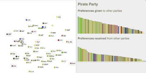
2010/12/16
Data visualisation of the day: if you draw lines between the locations of people connected to each other on Facebook, you get this map of connections:
A few interesting observations:
- There are notable dark patches: China is an obvious one, between the Great Firewall and the prevalence of home-grown websites. Brazil is also dark (presumably because everyone's on Orkut instead), as is Russia (LiveJournal is apparently the big thing there to this day). The Middle East is also largely Facebookless, with the exception of Turkey, Lebanon and Israel. Africa is also largely dark, with a few, largely self-contained patches of light.
- The east coast of Australia is more strongly connected to New Zealand than to the west coast.
2010/6/21
And the first dividends of Transport For London's opening of its data to the public have started flowing in; a chap named Matthew Somerville has created a real-time map of trains on the London Underground, displayed on a Google Map. The source code is available here. Somerville also has a similar map for National Rail trains, though, due to the more limited data published by National Rail, it can only show trains due to arrive at one of several stations. (Let's hope that National Rail see the benefits of opening their data soon.)
2010/6/13
Data visualisation of the day: Locals and Tourists. Location data was harvested from geotagged photos on Flickr and plotted on maps; the points were colour-coded: blue if the poster was a local (i.e., had been in the city for more than a period of time), red if they were tourists (recent visitors with no prior history), and yellow if it was ambiguous. Here, for example, is London, with the Thames and the West End ablaze with red and the East End blue (which means that there are fewer tourists but still plenty of photographers, think Hackney art hipsters and/or kids with iPhones):
And here are Paris; tourists flock to the obvious parts (the Eiffel Tower, the Champs-Elysees, the Seine and the Île-de-Cité), whereas the locals who tend to post photos gravitate to the east, around the Bastille and such; the affluent, conservative southern arrondisements are largely a wasteland, photographically at least. In Berlin, meanwhile, tourists fill the city's broad central boulevards, the Tiergarten and Alexanderplatz and Karl-Marx-Allee, and visit the East Side Gallery, but there's a lot of local photography happening around Kreuzberg/Neukolln.
In fact, one could use the frequency of non-tourist photography for an area as a predictor of cultural vibrancy. Areas where a lot of photos are taken by people who live in the same city and not by tourists could be the kinds of broad areas where local scenes form, and the kinds of people who engage in cultural activity beyond passive consumption (sometimes referred to as "hipsters") are more likely to be found. This is borne out by other maps: Melbourne (there are specks of blue around the inner north, while the sprawling suburbs are largely empty). In New York, meanwhile, Manhattan glows with tourist activity but Brooklyn is veined with blue.
Of course, the amount of blue space on these maps is considerably larger than any nexus of cultural activity would be; it'd cover the areas where events take place, where the participants live and work, and spaces in between. However, it does make one wonder whether one could data-mine the buzz of a city by correlating Flickr photo geodata or other indices of participation with other data; possibly transport routes?