The Null Device
Posts matching tags 'maps'
2012/3/8
In other recent news, Apple launched the latest gadget yesterday, to much-anticipated adulation. There were few surprises in the overt details: the retina display showed up as everyone predicted, and the CPU and camera were also bumped up; oh, and it does LTE, which explains the enlarged battery.
The launch included a presentation demonstrating the new iPad and some new apps for it. Buried within the demonstration of a photo editing package was a bombshell: a fragment of a screen, seen briefly, showed a street map which looked distinctly unlike Google Maps (the mapping system used by iOS since the first iPhone), suggesting that Apple are about to move away from Google Maps to a different platform. Such a move wasn't entirely unanticipated; relations between Apple and Google have been icy recently, so it was only a matter of time until Apple moved to a different mapping system; Apple's acquisition of several mapping-related companies, which promptly disappeared beyond the Cupertino event horizon, suggested that Apple would roll its own system. The only questions were when and what form would it take.
More clues emerged when the iPhoto app became available: (examination of internet traffic from iPhoto revealed that the map tiles were being loaded from a server named gsp2.apple.com, and soon, someone rigged up an unofficial web-based map viewer using the tiles. Finally, it was revealed that Apple are using data from OpenStreetMap for their maps, though rolling their own tiles. The service seems to be in its early stages so far; the resolution stops a few zoom levels short of street-map level and the data they're using is based on a slightly old snapshot of OpenStreetMap, though it's still pretty big news.
Apple's move to OpenStreetMap is the latest in a wave of defections from the once-ubiquitous Google Maps (FourSquare moved a few weeks ago and other sites have been moving to it, propelled by the carrot of OpenStreetMap's high-quality (and rich) data set and the stick of Google moving more aggressively to monetise their maps. As for other mapping services, they don't seem to be getting much of the action; Microsoft's Bing has Facebook, probably because Microsoft own 1% of Facebook, and Flickr still uses Yahoo!'s own mapping system. However, neither looks set to steal the crown from Google, as there isn't likely to be a crown to steal soon.
It looks like online geodata may have approached the tipping point that electronic encyclopædias reached with Wikipedia and UNIX on commodity hardware (remember commercial PC UNIX?) reached with Linux: the point beyond which it makes no economic or business sense to go it alone, and where proprietary products are an evolutionary dead end.
It'll be interesting what the UK's Ordnance Survey, for long the dog in the manger of geodata, will make of the new shifting environment it finds itself in.
2010/5/1
Some recent random posts related to urbanism, urban planning, architecture, transport, infrastructure and such:
- The World's Strangest Housing Communities. Includes Chinese replicas of American suburbia, sadly derelict futuristic pod cities in Taiwan (alas, now destroyed), and rumours of midget villages in rural America. Not to mention Alphaville, the chain of high-security gated cities in which Brazil's professional élites live behind electrified fences, guarded by a private army and entering and leaving only by helicopter (and which inspired a Jean-Luc Godard film of the same name),
- A Berlin-based street artist calling themself EVOL uses photographic prints to convert utility boxes and planters into miniature replicas of decaying tower blocks:


- A piece on hand-drawn maps, and the situations in which they are particularly useful, when subjective psychogeographic experience is more important than objective accuracy.
- A piece in The Economist about Portland, Oregon, a city which "looks to Amsterdam, Helsinki and Stockholm for ideas" and is touted by some as a model for a more sustainable America (though also mocked for being the cultural epicentre for hipsters and White People.
- Another possible alternative for living: Inhabited balloon cities perched atop high-altitude wind systems.
2010/2/28
 Acclaimed Melbourne street artists/underground illustrators Miso and Ghostpatrol have released
a downloadable, printable map of inner Melbourne (or, as some would argue, the parts of Melbourne White People like). The map consists of two sheets, covering the CBD and Fitzroy, and showing the locations of cafés, bars, art spaces and art supply shops; it may be downloaded from here.
Acclaimed Melbourne street artists/underground illustrators Miso and Ghostpatrol have released
a downloadable, printable map of inner Melbourne (or, as some would argue, the parts of Melbourne White People like). The map consists of two sheets, covering the CBD and Fitzroy, and showing the locations of cafés, bars, art spaces and art supply shops; it may be downloaded from here.
The choice of the CBD and Fitzroy suggests that gentrification doesn't seem to have affected the north/south divide. North of the Yarra is hip and culturally rich, whereas south of the Yarra is merely trendy, a shallow, consumeristic imposter for actual cool; St. Kilda (once the crucible of punk—blah blah blah Nick Cave blah blah Seaview Ballroom— but now, as The Lucksmiths so appositely worded it, home of bright-eyed boys in business suits, tourists where once were prostitutes) and Prahran (which committed the cardinal sin of getting house music and T-shirt boutiques a decade before Fitzroy) don't rate a mention in the psychogeography of cool in Melbourne. And while Fitzroy real estate prices approach South Yarra levels, there is still enough of a cultural legacy (not to mention tram routes from more affordable areas) to maintain the area's claim to cultural vitality.
2009/7/14
Web interface of the day: A Chinese company has unified isometric pixel art and Google Maps-style draggable maps to make pixelicious city maps.
They have a map of Hong Kong in English, and maps of other Chinese cities (Chinese only; Google translation here). Not sure if it's much more useful than a 2D map, but it sure looks pretty.
Now perhaps someone can commission eBoy to do one of Berlin. Or of the internet.
2009/4/20
The Map Scroll blog has a map of the Gini coefficients of all the US states, and another one of Europe.
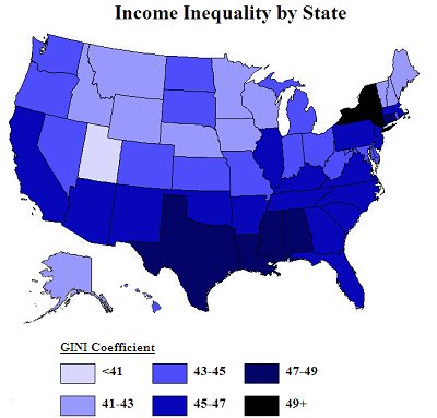
The Gini coefficient is a number from 0 to 1 representing the equality or inequality of income distribution in an economy; 0 is theoretical absolute equality, and 1 is one person having everything and everyone going without. In practice, it varies from about 0.2 to about 0.7.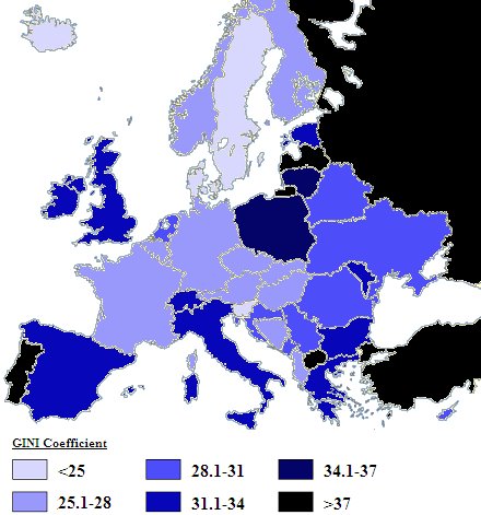
According to it, Europe ranges from the mid-.20s to the high .30s, with a few outliers in the low 40s. At the most egalitarian end, unsurprisingly, are the Jante states of Denmark and Sweden, as well as Iceland (perhaps surprisingly, if it's meant to have been an experiment in cut-throat neoliberalism). Things get more inequitous into Norway, Finland, France, Germany and Switzerland (which stays under .28, despite being home to a lot of the global super-rich), and then on to Italy, Spain, Britain and Ireland, and beyond that, Poland and Lithuania. The most unequal country in Europe is Turkey, which has a Gini coefficient of 0.436, somewhere between Guyana and Nigeria, or, if you prefer, Delaware and Hawaii.
The United States is, unsurprisingly, a lot less egalitarian in income than Europe. American states' Gini coefficients range from 0.41 (the solidly Mormon state of Utah, whose state emblem is the beehive, has a Gini coefficient equivalent to Russia's) to a whopping 0.537 in the District of Columbia (comparable to the Honduras). Other states are twinned with parts of the developing world; Alabama and Mississippi are most like Nepal, California has the income distribution of Rwanda, and New York, barely under the .5 mark, is twinned with Costa Rica. According to the article, this is an astonishing state of affairs for a developed country:
According the the CIA World Factbook (table compiled here), the lowest Gini score in the world is Sweden's, at .23, followed by Denmark and Slovenia at .24. The next 20 countries are all in either Western Europe or the former Communist bloc of Eastern Europe. The EU as a whole is at .307. Russia has the highest number in Europe (.41); Portugal is the highest in Western Europe (.38). Japan is at .381; Australia is .352; Canada is .321.
And then there is the United States, sandwiched between Cote d'Ivoire and Uruguay at .450. Not counting Hong Kong (.523), the US is a complete loner among developed countries. In fact, as you can see from the map above, there is no overlap between any single US state and any other developed country; no state is within the normal range of income distribution in the rest of the developed world. Here's a list of the states with their Gini index numbers, and the country where income distribution is most comparable in parentheses:Other interesting maps on the site include a map of religious nonbelief in the UK (which points out that Scotland and Northern Ireland are the most religious, and asks whether that correlates to the Scots-Irish roots of the US "Bible belt"), of antidepressant use in England and Wales (summary: it's grim up north, and in Cornwall too; either that or Londoners prefer a line of coke), and one suggesting that, as global warming advances, Australia is ecologically fux0red.
2008/2/28
French broadsheet Le Monde has published a map of the popularity of various social network sites across the world.
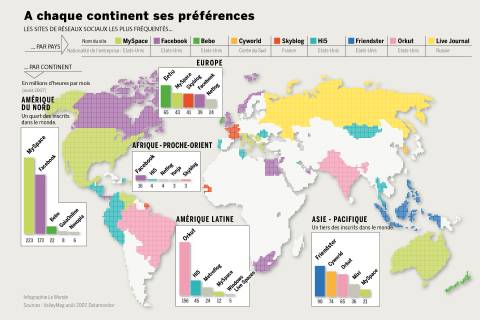 This map reveals that MySpace dominates in the USA and Australia, whereas the UK, Canada and Norway prefer Facebook. Which brings to mind the statistics about average IQs of countries, which place the UK's average at 100 and the US and Australia's at 98.
Interestingly enough, the chart lists LiveJournal as a Russian website, despite the fact that it began in, and operates out of, the US, though Russia has been a significant market for it and is now owned by a Russian concern.
2008/1/30
The latest thing to do on the London Underground: swapping station names around on maps, confusing tourists:

2006/3/16
The makers of the "Tube" map viewer for Palm handhelds* have released an updated map of Melbourne, partly in time for that big sporting event they've got there:
Melbourne, home to the 2006 Commonwealth Games, is a city of world-class events, including: a non-stop program of film and food festivals, renowned dining, major art exhibitions and musical extravaganzas.They've now padded it out a bit more, adding trams, and making it a bit more useful. (Before it used to be just Melbourne's rather minimalistic railway network, limiting its utility to tourists who are entirely unfamiliar with the city.) Still, without actual street maps (which their packages for some other cities, like London, Amsterdam and New York, have), it's not quite as indispensable as the editions for those cities.
Those wanting street maps of Melbourne on their handheld can make do with a JPEG viewer and scans of the 1966 Melway, which should be mostly accurate for the inner suburbs, give or take a few drive-in theatres and the odd freeway.
* that's "the map viewer named Tube", not "the program for viewing London Underground maps"
2006/2/3
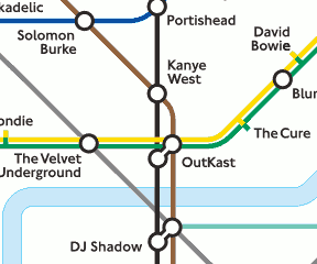 An artist named Dorian Lynskey has created a music-themed London Underground map, in which stations are artists and lines are genres.
I started out with a packet of coloured crayons, four sheets of A4 taped together and a big box of doubt, but the different character of each line quickly lent itself to a certain genre. Pop intersects with everything else, so that had to be the Circle Line; classical music for the most part occupies its own sphere, which made it perfect for the Docklands Light Railway. There were a couple of false starts but by the end of one afternoon I had assigned genres to almost all the lines and thrashed out most of the major intersections. The key stations naturally went to the most eclectic artists, not necessarily the most important: the Beatles may be more significant than Beck but even their most devoted fan must admit that they never tried rapping.
I also followed chronology wherever the path of the line allowed it. Each branch line represents a sub-genre: rock sprouts off into grunge and psychedelia when it reaches South-West London; hip-hop diverges, north of Camden, into old school and New York rap. If I was really lucky, the band name echoed the original station name: Highbury & Islington became Sly & the Family Stone.
Other people will quibble with omissions - it's a shame, for example, that the Circle Line constantly runs in tandem with either the District or Metropolitan lines, thus leaving no room for pure pop acts such as Kylie Minogue and the Pet Shop Boys. I should also point out that, to keep my head from exploding, I limited the remit to western, predominately Anglo-American music. Then there are those changes necessitated by London Underground's understandable sensitivity to explosive references: arrividerci, Massive Attack. For some reason, they also took exception to the late rapper Ol' Dirty Bastard.There is a PDF of the map available from the article; and copies can be purchased from the London Transport Museum for £7.95.
(via london-underground) ¶ 0
2005/11/22
Throughout its existence, the Soviet Union went to great efforts producing extremely accurate maps of the entire world, often containing information omitted from local maps. The information was often gathered by surreptitious means, especially in Western countries. And because the Commies didn't believe in intellectual property and the aggressive monetisation of all possible rights, these maps are now claimed to be in the public domain (though they are currently illegal in the UK, because of alleged copyright violations; the articles linked on the page, however, argue that the maps did not use Ordnance Survey data, though the Ordnance Survey still argues that the maps illegally undermine its monopoly), which could mean that, should digitised versions find their way onto the net, they may prove invaluable to open mapping projects.
And here is a Pravda article mentioning the alarm that occurred in Sweden when they found out that the Russians had better maps of Sweden than they did, and allegations that a lot of the data was gathered by KGB agents posing as the children of Swedish Communists who moved to the USSR in the 1930s and then disappeared in Stalin's purges.
(via bOING bOING) ¶ 3
2005/11/7
To help alleviate Melbourne's transport woes, an academic specialist in public transport has called for a Melbourne "tube" line. The line would bypass the already congested above-ground transport infrastructure and would cut under the centre of Melbourne, from South Yarra in the south to Melbourne University in the inner north.
So, in short, what we currently have looks like:
Were Professor Currie's proposal to be implemented, it'd look something like: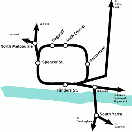
Though why not stop there? There was, a while ago, a proposal to build an underground line from North Melbourne, across the inner north (including Melbourne University), through to the Eastern Freeway and along the centre of that to Doncaster and the suburbs. Were that to be resurrected and combined with this plan, it would start to look like: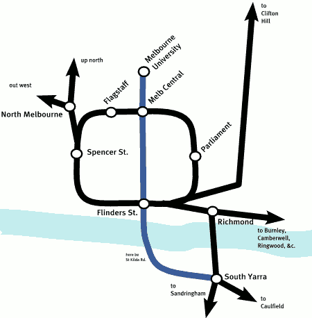
Of course, the chances of seeing anything of this sort happen are not good.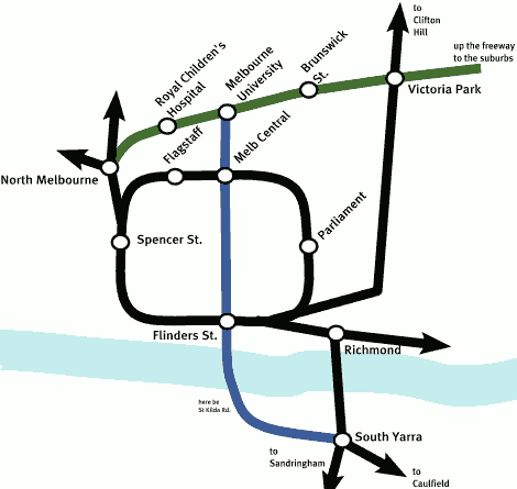
2005/8/8
Impressive hack of the day: turning a Nintendo DS into a GPS-enabled map viewer, using a GPS unit wired to its serial port and a CompactFlash card full of map tile images purloined from Google Maps.
The use of downloaded Google Maps tiles is interesting; I wonder how long until someone writes a map viewer for PalmOS which uses these, effectively cutting into the market share of programs like Tube (which have limited coverage, and often annoying qualities such as being unable to scroll between map tiles; a pain when you're looking for somewhere just off the map, or in the intersection between two tiles). Then again, Google may be able and/or obliged to use the DMCA against any software which attempts to use its map tiles in this fashion (though I am not a lawyer).
2005/3/10
On the subject of Tube maps, here's one with the names of films at the stations they were filmed near. Well, that and a few anomalies such as the space-warp which puts Greenwich one stop north of Richmond. (And was Austin Powers actually filmed on Carnaby St., or did they rebuild a façade of the street in a backlot in Hollywood?)
2004/9/2
The South London Underground, another fantasy tube map, this time flipping it about the Thames, so the north is underserviced, while in the south, it goes all the way down into Kent and Sussex. Though why does Dartford International Airport get 7 terminals rather than Heathrow's 4? (via Owen)
2004/7/31
A better German map of the London Underground, with the names of the stations translated etymologically, as opposed to merely having been converted into macaronic pseudo-German. Some of the translations are fairly straightforward (i.e., "Inselgärten" and "Kamdenn Stadt", and, indeed, "Evangeliumseiche"), while others look nothing like the originals (how, for example, does one get from "Amersham" to "Egmundshof"; or, indeed, why does "Piccadilly" come across as "Nimm-Dill" in German?). Still, it's reassuring to know that Mile End is "Mellenende", and not "2.4km Ende".
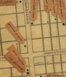
The author, one Horst Prillinger, also has two English translations of the Vienna Underground; one seriously translated and one more flippantly. Interesting to see that Vienna shares one thing with Melbourne and Brisbane: they all have a Brunswick St.
2003/10/24
Via Jim, this page of silly Tube maps, including one with the station names removed (see how many you can name), and this one in German (amusingly enough, Mile End is "2.4km Ende" in German). And here are some (mostly) sensible Tube maps; and a link to some brilliant stickers found added to line maps (I think I may have seen some of those when I was last over there).
2003/7/2
Some kind soul has scanned and put online the first edition of the Melway street directory, from 1966. It's interesting to see how Melbourne in the mid-1960s differed from the Melbourne of today (the City Loop didn't exist, but there was a railway line going from North Fitzroy to Royal Park; Monash University was mostly an empty space, and the complex of factories and squalid student houses to the north of it didn't exist; however, right to the east of it was one of Melbourne's many drive-in cinemas).
2003/6/3
A Canadian company has devised a universal postcode system. With this system, a 10-character code, of the form "W2B00 8P2H0" uniquely denotes an area measuring approximately one square metre anywhere on the earth's surface. The Natural Area Coding System itself is quite simple; each character is a base-30 digit, and the two groups of characters refer to longitude and latitude as fractions of 360 and 180 degrees respectively.
This all sounds like one of those brilliantly original ideas, like Esperanto or Metric Time, which, for all their ingenuity, come up face-first against the brick wall of pragmatism and inertia, people being creatures of habit and all; except for two things: firstly, in the age of GPS, Natural Area Coding System codes will be easier to determine than traditional post codes, as there will be no maps or databases to look up, and also no questions of changing boundaries (as happens from time to time, for example when resident groups or landlords lobby to redraw the boundaries so their properties aren't in Footscray or South-Central LA or somewhere similarly insalubrious). And secondly, Microsoft are backing the idea, and plan to integrate it with their MapPoint map service. (Perhaps they hope that they can use it to lock customers into depending on Microsoft technologies or something? I wonder if it's patented.)
NACS could eventually become a world-wide postcode, replacing legacy postcode systems devised in the pre-GPS era. It would probably happen with shipping/courier firms utilising the codes internally, and businesses which deal with them putting them on their details, and finally postal services phase out the pre-GPS system and adopt this. Of course, if someone detonates an EMP bomb in the high stratosphere and fries all the GPS satellites (or if the Americans stop being our friends), we're all fucked; but if all the satellites disappear, we'd have more important things to worry about.
2002/6/21
This is pretty cool; the London Bloggers Tube Map, mapping bloggers in London to their nearest Tube stops. (Oddly enough, it looks more complex than the Tube maps I've seen. Either they've carried out a massive Underground expansion programme since the London Underground mousepad I have was printed, or those white lines are some other (non-underground) railway system.)
Anyway, someone should do a Melbourne blogger tram map. Here's a start:
to
grudnuk.com
via Hume Hwy
  ^
  :          |(B)|             Legend:
  |  |       |   |             A = The Null Device
  |  |   112 +   |             B = Leviathan (on hiatus)
19| 1|     /(A)  |             C = The Monkey Puzzle
  |  |   /       |86
  |  |  |  +-----+
  : ++  :  |
 -+-+---+--+
 -+-+---+
======== YARRA RIVER ======
 |  |
    \-------
     \------
      +-----------------67
            C
Ph3ar my l33t ASCII-art kung fu!
2002/4/19
Killer applications for the web: A map of library cats residing in libraries and bookshops around the world. Well, so far, mostly in North America and Australia. Hmmm... wasn't there at one stage a cat in residence at PolyEster Books?
2001/1/21
Speaking of historical railway maps, here is an archive of maps of the Victorian Railways network, by decade. Fascinating; now I know that the Fitzroy line closed sometime in the 1980s, and the branch line to East Kew (which once linked Oakleigh to Fairfield or somesuch, around 100 years ago; not to be confused with the Kew one) was closed in the 1950s sometime. Though there is no trace of the rumoured railway line which ran from Elsternwick to Oakleigh or somewhere like that.
(I have been interested in historical maps for some time; since I started looking through a 1970s-vintage Melway street directory which had belonged to my late stepfather, probably from back when he was a features editor at the Herald. Unfortunately, this book has since been lost, some time before when I became curious about the dismantled railway lines of Melbourne.)
Vintage London Underground maps. Useful for the historically curious or Mornington Crescent players.
2000/12/5
A map of the London Underground with station names replaced by those of famous people (or people famous in 1992, at least) is being auctioned, and is expected to go for as much as £15,000. Wouldn't it make for an interesting conversation piece for your Mornington Crescent parties?