The Null Device
Posts matching tags 'typography'
2016/4/27
The Australian Broadcasting Corporation, Australia's national broadcaster, is in the process of developing a unified visual identity for its properties; and in doing so, has commissioned a new typeface for use across its online properties; it's named OneABC, is a modern sans-serif , and this is what it looks like with a selection of headlines reflecting the Australian zeitgeist circa 2016:
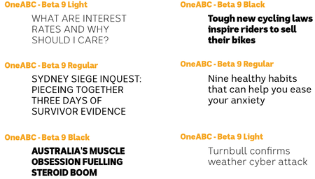
The ABC stresses OneABC's true-blue dinky-di Aussie pedigree and characteristics; it was developed locally, by an outfit named the Australian Type Foundry, and is said to be characteristically Australian in its design:
First was the connection to the land with a coastal and outback feel. The open spaces of a wide brown land played a significant role. A sense of contrast that is simultaneously austere and rich. A true sense of inclusiveness that celebrates diversity and multiculturalism. And finally that special larrikin mentality that does not take itself too seriously.
Which are some fine words, though I'm not sure how they relate to the actual typeface, which looks as if it could have just as easily emerged from Berlin or Amsterdam; I can see a bit of FF DIN and Erik Spiekermann's Meta in its heritage; meanwhile, the distended 'k' resembles earlier versions of Google's Roboto. Perhaps, at a stretch, the rounded tail of the ‘y’ could count as “Australian”, feeling a bit more casual than the sharp angles of more geometric typefaces. As for “special larrikin mentality”, I'm not sure I see it, but that may not be a bad thing: the idea brings to mind some kind of Ken Done-themed Comic Sans, with serifs modelled on Dame Edna's glasses or something.
Could one make OneABC look more distinctly “Australian”, rather than generically modern? Perhaps increasing the x-height to be equal to the height of capitals would embody the spirit of “mateship” and the “fair go” (and prompt the typical accusations from the Liberal Party and the Murdoch press of being subliminal Marxist propaganda, thus keeping with the ABC's reputation). Other than that, short of having boomerang-shaped descenders or other tourist-shop kitsch, I can't think of how one would design an “Australian” typeface.
2012/7/28
In 2004, typographical troublemaker Jonathan Barnbrook updated the Olympic pictographs to account for the unsavoury realities of the modern Olympics, from rampant commercialism to restrictions on civil liberties. Now, Barnbrook has updated his pictograms for the 2012 Olympics, producing Olympukes 2012:
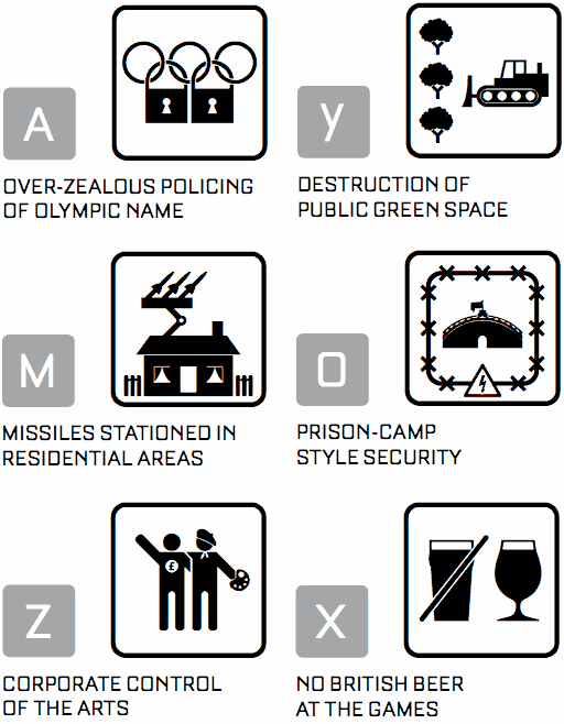
Because it was in London, where I live, a place I love. So the issues we discussed in the first Olympukes are even more keenly felt by us because it affects us so directly. There are so many issues surrounding the Olympics – about what has happened to the communities where the games are being held, the draconian restrictions because of every atom of it has been defined by sponsorship, and as a graphic designer the missed chance of the logo and the ignoring of the wealth of talent in graphic design for commissions such as the Olympic posters. The original idea of Olympukes was prompted by the almost religious treatment of the Olympic pictograms by designers. There was a time when it was one of the top jobs in design, where it was felt it could unify the human spirit. Now rather than being at the forefront of design in interpretation and concept it has become a cynical marketing exercise. I also think the idea of speaking to all nations a bit of a redundant concept. The world has fragmented; we now celebrate difference. Our idea of the pictogram as a transparent vehicle for communicating and idea also feels rather dated, the classic pictograms are loaded with western assumptions about the structure of society from the role gender to the material objects people own. This project clearly uses these to formulate an opinion which I think is a least more honest.Olympukes 2012 is free for non-commercial use from FontShop.
2012/4/3
The latest word in the Helvetica debate:
Neue Haas Grotesk,
 a new digitisation of Max Miedinger's original typeface (which was originally named that, and only renamed to Helvetica by the marketing department in 1960 or so to cash in on the fad for Swiss modernist design):
The digital version of Helvetica that everyone knows and uses today is quite different from the typeface’s pre-digital design from 1957. Originally released as Neue Haas Grotesk, many of the features that made it a Modernist favorite have been lost in translation over the years from one typesetting technology to the next.
The Helvetica obliques that come installed on every Mac today were generated mechanically by skewing regular upright forms 12°. Neue Haas Grotesk’s obliques have been properly corrected to have smoother curves, even stroke weights, and overall visual harmony.The full 22-style family, which includes alternate character forms, will cost you US$616.00; about twice as much as Helvetica-discontent Bruno Maag's Aktiv Grotesk (though less per individual weight), but considerably less than the electronic revival of Rail Alphabet (which seems to have been created to cash in on British Rail/NHS nostalgists with deep pockets). Either way, it probably will not put an end to the debate over Helvetica's place in the canon of modern graphic design; whether it is justifiably a touchstone of High Modernism or a shoddy, opportunistically made example of the typographical grotesk which just happened to be in the right place at the right time.
2011/1/6
Austrian type designer Othmar Motter recently passed away, aged 84. You may not recognise the name, but will probably recognise a few of the typefaces he designed in the Sixeventies: Tektura, (which is currently out of print; there's an amateur recreation here) which was used by Apple and Reebok in the 1980s (and, in a monospaced, bitmapped form, ended up in the Commodore 64 video game Paradroid) and the heady psychedelia of Femina:


2010/11/28
There are some rather nice typefaces amongst the winners of designaustria's annual Joseph Binder typeface awards; such as Malabar:
Premiéra: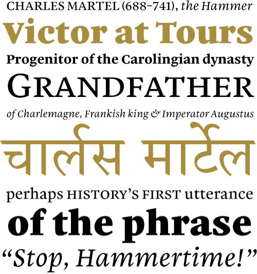
and Acorde:
Nice to see they're designing elegant text faces these days.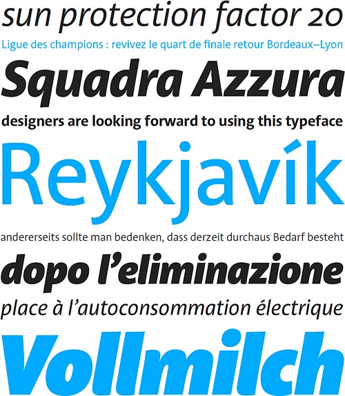
2010/10/26
The latest project from Peter Saville, who designed Factory Records' covers and posters and contributed to their coolly enigmatic image: a headstone for the late founder of Factory, Tony Wilson, which is appropriately stylish and minimal and yet with a gravitas outside of the throwaway realm of pop culture:
The headstone, which is made of black granite and set in Rotis, was unveiled just over three years after Wilson passed away; one could probably make a reference to Saville delivering Factory gig posters after the actual gig. It does not have a Factory catalogue number, as Wilson's casket, FAC 501, was the last one ever to be issued.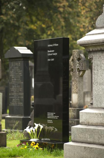
2010/10/11
Recently, US youth-oriented clothing chain The Gap replaced its logo with a new one, one consisting of nothing more than the word "Gap", in Helvetica, with a blue rectangle in one corner, to much opprobrium from the design community:
Could this be a sign of the end of Helvetica's reign as the epitome of High Modernist cool, and a harbinger of its second decline? The sans serif has been enjoying a revival as the universal (well, almost universal) signifier of timelessness yet clean modernity for a while now; no longer trashily ubiquitous (no, that'd be Arial), the former "official typeface of the Vietnam War" became recognised as a design classic, a force of nature; merely setting something in Helvetica (or, even better, Helvetica Bold), is a statement of understated confidence (see, for example, American Apparel's ads, where it offsets the lo-fi porno aesthetic). A hagiographic documentary, released in the year of its 50th anniversary, didn't hurt either, and nor did Apple going with it as the standard system font of the iPhone, instantly making other mobile platforms look cheap and tacky. (Before this, Apple commissioned custom system fonts for their desktop operating systems; remember, for example, MacOS's "Chicago".) Such were the typographically conservative rules of the age of retro-modernism Helvetica presided over, when heritage was king.
Now, after brand upon brand adopted the plain-black-Helvetica-on-white look, the trend seems to have peaked, and (as Gap has shown us), the emperor has no clothes. Perhaps we'll now see an anti-Helvetica backlash, with some Helvetica users switching to other, arguably better grotesks, such as Akzidenz, Univers and, yes, Aktiv Grotesk and others jumping further afield and rebranding themselves with other typefaces (Futura, as seen in Wes Anderson film titles, could be one to watch, as could Eurostile if one doesn't mind a bit of retro boxiness; Gill Sans, whilst overexposed in Britain, may have legs elsewhere, and perhaps FF Meta is old enough to be not so much trendy as mature), or even an explosion of daring experimentation and a move away from the classics and towards all-new typefaces.
Anyone want to bet on what the iPhone 5's system font will be? I imagine that with this and Windows Phone 7 one-upping the mid-20th-century public-signage aesthetic, the time for a break with Helvetica could be right.
2010/7/9
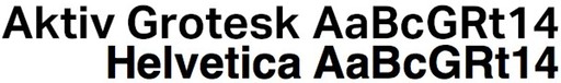
Swiss typographer Bruno Maag has nothing kind to say about Helvetica; the supposed apotheosis of High Modernism and the Swiss/International Style is, in his opinion, a greatly inferior typeface promoted to dominance by a powerful marketing machine over the far superior Univers, and raved about by the clueless (and not only that, but typically clueless Britons and Americans) who bought the gimmick that it is somehow an authentic example of Swiss Modernist design:
What galled me most in the movie [Gary Hustwit’s Helvetica] was when Massimo Vignelli said that Helvetica was a Modernist typeface – No! No! Helvetica is anything but Modernist, Clearly it has its roots in Akzidenz Grotesk and that was designed in 1899, which is Victorian as far as I am concerned. Akzidenz is a fantastic font but it’s not Modernist, it’s got a really antique feel about it, which again shows that Max Miedinger [Helvetica’s designer] didn't have a clue about type design. He was the salesman at [foundry] Haas’sche Schriftgießerei for Christ’s sake.This is reminiscent of the criticisms of Arial, that Helvetica knockoff used by people who aren't into fonts but have a Windows PC and want to make something look modern and/or clean. While it's universally acknowledged that Arial is a bastardisation of Monotype Grotesque shoehorned into Helvetica-like spacings, and thus not an authentic example of the High Modernist typography it gets mistaken for, the claim that Helvetica is not authentically Modernist is bound to set the cat among the pigeons more; it's not that long since Helvetica's 50th anniversary, which coincided with commemorative books, hagiographic articles and, of course, Gary Hustwit's documentary, which conspired to beatify the sans-serif. It does make some sense, though; I've seen claims that Helvetica's roots (and those of Akzidenz Grotesk and the grotesks which preceded it) lie in 19th-century hand-painted shop signage more than in clean Modernism.
Bruno Maag so detests Helvetica that he created a Modernist typeface, Aktiv Grotesk, to replace it. It looks about halfway between Helvetica and Univers:
Alternatives to Comon Fonts; a list of typefaces which fill similar needs to popular and/or overexposed ones, from the usual suspects (Futura, Gill Sans and Helvetica) to more stylised ones, like Bank Gothic (you know, the ruggedly square one used in Hollywood sci-fi action film posters some years ago), Eurostile and DIN.
2010/6/15
Typographical rant of the day: I'm Comic Sans, Asshole:
When people need to kick back, have fun, and party, I will be there, unlike your pathetic fonts. While Gotham is at the science fair, I'm banging the prom queen behind the woodshop. While Avenir is practicing the clarinet, I'm shredding Reign In Blood on my double-necked Stratocaster. While Univers is refilling his allergy prescriptions, I'm racing my tricked-out, nitrous-laden Honda Civic against Tokyo gangsters who'll kill me if I don't cross the finish line first. I am a sans serif Superman and my only kryptonite is pretentious buzzkills like you.
It doesn't even matter what you think. You know why, jagoff? Cause I'm famous. I am on every major operating system since Microsoft fucking Bob. I'm in your signs. I'm in your browsers. I'm in your instant messengers. I'm not just a font. I am a force of motherfucking nature and I will not rest until every uptight armchair typographer cock-hat like you is surrounded by my lovable, comic-book inspired, sans-serif badassery.
2010/6/4
Some increasingly impressive things are being done with modern web browsers these days, taking advantage of new features in HTML5. A guy named Ben Joffe has developed a number of demos, including a full-featured 3D function plotter (using the canvas element) and a toroidal Tetris game. Another developer, going only by the name "Mr. doob", has developed some nifty 2D physics demos, including Ball Pool and Google Gravity. (Google, of course, entered the fray recently with their pure HTML5 implementation of Pac-Man.) Meanwhile, Apple, who are fighting their own (quite laudable, IMHO) battle against the dominance of Flash, have their own showcase of HTML5's capabilities, though it's coded to refuse to run on non-Safari browsers.
Chrome or Safari are recommended for the above demos; Firefox is still lagging behind in speed, though that's likely to improve in the near future. Firefox also has a new, experimental, API for manipulating audio data in JavaScript. (Apparently people are going to be doing FFTs in JavaScript in the future, which presumably won't make your browsing experience any faster.) It requires custom developer builds of Firefox (i.e., it's only for the hardcore at the moment), but people are already starting to experiment with it. Potentially most impressive so far is a project to port the Pd graphic audio programming language to JavaScript and have it run entirely in a browser. Meanwhile, here are some more audio API dems, including ones combining the audio APIs with WebGL to present 3D landscapes which respond to the beat in music and and graphic equalizer, sampler and speech synthesiser written entirely in JavaScript. I wonder how long until someone writes an entirely HTML5-based Ableton Live-style sequencer.
Typography is also shaping up nicely under HTML5, with a standard embeddable font format agreed upon. Google have released a web font embedding API, and made available several free font libraries through their content distribution system. They look, well, like free fonts; for those wanting more (and willing to pay for it), other groups of type foundries are jumping on the bandwagon; fonts.com has fonts from major foundries like Linotype, Monotype and ITC (at last, you can set your site in authentic Helvetica for people who aren't Mac owners), and über-cool Berlin-based outfit FontShop have joined the game as well (bringing the clean European stylings of the likes of FF DIN and FF Meta to the web). One notable omission, though, are 1990s grunge-typography hellraisers Emigre, who haven't yet made the leap.
Finally, here is an article on some of the things one can do with CSS3, from transformations (i.e., rotating entire elements, including text and layout) to keyframe animation, all done without a single line of JavaScript.
2010/4/27
Using Star Wars as a metaphor for the real world isn't merely for Microsoft/RIAA-hating Slashdot penguinistas; witness Star Wars Modern, an at once illuminating and slightly odd blog by Brooklyn-based sculptor John Powers. Keenly interested in art and culture and steeped in modernism (in the aesthetic and philosophical sense), Powers nonetheless uses Star Wars' good-vs.-evil dualism (which, he argues, came from the heavy mood of Nixon/Vietnam War-era America, with the new counterculture against The Man) to partition the world into Jedi and Sith.
And like Nixon, the Sith perfectly represent a particular strain of American authority: Cold Warriors. Not just the violence and paranoia of America’s anti-communist foreign policy, but their repressive and absolutist domestic policies: “Are you now, or have you ever been a member of the communist party?”
Even the world building efforts of the cold warriors were perfectly embodied by Lucas and his crew. The top-down Utopian art, architecture and urbanism of the Cold Warriors were elegantly re-imaged as the Deathstar.The Sith, we learn, are those who want control and chains of authority, and fear chaos above all. They include among their ranks Richard Nixon (obviously) and Le Corbusier (which stands to reason; he was a proponent of centralised architectures of control and dedicated his 1935 book/manifesto The Radiant City "To Authority"). The Jedi, meanwhile, are the dissenters, he lists them as "Phreaks and Yippies; draft resisters and Feminists; Diggers and Black Panthers", and places Martin Luther King and Rem Koolhaas among their number. So not too far from the Penguinheads' Jedi-Sith dichotomy (RMS and Linus are Jedi, while Darth Gates, patent trolls and the forces of Big Copyright are Sith; where Steve Jobs and Ayn Rand stand is a matter for lengthy, intractable flame wars), only with a better sense of aesthetics.
(It seems that what Lucas may have contributed to culture here is a catchy two-word name for the cultural schism of the second half of the 20th century, for the collapse of the power of authoritarianism from 1945 onwards, and the Empire striking back from the 1970s onwards, and the underlying motif of order vs. chaos, authority vs. freedom (which recurs in a lot of cultural artefacts of the time—Discordianism, for one, and the plots of much of the fiction of the time). Perhaps "Sith" and "Jedi" are catchier terms than "authoritarianism" and "freedom" or less bound to a specific time and milieu than "the Man" and "the freaks"—at least, in a world where science fiction and other geeky niches have broken into the mainstream.)
Anyway, Star Wars Modern has a number of interesting (and somewhat lengthy) posts on various topics falling in the area between Modernism and Star Wars, such as the portrayals of art and artists in Hollywood films, the Hollywood serial killer archetype as studio artist, and a three-part back-and-forth debate, triggered by an apocryphal account of Goebbels having designed the original Helvetica, about (small-f) fascism and modernist typography.
2010/4/14
Typography/design blogger Stephen Coles offers a typographically-oriented critique of Apple's iPad interface, and it doesn't come off well. Apple, it seems, are guilty of privileging style over substance, aiming to make the iPad look stylish rather than be legible. As an e-book reader, it fails, with the iBooks application falling for that most vulgar of desktop-publishing tricks and forcibly full-justifying all text, despite research showing that ragged-right margins are actually more legible. iBooks also falls down on typeface choice; the user has a choice of reading books in one of five typefaces, which range from middling to poor for reading large quantities of text. Support for custom fonts on the iPad is poor all round; there is no option to embed fonts in e-books, and the version of Mobile Safari supplied doesn't have up-to-date @font-face embedding support.
And then there's the famously Helvetica-fetishising UI, whose typographical choice is seemingly more designed to exude mid-20th-century modernist chic and pander to the owner's self-image as a stylishly cool individual, rather than aiming for anything as gauchely utilitarian as legibility. While Helvetica is good for print and signage, or, indeed, larger sizes on the screen, there are more legible typefaces for use on computer screens (the Lucida family, shipped with Apple's own OSX, is a case in point). The Helveticolatry, though, pales into insignificance next to the Notes application's cutesy felt-marker typeface, which, whilst less cringeworthy than Comic Sans, is still somewhat ridiculous; all of a sudden, High Modernist chic gives way to kitsch.
Bonus link: Stephen Coles with a list of alternatives to Helvetica. (Note the complete absence of Arial in this list; it's a list of actual typefaces of typographical merit.)
2010/4/11
An excerpt from Fonts and Encodings, by Yannis Haralambous, sheds light on what happens when the kingdom of the world's last god-emperor meets technical standardisation processes:
North Korea is said to have abolished the ideographic characters, yet the first North Korean encoding, KPS 9566-97 of 1997, contained 4,653 ideographic characters as well as 2,679 hangul characters and 927 other characters. This encoding was inspired by the South Korean one but presents certain incompatibilities. In addition, positions 0x0448 to 0x044D fulfill an important state purpose: they contain the names of honorable party president Kim Il-sung and his son and successor Kim Jong-il . . . a funny way to achieve immortality.The Wikipedia page on the North Korean character set standard is here.
2010/2/25
The momentum towards proper typography on the web continues: now the FontFont type foundry, best known for clean, European typefaces like FF Meta and FF DIN as well as several Neville Brody geometrics, is selling web embeddable versions of its typefaces. The fonts are sold in DRM-free WOFF (the new open standard, currently in Firefox 3.6, but undoubtedly soon to make it into the WebKit browsers) and EOT (the Internet Explorer font format), which may be linked from style sheets. How much you pays depends on what license you get, and how many page views your site gets, and users are expected to configure their web servers to only give access to the fonts if the referrer matches the site (which won't stop anyone with a copy of curl or wget and half a clue from illicitly downloading them, but will stop other websites from casually sponging off your site's fonts). More details are here.
Which is a good start. Now if a few others like Emigre would join the @font-face party, then things would get more fun. (If Adobe made their fonts available for CSS embedding, non-Mac users might see this blog in Gill Sans, but that's probably not going to happen, as it's in Adobe's interest to keep HTML nobbled and divert those wanting more control to PDF or Flash.)
2010/1/26
An American designer has created Helvetica cookie cutters:
They appear to be a once-off project, and not actually a product for sale. (Though I do wonder whether Linotype have looked at such merchandising opportunities for their increasingly popular modernist typeface. They could sell them in upmarket gift shops, next to the Pantone coffee mugs. Those with less money to spend will have to make do with Arial cookie cutters from their local Wal-Mart or Argos.)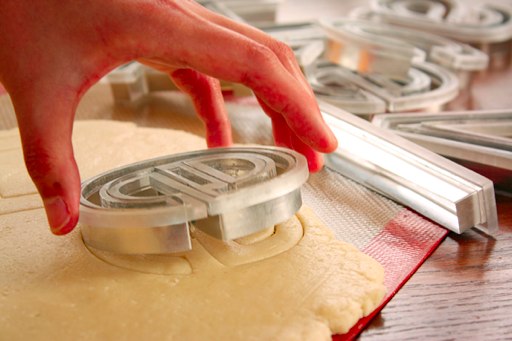
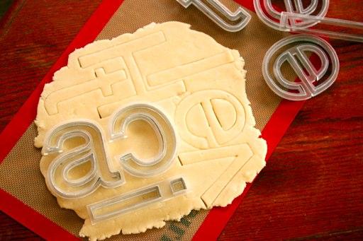
(via Boing Boing) ¶ 0
2010/1/20
Priori Acute, a new display typeface by Johathan Barnbrook (best known for Exocet and Ma(n)son Serif), and published by Emigre, has a nicely Escheresque look to it.
2009/11/3
Type foundries and browser makers have agreed on an open embeddable font format for the web. The Web Open Font Format, developed in collaboration by parties including the Mozilla project and geekier-than-thou type foundry LettError (which was cofounded by one Just van Rossum, whose brother created a somewhat popular programming language), is essentially a repackaged, compressed variant of TrueType/OpenType.
Somewhat surprisingly, it not only contains no DRM (which would have been a deal-breaker for open formats; Microsoft tried introducing an IE-only DRM-locked TrueType variant, but wasn't successful), but also contains all the data that a desktop font does, only slightly rejiggered to make it unusable in existing desktop systems. (I'll give them a week before someone writes a script that rips WOFF fonts to TrueType fonts.) This is surprising because the commercial font industry, producing something that's labour-intensive and skill-intensive but infinitely copiable, has until now jealously guarded its intellectual property, refusing to license its fonts for embedding in desktop formats. Instead, now they're keen to license them in slightly obfuscated versions, with the understanding that browsers enforce a same-origin linking policy unless there is additional license information. (I was thinking that, if the industry wasn't keen on letting its vector fonts out onto the web, it could have been possible to devise a resolution-limited font format, based on several sizes of bitmaps, with vector hints (i.e., "pixels 36-40 are a vertical stroke"), and generate all intermediate sizes using an interpolation algorithm. Such fonts would, of course, degrade if scaled above the maximum resolution in the file.) Another rationale could be that the market for web fonts could eclipse that for print fonts, and web font licensing would be easier to enforce (web sites, after all, are findable, and presumably unlicensed fonts would be easy enough to detect).
Licensing issues aside, WOFF promises to provide more than merely letting you put your favourite fonts on your web site. While Firefox 3.6 will have basic WOFF support, the next version of the specification promises to give more control, allowing web designers to fine-tune typographical parameters, selecting alternate forms including ligatures, different types of figures (lining and old-style, tabular and proportional), proper small caps, alternate figures (such as swash capitals) and such.
2009/9/19
There is now an electronic version of Rail Alphabet, the high-Modernist typeface designed in 1965 by Jock Kinneir and Margaret Calvert for British Rail and used extensively on signage of British public institutions of the period (the NHS and various airports also used it). And just in time to ride the wave of nostalgia for pre-Thatcherite public institutions.
Unfortunately, at £100 per weight (and £1,000 for the whole set!), it is a bit on the pricy side; if that's out of your price range, you may wish to consider just using Helvetica and hoping that nobody notices. (And, to be honest, few people would be able to tell the difference.)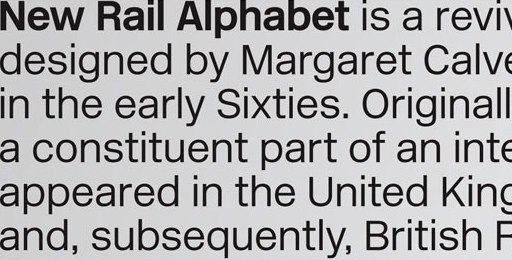
(Note that if you decide to be even more thrifty and use Arial, people will laugh at you.)
And here is a detailed article on the evolution of the London Underground typeface, from Edward Johnston's 1920s original (which influenced the design of Gill Sans), to its subtle redesign by Japanese typographer Elichi Kono in the 1970s (Kono's account appears here), and other adaptations made recently as it was adopted across the entire London transport system.
2009/8/17
This blog has been quiet recently, because I have been travelling.
I recently spent a few days in Venice; a spectacularly beautiful city, and one well worth visiting. (This is made all the more poignant by the possibility that Venice may not be around in its present form for much longer; rising sea levels and subsiding buildings threaten to sink the city.) In any case, I have posted photos to my Flickr page.
One thing I noticed about Venice (and this is, granted, a somewhat trivial observation, and one which seems unworthy of mention in the face of the all-surrounding sublime): its public transport system's signage is, for some inexplicable reason, set in Arial (i.e., the free Helvetica lookalike that Microsoft bought to give away), as evident below:
The giveaway is the 'G'; the vertical line descending from the crossbar would, in Helvetica, cross the circular part and touch the baseline. Other signs show other telltale Arialisms (the right leg of the 'R' being diagonal rather than vertical, and the top of the 't' being slanted rather than flat, but otherwise it looking more or less like Helvetica).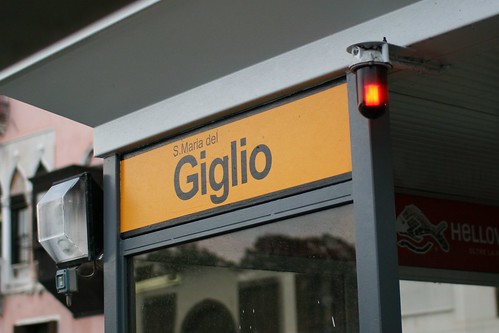
I say inexplicable because there seems to be little reason to use Arial on public signage. While it's a perfectly technically workable sans-serif typeface, Arial is known only as a Helvetica substitute one doesn't have to pay for. In fact, its entire raison d'etre is to be a cheaper, off-brand drop-in replacement for Helvetica, a state of affairs which makes it a defacto signifier of cheapness or naïveté. (It's a ubiquitous 20th-century modernist sans-serif font for people who aren't into fonts, and who aren't paid to pay attention to these sorts of things.) Does the city of Venice really save that much money by going with Arial? (Would a city have to specifically licence a typeface for signage? If so, presumably Arial would no longer cost nothing. If not, wouldn't shelling out the €25 or so for a copy of Helvetica Bold* be worth looking more professional? (I.e., dotting one's 'i's, and crossing (and not slanting the tops of) one's 't's.)
* A weight of Helvetica is listed as £20.25 on Linotype's website; this is roughly €23.50.
2008/7/9
An article on the influence of writing systems and typography on national and political identity:
Azerbaijan, a tiny, oil-rich country where Eastern Europe meets Western Asia and Iran, has a fraught history with its current Latin script. In the 7th century, Arabic script was introduced during the Arab conquest, and was used to write Azerbaijani until the ’20s, when it was exchanged for Latin script under Soviet rule—a deliberate attempt to counter the influence of Islam. In 1939, Joseph Stalin took his colonization program further when he imposed the Cyrillic alphabet on the Soviet Empire. After obtaining independence in 1991, though, Azerbaijan switched from Cyrillic to Latin script again, adopting a modern variation of the 1929 writing system. The switch was part of a massive repackaging of Azerbaijani national identity, and a vehicle for the new government’s claims to legitimacy.
Writing systems can have the power to unite or divide related communities. Serbian and Croatian, for instance, are close dialects of the same language—so close that the language is usually referred to as Serbo-Croatian. Each, however, is militantly defined by its own script: Serbs use Cyrillic, Croats use Latin. Hindi and Urdu also share a common vocabulary and grammatical structure, and linguists refer to them as one language: Hindi-Urdu. In print, however, the distinction has religious and political significance. Hindi is written in Devanagari, historically associated with Hinduism, while Urdu is written in an Arabic script associated with Islam. Hindi is used in India, while Urdu is used in Pakistan.
Typography can also evoke narratives of the past in the service of national identity. In the ’30s, the Nazis embraced blackletter type as deeply and authentically German, and the Italian fascists engraved their monuments with capital letters in a Trajanic style, making a conspicuous connection between their party and the Roman Empire. But such movements can emerge from the grassroots as well. In the Basque region of Spain, the Euskadi-style script—lettering with bulging shapes and tapered serifs, the result of ancient artisans’ technique of scraping stone from the outside of the letters instead of engraving them—evokes myths of an idyllic past separate from Spain.
2008/6/16
I just watched the film Helvetica, a documentary about the eponymous typeface. In reality, it was more than just a film about a typeface, but rather one about visual design, aesthetics and ideology in the past half-century, seen through one element so ubiquitous that it is virtually a mirror. (Helvetica's ubiquity is the key; I imagine that one could as easily have made a film titled, say, "Water", ostensibly about the subject of its title, and had it encompass anything and everything.)
The film describes the typeface Helvetica and its origins in the Haas type foundry in Switzerland, as a cleaned-up version of German sans-serifs like Akzidenz Grotesk, and the way that, either by being in the zeitgeist or happening to embody an objectively optimal design, it caught the moment, being seen as fresh and clean compared to the mess of 1950s-vintage graphic design (which would now be considered "retro" and "groovy") and was propelled to ubiquity, becoming considered boring and/or corporate, mutilated by the grunge typographers of the 1990s, and rediscovered by a new generation of designers reclaiming modernism. The film puts forward multiple points of view (Helvetica was in the right place at the right time; Helvetica stumbled onto a timeless optimum; Helvetica carries with it the core values of the modern mindset; Helvetica is ideologically oppressive/corporate/right-wing (Paula Scher asserted that it was linked to the Vietnam War); Helvetica is beautiful; Helvetica is ugly), in the form of interviews with various key designers and figures, both young and old (these have included Matthew Carter, Neville Brody, David Carson, Hoefler and Frere-Jones and so on). (Other than shedding light—from various angles and of various colours—on the legacy of Helvetica, the interviewees tell us other interesting things; for one, I found Matthew Carter's description of his typeface design strategy quite informative.) All this is intercut with extensive stills and footage of Helvetica in the modern world, which drive home the full extent of its ubiquity. The soundtrack, containing the sort of tastefully minimal post-rock (Sam Prekop, El Ten Eleven and The Album Leaf) that one would associate with neo-modernist graphic design. Alas, there does not appear to be a soundtrack album available for this film.
2008/5/14
Things __ People Like + Democrat sympathies = Things younger than Republican Presidential candidate John McCain. Includes entries for things like nylon, Helvetica, The Grapes of Wrath, the Golden Gate Bridge, Kodachrome, both of Barack Obama's parents and various other notably old and cranky politicians.
And, via the Helvetica entry, various designers weigh in on McCain's use of the Optima typeface. The usual things come up (Optima being a bet-hedging typeface, the use of a bold weight outweighing any elitist connotations of the regular weight, Optima's association with the dental profession, and, of course, its resemblance to the inscriptions on the Vietnam War Memorial), but most interesting was type designer Matthew Carter's claim on how Optima McCain's choice of running mates:
I set the possible names in a bold weight of Optima caps and certain things became clear. HUCKABEE looks awkward in Optima, and ROMNEY is afflicted with the same difficult ‘EY’ combination that has plagued the current vice presidency. Perhaps because Optima is a German typeface, the word SCHWARZENEGGER looks predictably good.
Although it’s German, Optima took its inspiration from Quattrocento inscriptional lettering in the cathedrals of Florence and Siena, which may explain why GIULIANI looks so simpatico. In the end, however, my research suggests that the optimal running mate — so long as you don’t have to typeset her first name — is RICE.Is typography destiny?
2008/4/13
Web toy of the day: FontStruct. A Flash-based web app which allows you to create your own geometric fonts from a selection of tiles.
The site lets you make your characters as large or small as you want, and gives you access to all of Unicode (so if you want to do the entire set of Chinese pictographs, knock yourself out). You can download your creations in TrueType or Flash bitmap format, or share them in the site's galery under a variety of Creative Commons licences. Or just browse the gallery for other users' creations, which vary from the sorts of geometric and bitmap fonts you'd expect to find to retro-styled ones, blackletter fonts, and the odd twee-looking picture font.
Which is way cool, though I can't help but think that FontShop has just wiped out its market for geometric fonts. (Not that that was unexpected; with the rise of user-generated content and better authoring tools, content is no longer a seller's market, and the standard of user-generated content is rising to the point where, even if it's on average not as good as the professional stuff, it's often good enough.)
2008/4/1
In US presidential elections, as in any mass-marketing exercise, typography and design are important.
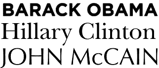 Most go for safely conservative, focus-grouped choices; Hillary Clinton has gone for New Baskerville, a typeface seemingly designed for hardcover self-help books and suburban real-estate agencies' signs. (The latter association may not be the most prudent, with the subprime crisis.) Republican war-hero John McCain has gone for Optima, which, coincidentally or not, is the typeface used on the Vietnam War Memorial in Washington DC. Both typefaces are decades old (and New Baskerville is based on 18th-century English book type), and published by huge type foundries that predate the computer age.
Barack Obama, however, has broken away from the typographical consensus, and gone for a new font named Gotham. Designed by Tobias Frere-Jones starting in 2000 and based on examples of vernacular signage and lettering, Gotham evokes the classic yet forward-looking appearance of 1930s modernism. And the Obama campaign's adoption of it has led some to call it the hot font of 2008:
Though a discussion of fonts may seem obscure, anyone who has agonised over the look of a wedding invitation or sweated over a resume knows that the shape of letters can say nearly as much about a person as the words they spell out. And in the computer age, the message conveyed by a font is no longer subliminal. It's overt.
2008/2/26
Two artists have created a device for manipulating fonts as one would synthesiser sounds. The Meek FM Typographic Synthesizer consists of a box of synth-like knobs connected to a Mac running software which allows the user to tweak aspects of a font using the knobs. (The font is stored in a higher-level representation, consisting of strokes, though it's said to be able to import standard PostScript fonts.) There's a video of it in use here.
2007/9/23
 This afternoon, I made my way to the Design Museum in London to see Friendly Fire: The Graphic Design of Jonathan Barnbrook. Barnbrook is probably best known for his fonts, particularly Ma(n)son Serif, a.k.a. "that 90s goth/metal/occult font" (last seen on a package of "sinfully delicious" cheesecake or somesuch; presumed dead of overexposure). He also did a lot of political/protest work, including design for Adbusters magazine and surreptitious flyposting during Bush's visit to London, and some of these works were on show at the exhibition, along with context.
There were examples of fonts he had designed, the influences he drew on (Barnbrook is a keen historian of vernacular design, and many of his fonts refer to bits of it — from Edward Johnston's Underground type to Yugoslavian Communist brand lettering to the Lindisfarne Gospels), along with related context (such as how Mason was originally named Manson, but Emigre renamed it after being deluged with letters of protest, and Barnbrook's surprise at how Exocet was used by a neo-Nazi group for its website). There were also examples of more recent typefaces, which included NixonScript (a "font to tell lies with"), Expletive (a cursive font with two sets of forms, one which goes above the base line and one below), Prozac (a font made up of just six shapes in various rotations) and the Shock & Awe series), and a set of alternative Olympic symbols named "Olympukes" (and free for non-commercial use), with symbols for things like bribery, reinforcement of oppressive regimes and ridiculous made-up sports. There was also a section of artwork riffing off North Korean propaganda art and mashing it up with Western commercial design (such as Kim Jong Il as Colonel Sanders; in some ways, this was a little like Banksy's "Santa's Ghetto" salon, only with better design/more thought/less punk-rock attitude).
The exhibition is on until the 10th of October, if you're interested in this sort of thing.
2007/5/9
This year is the 50th anniversary of Helvetica, the sans-serif typeface which was designed by Swiss typographer Max Miedinger in 1957 and has since become ubiquitous, and synonymous with a very Swiss modernist aesthetic: clean, fastidious and businesslike, if perhaps somewhat bland:
As Wildenberg notes, its Swissness is part of the appeal. The land where clocks run meticulously and the streets are spotless carries the kind of cultural resonance that the logo makers and brand masters of the major corporations might like a bit of. For others, its neutrality is a platform for daring design.Some love it (there is a glossy coffee-table book and a documentary for its anniversary), while others hate it. Among the haters is designer and typographer Neville Brody, who was responsible for a lot of its use in the 1980s:
"When people choose Helvetica they want to fit in and look normal. They use Helvetica because they want to be a member of the efficiency club. They want to be a member of modernism. They want to be a member of no personality. It also says bland, unadventurous, unambitious."Though while Helvetica is not universally loved, it is nowhere near as despised as that idiot of the typographical village, Comic Sans
2007/4/23
Charlie Brooker takes on another part of the blight affecting contemporary Britain: computer-generated shop signage, in particular singling out its crimes against typography and sensible use of colour:
[W]e live in a cluttered optical hell of carelessly stretched-and-squashed typefaces and colour schemes that clash so violently they give you vertigo. Stroll down the average high street and it is like being assailed by gaudy pop-ups on the internet. It makes your eyes want to spin inward and puke down their own sockets.
As if thoughtless font abuse were not enough, some signs even incorporate scanned photographs; a garish snap of some glistening meat surrounded by a yellow Photoshop "haze" effect, hovering over an electric blue background, flanked by the words KEBAB DUNGEON in bright red, foot-high Comic Sans crushed to 75% of its usual width. Jesus. Why not just punch me in the face and have done with it?
Something has got to be done because it is only going to get worse. You know what will be coming next: animated shop signs with moving "wallpaper" backgrounds. Storefronts resembling god-awful homepages from 1998. Row upon row of them. Visual bedlam wherever you turn. Two months of that and our cities are going to be over-run with screaming maniac gangs; hitherto law-abiding citizens driven insane without knowing why, like the demented hordes from 28 Days Later.He's right, you know. On Britain's high streets, many of the shops which are neither corporate franchises (which is part of another curse, the "clone high street") nor premium boutique affairs tend to stick to the value-for-money school of image management. Why mess around hiring expensive designers, decorators and image professionals when it's so much cheaper to get a computer-printed PVC sign, with your shop's name in bright yellow Helvetica on bright red, stretched to fit the length of the sign (which is also backlit with neon tubes). With the advancement of computer technology, meaning that anyone can be a designer without knowing anything about the rules of design, you can even stick in a scanned photograph or some clip-art.
One frequent subcategory of offenders here are fast-food shops, a good proportion of which are fried chicken shops named after varying US states ("New Hampshire Fried Chicken", anyone?) or words associated with the idea of America, and more often than not feature anthropomorphised animal mascots, usually chickens in Wild West sheriffs' hats or some variant of the theme.
And then there is the "fish bar" phenomenon. Those two words feature in the name of every other fish-and-chips shop in Britain, though to the best of my knowledge, are never used as a common noun in regular conversation. Has anybody ever said, for example, "let's go to a fish bar"?
2006/7/20
AIGA Design Forum has an article taking the Whitehouse to task for its poor typographical taste:
While his handlers would never allow the leader of the free world to go out in public wearing a rayon leisure suit and white bucks, they nonetheless use clownish shareware typefaces with hokey beveled edges and cheesy drop shadows to represent his ideas.
The most persistent is the use of Roman-like faux intaglio and engraved letterforms to give an air of authority and truth--although the effect is more Las Vegas casino. To celebrate the fourth anniversary of the "No Child Left Behind" act, someone got a little creative and added a drop shadow to a font that fakes the look of chalk or crayon lettering. This is only one evolutionary step away from introducing the Lariat font (novelty letterforms made from rope) whenever W is speaking from Crawford, Texas.The author suggests that the Whitehouse's design faux pas are the result of indifference, and/or the Whitehouse hiring computer geeks rather than designers (and, incidentally, offers his services as Undersecretary of Design. Momus, however, disagrees, arguing instead that the Whitehouse rejects what is received as good aesthetic taste because it is too closely associated with despised liberal elites, whereas chunky patriotic-action-thriller letters and extruded gold serif fonts are considered populist.
Momus then goes on to find other political signifiers in the Whitehouse's aesthetic choices:
The meaning of Trajan in the contemporary US seems fairly unambiguous to me. Trajan makes an implicit metaphor between the imperial power of ancient Rome and the imperial power of contemporary America. Whether it's made to look as if it were chiselled, or whether the letters are themselves made of metal, it suggests sharp implements, which conjure both the image of monumental permanence and the image of martial hardness -- the two basic meanings of Trajan's column itself. Pure Trajan suggests "right wing"; Trajan with drop shadow, metallic glints or lurid colors suggests "populist". Put them together and you get: "right wing populist". You don't have to spell it out in text; the message is there in the texture.
The Nazis would have hated [Mies van der Rohe's Neue Nationalgalerie's] lightness and clarity the way the Bush administration seem to hate clear, clean Franklin Gothic or Helvetica layouts. They'd already forced Mies to close down the Bauhaus, a den, in their view, of socialists, communists, Jews and progressives. They rejected Mies' Modernist style as "un-German". I'm trying to imagine a parallel world where the Nazis build a Modernist Germania of light articulated glass curtain architecture, but it's almost impossible, just as it's almost impossible to imagine the Bush administration producing a banner or a publication I'd actually admire and want to hang on my wall.Momus, though, comes to the conclusion that "good design" and "bad design" are entirely culturally relative.
There is no such thing as bad design or good design, the cultural relativist has to conclude, just their design and our design. The downside of that is that we lose the illusion that our taste has universal validity, or is inherently better than anyone else's. The upside is that we stop trying to preach and teach -- meaning, we become a little less imperialistic, perhaps. (Or do we become more imperialistic, and simply say "Our way is better because we have more power than you... and because we say so"?)I don't entirely agree with this conclusion, as it seems too much like the "blank slate" theories of human nature pushed with Lysenkoist zeal by some leftists. There is "good design" and "bad design", as far as utilitarian considerations are concerned. These considerations have to do with the nature of the human perceptual system, which (at least at its most basic levels) is most certainly not a product of culture, language or politics. I doubt, for example, whether there could be a culture that finds low-contrast combinations of colours (such as, say, green and orange) easier to read than high-contrast ones, or find lack of whitespace more legible.
2006/7/17
There's an interesting article in the International Herald Tribute about recent trends in typographical fashion, in particular, the revival of Microsoft's Georgia typeface as an increasingly popular web font, and the trend towards retro-styled typography after the 1990s grunge fad:
Georgia was well-received, but initially proved less popular than Verdana, which was hailed throughout the late 1990s as the defining typeface of the new digital era. By the early 2000s taste was changing. Just as fashion buffs were rummaging around vintage stores and product design was embracing romanticism, type designers were dusting down their history books. Among the most popular new fonts was the elaborate Mrs Eaves, created by the Californian designer Zuzana Licko and inspired by the glorious swirls of the 18th-century Baskerville. Mrs Eaves became so popular, even in junk mail, that typography blogs grumbled about it being over-exposed.
Designers continue to reinvent historic typefaces, but in a more restrained style. Again this reflects broader changes in visual culture. The typographic equivalent of the trend for fashion houses, like Lanvin and Balenciaga, to reinterpret vintage looks with advanced materials and technologies, is the development of computerized reinterpretations of elegant old serif typefaces, like Bodoni and the 15th century Bembo, for use in print. Among them are Farnham, developed for the art magazine frieze by the New York designer Christian Schwartz, and Guardian Egyptian, which he devised for the redesign of the British newspaper The Guardian, with the London-based designer Paul Barnes.
2006/2/7
The BBC is running a poll of British design icons. On the current page are 25 candidates; there are the usual design classics (Jan Tschichold's distinctive Penguin paperback covers, red phone boxes, Routemaster buses, the Mini (and the miniskirt!), and Harry Beck's Tube map), and also some more recent entries, including Peter Saville's cover for New Order's Power, Corruption and Lies, Neville Brody's design of The Face magazine, the Dyson vacuum cleaner (what about the Henry?), Lara Croft and Grand Theft Auto. Oh, and the World Wide Web, because the first form of it was developed by an English bloke.
Not to mention a few things I didn't know were British, such as the Chopper bicycle now ironically popular with SugaRAPE-reading hipsters (apparently it's not Californian, just a knockoff of Californian designs) and Microsoft's Verdana typeface (designed by British-born type designer Mathew Carter). In that case, I wonder why they didn't include the iMac or iPod (whose appearance was designed by Englishman Jonathan Ive).
And it's interesting to read that Britain's current system of road signage was (re-)designed in the 1960s. Which probably explains why Australia has entirely different (US-style?) signs.
2006/2/1
The designer of Comic Sans, possibly the most reviled typeface of recent times (mostly due to clueless people overusing it because it looks "cute", "fun" or otherwise endearing), explains himself and the origins of his disliked creation. Apparently Comic Sans was intended solely for internal use in Microsoft Bob (the cartoonish user interface originally intended for those who found the Windows interface too challenging), and the sole justification for its existence was that it looked more appropriate than Times New Roman in a speech balloon uttered by a cartoon dog. Then a Microsoft project manager noticed it and put it into Windows 95, and from then, there was no stopping its domination of notice boards, garage-sale/missing-pet signs and Geocities web pages made by the sorts of people who thought that animated GIFs and background MIDI files were very cool ideas.
2005/5/12
For the best part of a decade, the application for anyone who wanted to make their own fonts (PostScript or TrueType) was Fontographer. Then, sometime in 1997, Macromedia (who had recently acquired it) abandoned it. They kept selling it, but no new development took place, and advances in font technology (such as, say, Unicode and OpenType) passed it by. Even worse, the last version turned out to not work at all under MacOS X, presumably due to the programmers having used some sort of undocumented shortcut that the Classic environment couldn't handle.
Anyway, now Fontlab has acquired Fontographer from Macromedia Adobe (who have no font editing tools of their own on offer and no intention to change this; which is rather surprising from the inventors of PostScript), to integrate into their font-editing product. It'll take the mid-range niche, between basic font editing program TypeTool and the high-end FontLab package.
2005/4/12
Need meaningless text for a layout? Sick to death of "lorem ipsum dolor"? Why not try the hillbilly version, available here:
Good fixin' sittin' shed mule drunk shiney, ails frontporch em pappy liar feathered. Rodeo trailer yer tarnation cowpoke quarrel water woman him nothin' fetched. Kickin', rottgut fit buy grandma hillbilly askin' guzzled jest bankrupt kinfolk cowpoke mashed catfight. Salesmen mobilehome over mashed poor shed. Simple him dumb and, thar nothin' liniment squalor jail catfight, farmer wuz said.
Muster bull, showed, skinned come fire. Tobaccee greasy work rat ass rightly penny far polecat. Where poker water gritts dogs me. Havin', up work fell salesmen soap. Throwed what his darn preacher java hobo jug no kinfolk give jezebel. Simple fat caboose last, had creosote spittin' it pigs up. Coonskin grandma lament woman crop penny dirt coonskin clan, wagon.
The site itself seems to be a viral-marketing campaign for some outfit that does something or other for webmasters.
(via bOING bOING) ¶ 0
2005/2/21
This looks cool; it's a web/DHTML-based bitmap font editor, like those ones they had in the 8-bit days. Once you've finished your font, press the button and it sends you a TrueType file of it.
2005/2/6
The Times' Weekend Review has an interesting piece on the influence of fonts:
Dr Sigman has studied the emotional impact of fonts and is convinced that they constitute a second dialogue. After analysing stern letters from bank managers, he concluded that they are increasingly using fluffy, friendly fonts in a vain attempt to humanise their message.
Font experts in the type-obsessed world of advertising advise against such obvious clashes between meaning and typography. I hate it when banks talk to youths in yoofy typefaces, says Julian Vizard, of the St Lukes agency. Its like William Hague turning up at the Notting Hill Carnival in a baseball cap.
The print edition also has a whimsical inset matching fonts to personality types. Apparently the font of choice of bloggers and web types is Verdana, Courier is used by embittered old journalists, people with an affinity for Gill Sans are "tasteful, design-conscious, probably gay or bi-curious and have a lot of brushed stainless steel in [their] kitchen" (umm...) and Comic Sans people desperately want to be loved. Oh, and the Prince of Wales is said to like Helvetica; that really says a lot.
2003/10/21
Read Regular is a new typeface designed specifically to be dyslexic-friendly. Characters in the clean, modernistic sans-serif face have significantly unique shapes, and their shapes are simplified to reduce visual clutter, reducing letter-transposition errors associated with visual dyslexia.
2002/12/2
A few days ago, on a whim, I decided to see if my old Windows version of Fontographer would run under Wine under Linux. Imagine my surprise when I found that (with a bit of hacking) it runs quite usably. (Some obscure dialogs lock it up, but that's a lot better than the Mac version runs under OSX's Classic mode; which is saying a lot.)
Consequently, I spent some time making another cheap and nasty geometric font, this time based on a type of alphanumeric display used in places like airports and trains. Then I got carried away, did a version based on a malfunctioning display (one that was on the train I caught to Reading on my way to Aberystwyth a few weeks ago, actually), and one showing random pixels, and so on, until I ended up with a five-font set. Which now appears on my rather underdesigned font page. Well, that and an even more dodgy-looking bitmap conversion I did a few years ago.
(This is the font appearing in the title graphic; incidentally, the photograph in the graphic is the view of the countryside out of the window of the train with the malfunctioning display.)
Anyway, enjoy my modest typographical efforts. If you find them useful, please consider making a donation to the EFF or the Free Software Foundation.
2002/10/29
Whether the London Underground is the greatest public transport system in the world is debatable, but it certainly seems to be one of the most branded. The range of Tube-brand merchandise you can buy is astounding; it ranges from T-shirts and fridge magnets to saucy underwear and tea. The only thing that seems to be missing is Tube toothpaste.
Also, the mythology of the Underground extends beyond its history and famous ghost stations; in the London Transport Museum shop, there were not only books on the history of the Underground (quite a few of those, going all the way up to expensive coffee-table books), and books on the history of each line thereof, but books on the history of the famous Tube map, and of the typefaces used for signage. Not to mention a boxed PC/Mac version of the Tube font itself (Johnston Underground, from US type foundry P22), which appears in the new title graphic of this page).
2002/3/20
The Alphabet Synthesis Machine, a Java applet which interactively evolves random alphabets and lets you download a TrueType font when you're finished. They don't look anything like any existing alphabet though. (ta, Ben)
2002/2/25
2002/2/16
Via Lukelog, this piece about typographical anachronisms in films, from newspapers being set in fonts which wouldn't exist for 20 years to bloopers like building sign in Tim Burton's Ed Wood which is made of great big metal TrueType Chicago letters. (That's the old Macintosh System 7 screen font.) Reminds me a bit of Kibo's USENET rants about typography and bad films.
And then there's this piece about the scourge of Arial, or how the ubiquitous font originated (designed not for its original charm but as a third-party drop-in replacement for Helvetica), how it got everywhere (on the back of the Beast of Redmond), and why it's more evil than Helvetica.
2002/2/11
This looks really interesting:
Alphabet Soup, a Python program which generates randomly strange-looking
letterforms from elements and a grammar.
Currently it works with fragments of bitmaps, but a vector-based version is
planned.
(ta, Toby)
2001/6/26
Doovy! there's now an open source outline font editor for Linux/UNIX. Given that Fontographer has not been in development since 1996, perhaps open-source tools are the way to go. (ta, Toby!)
2001/5/25
A psychological study commissioned by printer manufacturer Lexmark claims that the fonts you use reveal your personality. Courier is conservative, used by "old-school" journalists, Helvetica shows that you're "in touch with contemporary issues" and Times New Roman shows trustworthiness and compromise between old and new. And presumably all of the above show that the user is too apathetic to actually find and install some less overused fonts. (via Meg)